The Gallery

FIVE - a return to pre 2011 Channel 5

Channel 5 is a name, FIVE is a brand. (May 2014)

This site closed in March 2021 and is now a read-only archive
DE
declan
KERNING.


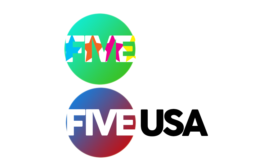
I can understand why you say kerning. However, is it really bad? Since starting this mock I have paid so much more attention to broadcasting and I find many channels don't have the best kerning - but it's still readable. I am happy to make the kerning better if you are really unhappy with it.

If you are also talking about kerning in the "FIVE" logo I have designed for it to look like this.

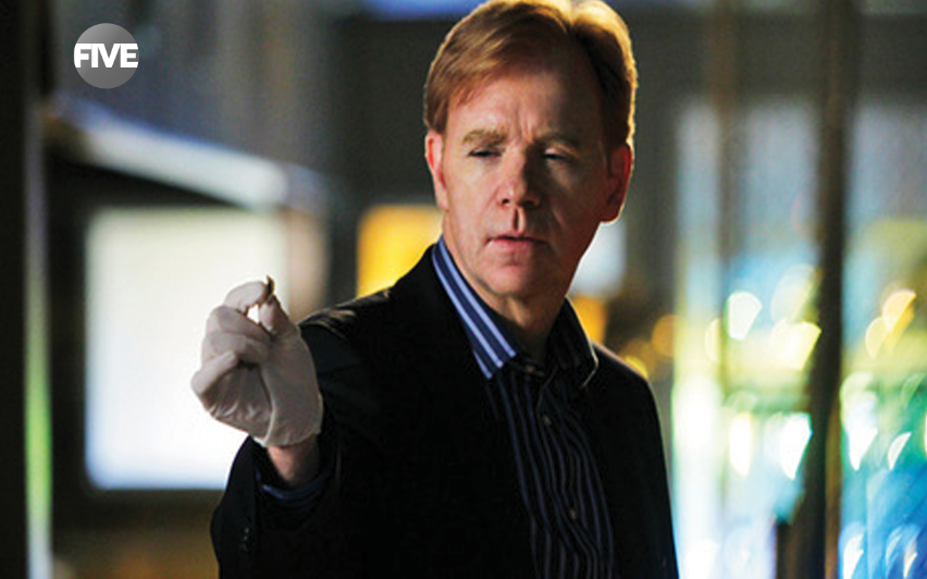
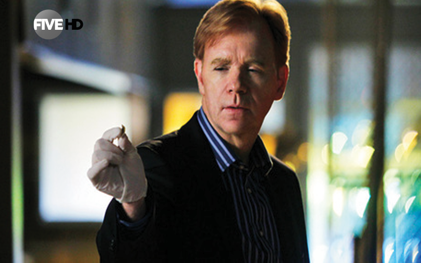
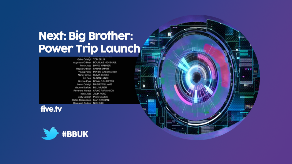
Other than the kerning do you like the images above?

Thanks for getting back to me.
DE
declan
On addition to those images I uploaded earlier, whilst away, I created the logos for sister channels - FIVE* and FIVE USA. on top of this I have created a simple DOG for FIVE and then one for FIVE HD.

Here they are:


*

A simple design of what I imagine the DOG would look like on FIVE.

*

Now featuring HD.

*

Put these two together. The FIVE* would be bright and colourful. The logo would feature a "conveyor belt" of colourful stars (FIVE*) inside the FIVE. As for the circle it is open to changes in colour if wanted. The FIVE USA has the circle with a gradient blue/red to match the American flag situated beside a simple, yet effective, USA.

Hope you like these. Thanks.
AG
AxG
These are simply poor, and I can't imagine them on TV, the Five* logo is excruciatingly bad, more like Milkshake.
DE
declan
AxG posted:
These are simply poor, and I can't imagine them on TV, the Five* logo is excruciatingly bad, more like Milkshake.


Thank you for your comment.

I'll admit the FIVE* was one that I wanted to do something different as opposed to a star beside the FIVE - which is fine - but I wanted something else. I suppose it hasn't worked out well.

Are you talking about the most recent logos - the sister ones? I do hope you don't mean the whole bunch - what is your views on the other things I've uploaded particular to the circle gradient?

Thanks again.
DE
declan
Here also is an ECP for Big Brother:

*

Not trying to be egotistic in any way but would like for you guys to see this. I believe, not only from comments here, but also from a viewcount on metropol that the gradient logo is liked:

*

It is the biggest viewcount I have and compared to the other logo designs it's unrealistic. Hope this coveys your feelings too. You may see that the date is not the same as the original upload this is because it was noted that harabara wasn't wanted and I changed it to cocogoose - which has been in used in all designs since. Although, I never made a new post to show this I uploaded for this to be used for the thumbnail of the thread.

Thank you.
AS
ASO

Not trying to be egotistic in any way but would like for you guys to see this. I believe, not only from comments here, but also from a viewcount on metropol that the gradient logo is liked:

*

It is the biggest viewcount I have and compared to the other logo designs it's unrealistic. Hope this coveys your feelings too.

Doesn't mean people like it. Just saying.

The 5* and 5usa logos are awful and just need scrapping and starting again.

Here is the advice that you should understand by now: Start lots of different ideas now, work on them, look at them in a few days, work on them, look at them in a few days after, work on them, look at it a while later and ask yourself "are these the best I can do?" - If they are, upload them, If they're not then carry on the process. If you did upload them because they're the best you can do, you will get constructive feedback and you can tweak them.

I am not going to give you this advice to you again - you have heard these things all before (about doing what mdta does and spending time with gaps in between.) You have had this advice from me a few times and from others too. Next time I will just copy and paste this until I think you have properly followed this.

Also, you made it out that you can make the kerning better, but are essentially refusing. Do it if you can. He clearly is unhappy with it. Personally, I don't mind the kerning in the logo but think that more attention could be payed.

By the way, the DOG is very intrusive and opaque. It would definitely be reported in the Really Bad DOGs thread! Generally, DOGs are smaller than that, all one translucent grey colour, not grey with a gradient, a bit of white and some black. It's too annoying and rather ugly. Having said that, at least it's not in the 4:3 safe area.

Also I hate the sunset coloured background with the blue logo - clashing... Why does there have to be so much colour? Why not have a bit of white in there?
DE
declan
ASO posted:

Not trying to be egotistic in any way but would like for you guys to see this. I believe, not only from comments here, but also from a viewcount on metropol that the gradient logo is liked:

*

It is the biggest viewcount I have and compared to the other logo designs it's unrealistic. Hope this coveys your feelings too.

Doesn't mean people like it. Just saying.

The 5* and 5usa logos are awful and just need scrapping and starting again.

Here is the advice that you should understand by now: Start lots of different ideas now, work on them, look at them in a few days, work on them, look at them in a few days after, work on them, look at it a while later and ask yourself "are these the best I can do?" - If they are, upload them, If they're not then carry on the process. If you did upload them because they're the best you can do, you will get constructive feedback and you can tweak them.

I am not going to give you this advice to you again - you have heard these things all before (about doing what mdta does and spending time with gaps in between.) You have had this advice from me a few times and from others too. Next time I will just copy and paste this until I think you have properly followed this.

Also, you made it out that you can make the kerning better, but are essentially refusing. Do it if you can. He clearly is unhappy with it. Personally, I don't mind the kerning in the logo but think that more attention could be payed.

By the way, the DOG is very intrusive and opaque. It would definitely be reported in the Really Bad DOGs thread! Generally, DOGs are smaller than that, all one translucent grey colour, not grey with a gradient, a bit of white and some black. It's too annoying and rather ugly. Having said that, at least it's not in the 4:3 safe area.

Also I hate the sunset coloured background with the blue logo - clashing... Why does there have to be so much colour? Why not have a bit of white in there?


Thank you, ASO!

I did the back/forth thing the other day and in the end it seems a few things were liked but not all - that's fine it's progress.

Will go away and work on all of it a bit more. Fair comment about the sister channels that seems that generally they aren't liked - I'll fix it.

Kerning: The logo will remain the same as, like you understand and others too, it was designed like that. The reason I haven't attempted to change kerning elsewhere much is because 1) Want to ensure safety in areas 2) I thought that it wasn't bad when I compared it to the first page's kerning issues. However, that said I will look at it in more depth.

The DOG is something up until the other day I had never attempted and I suppose it is showing that instability.

The sunset one was the idea of timing and wanted colours to reflect that time of day. Yes, it is very colourful but was hoping that would make FIVE stand out - personality maybe haha? Nevertheless, I'll take another look over and adapt it. White? I was afraid people would criticise it for being plain but maybe not now.

Thanks again ASO. Your feedback and other people's help me.
AS
ASO
You could use the sunset colours in the logo and have a white background - just don't use two gradients like that together because it is horrible.
DE
declan
ASO posted:
You could use the sunset colours in the logo and have a white background - just don't use two gradients like that together because it is horrible.


Thank you will give that a go.
HB
HarryB
I am very confused with the spacing of your letters and the colours need to be changed for 5 News, here is my example of what you could follow if you like.

*
DE
declan
I am very confused with the spacing of your letters and the colours need to be changed for 5 News, here is my example of what you could follow if you like.

*


NO WAY!

*

I was working on one today which is actually quite similar to yours as you can see. I had the idea that the news had to change colour and came up with above.

As for the kerning I have edited it and will upload in in a few minutes. What I will say is the gradient with the text that is the same as the circle is very appealing and I think I'll maybe do that as opposed to the black.

Thank you very much!
AS
ASO
I think News should be in caps. Would make it less cheap, tacky looking, and more newsy.

Newer posts