The Gallery

FIVE - a return to pre 2011 Channel 5

Channel 5 is a name, FIVE is a brand. (May 2014)

This site closed in March 2021 and is now a read-only archive
DE
declan
Why do you post everything in spoiler tags? It makes looking at your work a horrible experience before you've even seen it.

Oh, and KERNING .

Kerning where??


I would also like to ask that?
Last edited by declan on 29 May 2014 8:30pm
DO
dosxuk
---
Last edited by dosxuk on 2 June 2014 5:51pm
DE
declan
FIVE logo designed to be that way. Look at the the one with the text masked. It allows for the picture to be more visible.

As for the rest I don't think it's a massive problem it is very readable. When my very first mock had issues with kerning it had issues with kerning. I genuinely don't think this is a massive problem in terms of the overall view of it.

Thanks for taking time to identify it. Is it just this one or across the board?


Thanks again Smile
DE
declan
Can I just get a raincheck? Is everybody happy with the continuation of the gradient circle that has been used? I just want to make sure. My next step is finishing the sister channels but need to be sure that everybody is happy with the logo before continuing. Don't want to get so far and then for it to not be liked?

I think this time has been a lot better as people have definitely been less "better if" and more "this is good" if you get what I mean? I am hoping to get some stars on this mock soon if it is worthy Smile
MW
Mike W
Can I just get a raincheck? Is everybody happy with the continuation of the gradient circle that has been used? I just want to make sure. My next step is finishing the sister channels but need to be sure that everybody is happy with the logo before continuing. Don't want to get so far and then for it to not be liked?

I think this time has been a lot better as people have definitely been less "better if" and more "this is good" if you get what I mean? I am hoping to get some stars on this mock soon if it is worthy Smile

I don't think anyone's happy with what you've thrown at us. It amounts to assault! Go away for a while and come up with a new concept (not a bloody circle!) and work on it, come back after a few weeks or months and show us what you've come up with, then you'll get decent comment! Instead of just seeing what people are suggesting and executing it poorly!
DE
declan
Can I just get a raincheck? Is everybody happy with the continuation of the gradient circle that has been used? I just want to make sure. My next step is finishing the sister channels but need to be sure that everybody is happy with the logo before continuing. Don't want to get so far and then for it to not be liked?

I think this time has been a lot better as people have definitely been less "better if" and more "this is good" if you get what I mean? I am hoping to get some stars on this mock soon if it is worthy Smile

I don't think anyone's happy with what you've thrown at us. It amounts to assault! Go away for a while and come up with a new concept (not a bloody circle!) and work on it, come back after a few weeks or months and show us what you've come up with, then you'll get decent comment! Instead of just seeing what people are suggesting and executing it poorly!


What I was asking if people were happy with that circle.

People are happy with the circle they've said.

I am still working on the mock. Haven't uploaded in a couple of days.

Also, me and HenryL96 have been working on a news mock. He is designing a news studio incorporating the circle logo - which shows interest.

I feel it's unfair to say I've executed poorly. I think people would agree with me and say I have tried to cater to their requests.

Thanks for you reply.
DO
dosxuk
---
Last edited by dosxuk on 2 June 2014 5:50pm
SomeRandomStuff and bilky asko gave kudos
DE
declan
TBF, it's quite difficult to poorly execute a circle with a word in it.


Thank you.
AS
ASO
TBF, it's quite difficult to poorly execute a circle with a word in it.


Thank you.

That wasn't a compliment.
DE
declan
Sarcasm haha Wink
DE
declan
Hey everyone.

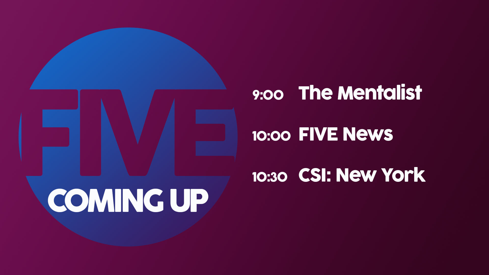
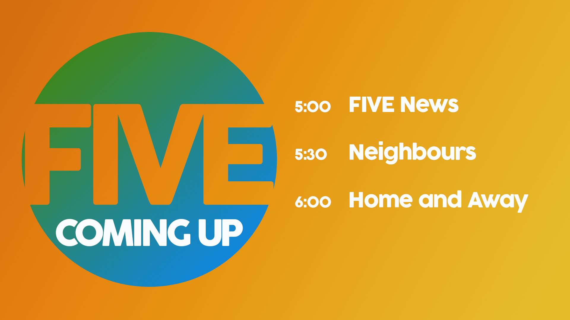
I have been working back and forth on this mock. I have composed an ECP along with two coming up screens. The coming up screens are taken from evening and nighttime programming and you will see how their colours (hopefully) match this.

*

An evening screen. This features a green/blue circle along with a gradient orange background.

*

An off-main logo features here on top of a purple gradient showcasing FIVE's late programming.

*

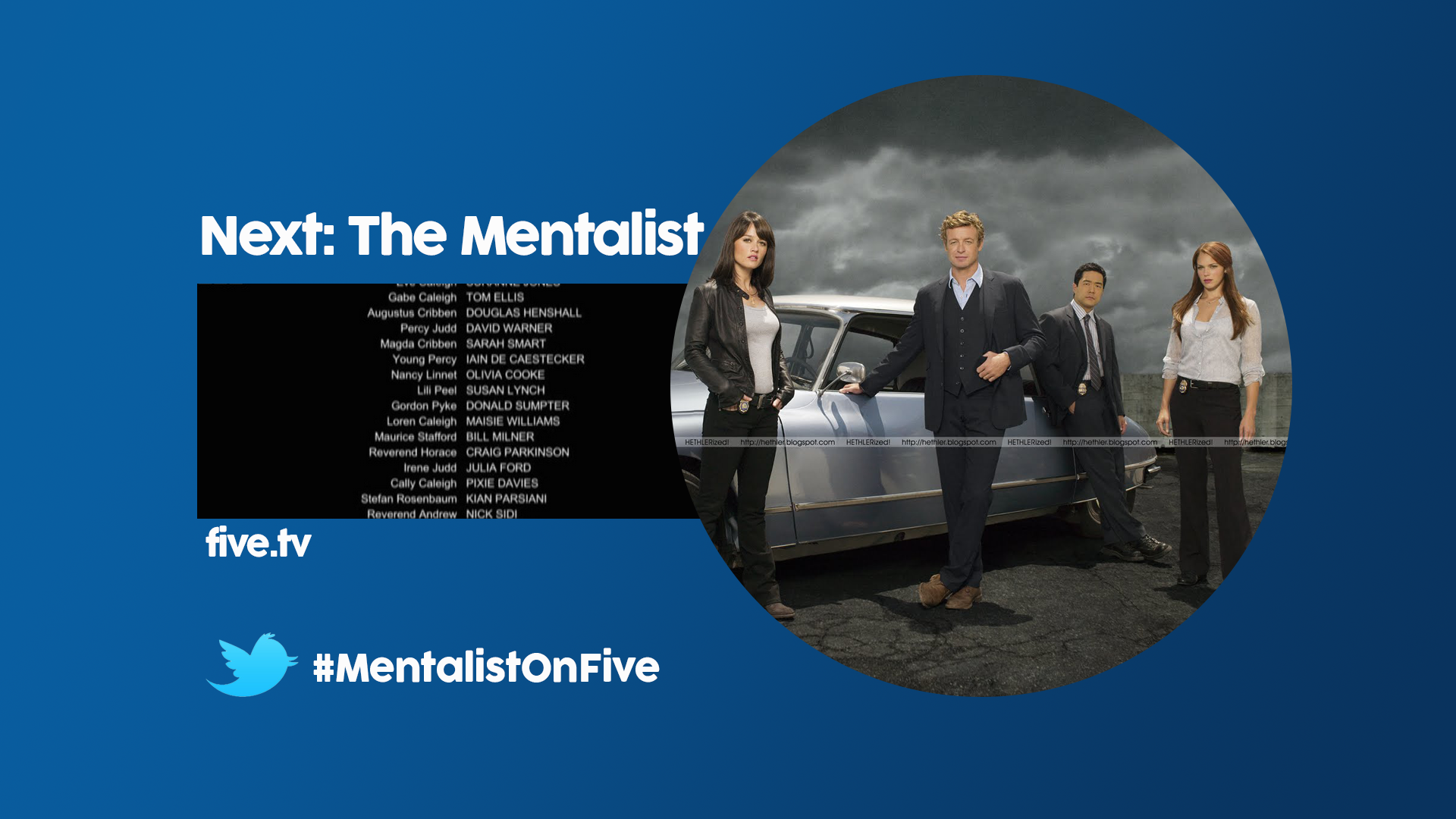
An ECP advertising the mentalist. I have included the ability to "get involved" with twitter - last seen in a much earlier page. I decided not to have "FIVE" across the circle.

Along with these the promo screens seen earlier will take the masked text ones not the white FIVE ones. I'm sure you know what I mean but don't hesitate to ask if confused.

Hope you like these. Tell me what you think.

Thanks.
CR
Critique
KERNING.

Newer posts