The Gallery

FIVE - a return to pre 2011 Channel 5

Channel 5 is a name, FIVE is a brand. (May 2014)

This site closed in March 2021 and is now a read-only archive
DE
declan
WOW! Looking at your old version of this mock and looking at these just shows how far you have come! Keep going with this, I really like:)


Thanks very much. Yeah this compared to page 1 is extremely different and I also think I've come a long way. I'm continuing to work on this. Got a few questions for everyone though:

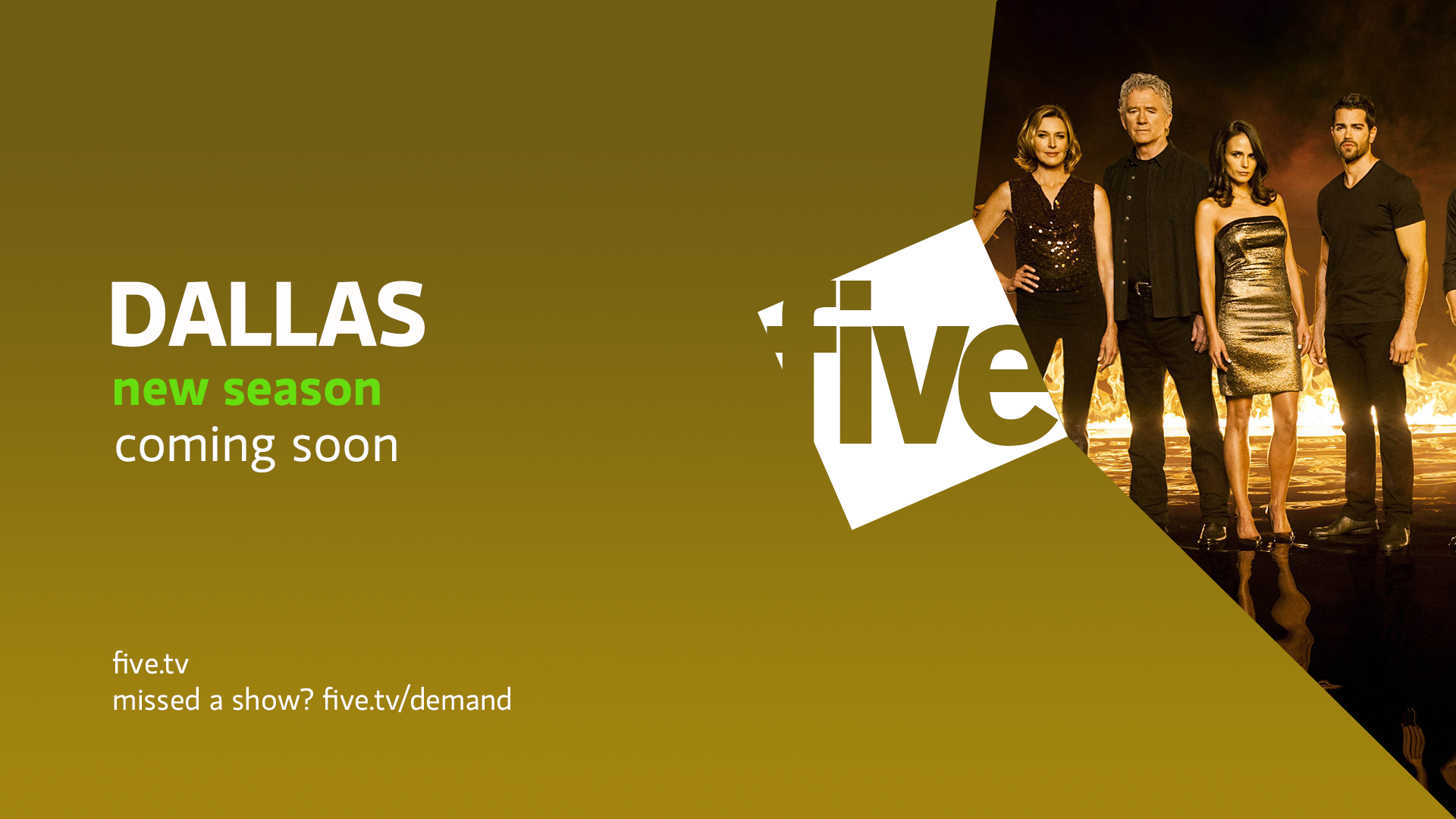
1) The video I uploaded prior the the ident and stings (2nd neighbours one) does everyone want this to be the main way for promotions? I'd like to show a Dallas one I have of this?

2) The things that have been commented on is that I need a new five star logo, right? New ECP? New cross channel promotion?

What have I missed? What else do you guys want to see on top of what I am doing?
Last edited by declan on 15 July 2014 9:37pm - 2 times in total
DE
declan
Here are a few other ECP designs as the other ones weren't really liked, hoping these ones are:

*

Or with a white bar

*

A possible way to promote across the brand on this one. I can't decide about this one though

*

Another design, quite simple I actually quite like this, but what do you think?
*

Thanks for taking time yet again. I was really happy when I got some great feedback on the stings an ident. Currently uploading that Dallas one to youtube and will get it on here ASAP.
BR
Brekkie
Like the idea for the break stings - simple but effective. Not keen on the end cap for the trailer though - the text just looks a bit amatuerish.

For what it is the ident is OK, but a whole package like that would be a bit boring, although as part of a varied package it's fine.

Not keen on the ECPs though - the top one is probably the best of what you've posted. To be fair it's probably more about me not being a fan of that style of ECP (with a reduced credits box) than your design.
MarkT76, dbl and ASO gave kudos
DE
declan
Like the idea for the break stings - simple but effective. Not keen on the end cap for the trailer though - the text just looks a bit amatuerish.

For what it is the ident is OK, but a whole package like that would be a bit boring, although as part of a varied package it's fine.

Not keen on the ECPs though - the top one is probably the best of what you've posted. To be fair it's probably more about me not being a fan of that style of ECP (with a reduced credits box) than your design.


Yeah simple but effective, a few more designs just in the style. Ok, I'll continue to work on that, what if the trailer ended with the promo screens from the page before? Like when it zooms out it goes to the big five with an image of that show and then text at the left?

I have another ident ready one that is quite suited to night time. Is it the animation?

Do you prefer ECPs like the one before last were it takes up majority of page? I'll give you and the rest of the forum an option. I get what you're saying about it as sometimes when you see ones like that on TV they can be a struggle to read however, I feel it's the way they are all going. Nevertheless, alternative in the works!

Thanks, Brekkie. Nice to hear from you hope to hear some more in future!
Last edited by declan on 13 July 2014 11:59pm
DE
declan
Here is another sting or ident - someone put 50p in the meter haha!


Tell me what you think.
Last edited by declan on 15 July 2014 11:06pm
DE
declan
I have designed another promo screen to include a logo which the other one was faulted for missing. I have gone for the white box on the blue background for the promo but as you will see I wonder if maybe the colouring should change depending on the programme.

Here are the promo screens:

*

*

*

Or, match the programme?

*

I hope you like these, give me your feedback on them.
AS
ASO
It took a while - these are good. Smile

You've got it - so now you need to continue by doing things other than promo screens and working on 5 USA and 5* - these should be completely different in my opinion.

5 News graphics?
TW
tweedledum
Very odd having the programme title in upper case, then lower case for the time, etc.

I think you have got the font bang on now, I like that.

As for the ECP, the credits are too small. At least a quarter of the screen size, I think...
DE
declan
ASO posted:
It took a while - these are good. Smile

You've got it - so now you need to continue by doing things other than promo screens and working on 5 USA and 5* - these should be completely different in my opinion.

5 News graphics?


Fantastic, thank you! Promo screens are done - we have them. One quick question: changing colours or staying the same with programmes?

Yes, finally I can begin to showcase my sister channel stuff. We have the 5USA logo although it was called that I ditch the five star logo, or have I to keep it?

As for the news I was working with HenryL96 but he appears to have dropped off the face of the Earth or is hard at work. He is designing the studio but I shall upload some straps and other on screen graphics.

Thanks ASO!
DE
declan
Very odd having the programme title in upper case, then lower case for the time, etc.

I think you have got the font bang on now, I like that.

As for the ECP, the credits are too small. At least a quarter of the screen size, I think...


Better?

*

I uploaded that font a few days back but it was after I showcased the different fonts on the promos so I thought everyone must of bypassed it thinking it was a reupload of an image. I think it looks great too!

Brekkie had said he didn't like the ECP, not because it wasn't good, but his personal taste so I began work on a different one but wanted these up first.

Thank you very much.

Oh, what does everyone think of the "dying light" video?
Last edited by declan on 16 July 2014 5:14pm
TH
thisiscnn
It get's better day by day, shame no one realises that if Channel 5 were actually considering a rebrand it wouldn't be perfect at the first stage - it's nice to see the design develop.
TV Archive, tweedledum and declan gave kudos
DE
declan
It get's better day by day, shame no one realises that if Channel 5 were actually considering a rebrand it wouldn't be perfect at the first stage - it's nice to see the design develop.


Thank you very much!

I'm glad you like the on-going development of the mock and I hope I continue to please.

Newer posts