I've written three times in a thread with 74 replies... Also I feel like you are ranting for the sake of it. I think you need to be more appropriate, remember we're online, total strangers, there's absolutely no need to be fed up. If you don't want to respond thats fine, but I'm allowed to push for more depth of feedback, especially as the previous post was more rant than helpful! I am helping this mocker, we're discussing it in depth in DM and so we're both really grateful, as novices, to receive a lot of feedback! What I can pick up through these sorts of mocks, only improves my own!! And could even improve yours!
I am also trying to help Declan hence the comments I've written. I would appreaciate it if you weren't patronising because I actually agree with much of what you have said. You don't think that you're targetting me for the sake of it? The posts I have written today have been absoloutely helpful and Declan has expressed his gratefulness for that. With respect, I am sorry to say that you're simply acting like a petulant child by saying that. If you compare my feedback to lots of others on this thread and actully read what I've written then you'll see the advice I have given Declan. Also, you talk about helping lots of novices improve - but how can that happen if you're talking about the mock by PM? I think you are creating an issue out of nothing here - the comments were constructive.
I am tired now.

Let's take the thread back to the mock and forget about this, draw a line under it eh?

The thing is Declan - Desmond has brought the business up and up. Ratings have improved, as has profit etc.
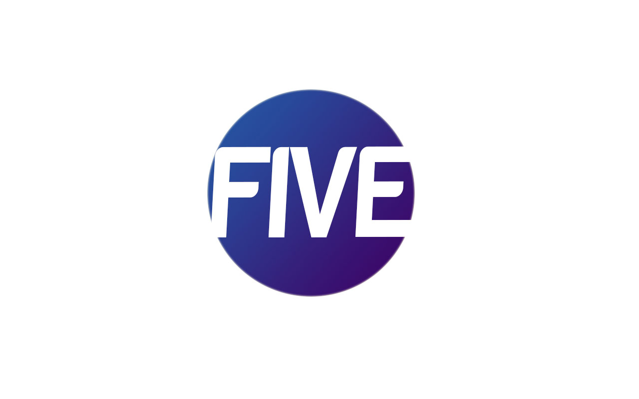
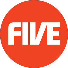
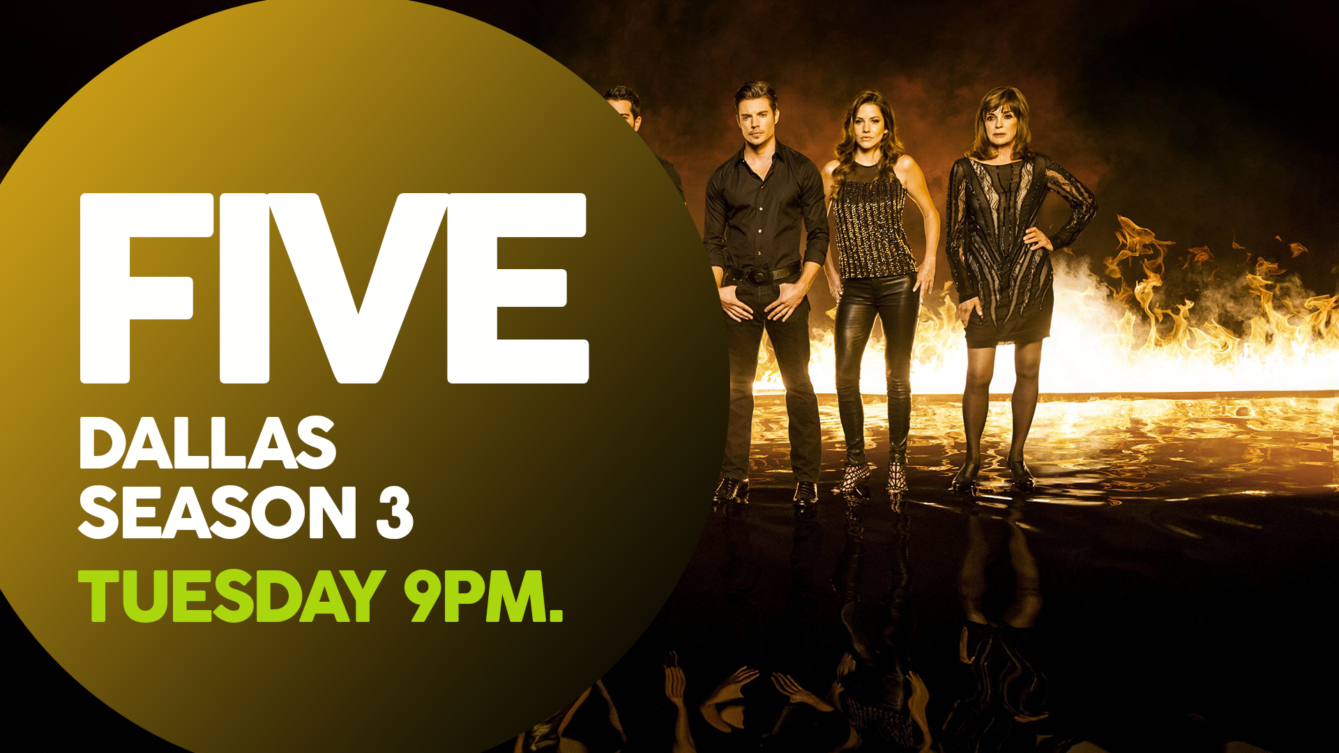
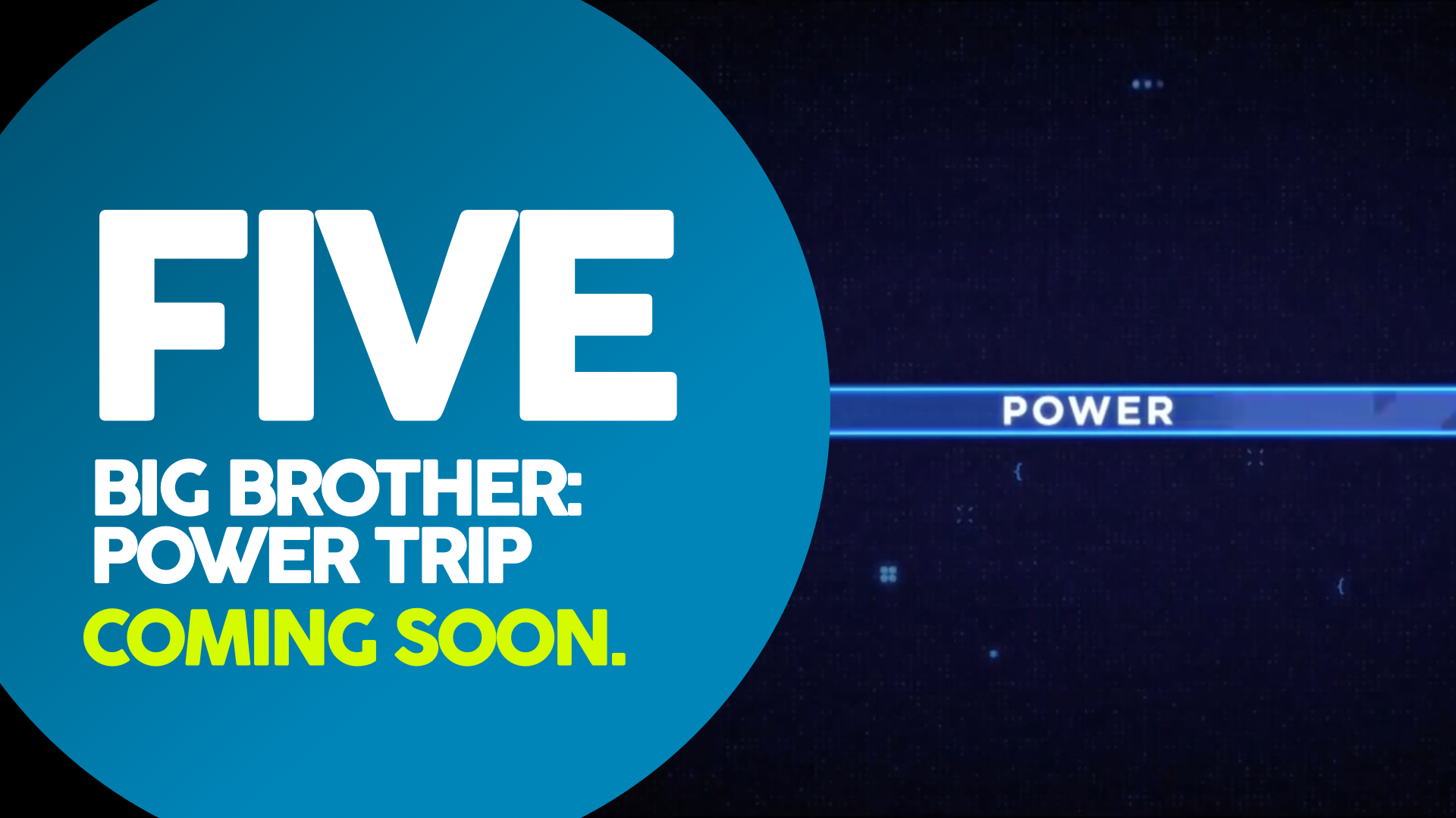
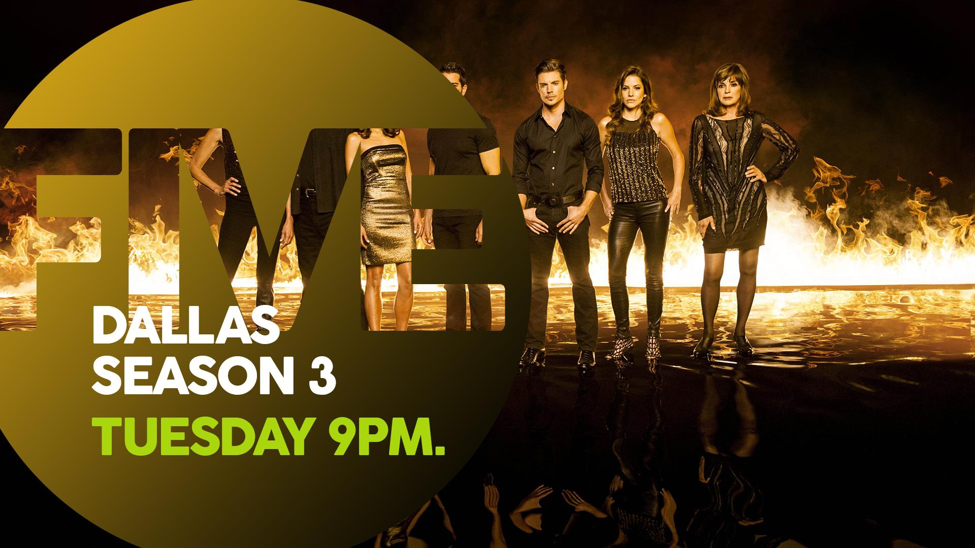
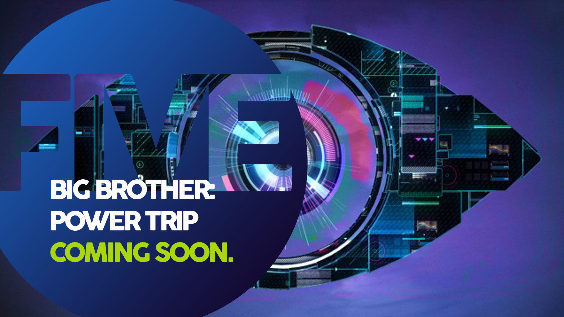
The channel's current logo is very boring. A 5 inside a circle is a bit dull. So to give it more personality - which is what this mock set out to do - writing FIVE inside a circle with a gradient (which is the best one you've done) could be much more creative. Why not make the shape more interesting like you did with some other ideas? I personally would like to see the next logo with the gradient, but with a different font and a different shape behind. If the aim is to give personality to the channel, I think there is scope to be even more creative than the pre 2011 branding. Earlier in the mock, you had some creative ideas, but the execution was not so good. I can't help thinking that the mock went a bit safe after that. I just think (and this is not offending the mock) that you could adapt the logo that I like to make it a bit more different from both of the two most recent eras. Look at the current blue UKTV logo for inspiration if you haven't already.
Hope this helps.