DE
Thank you.
The last two are just basic ideas that would be improved if one of them was the favourite out of all the designs.
As for the movement, there is a wide range of possibilities. The colouring would change probably. As for animation I could have have it falling, bursting with colour, a lot of things are possible to make it seem alive.
Definite improvement, Not a fan of the original gradient or the front in the second image, and feel like more needs to be done on the last two. Would love to know more about the movement of the first logo!!
Thank you.
The last two are just basic ideas that would be improved if one of them was the favourite out of all the designs.
As for the movement, there is a wide range of possibilities. The colouring would change probably. As for animation I could have have it falling, bursting with colour, a lot of things are possible to make it seem alive.
HJ
Hate this idea!!!
I think there is promise, and would like to take your circle design, with the News logo, and begin working a News studio for it. I think you've definitely got a good concrete start now!!
I would in the meantime like to read some other peoples opinions on this mock!!
5 Live could be a slogan if it moved around like a human haha!
Hate this idea!!!
I think there is promise, and would like to take your circle design, with the News logo, and begin working a News studio for it. I think you've definitely got a good concrete start now!!
I would in the meantime like to read some other peoples opinions on this mock!!
DE
Hate this idea!!!
I think there is promise, and would like to take your circle design, with the News logo, and begin working a News studio for it. I think you've definitely got a good concrete start now!!
I would in the meantime like to read some other peoples opinions on this mock!!
Yeah definitely! I've seen your GMB and I wouldn't be able to create it myself please do!
Yeah I need to see what others think too - hopefully they also like.
Thanks.
5 Live could be a slogan if it moved around like a human haha!
Hate this idea!!!
I think there is promise, and would like to take your circle design, with the News logo, and begin working a News studio for it. I think you've definitely got a good concrete start now!!
I would in the meantime like to read some other peoples opinions on this mock!!
Yeah definitely! I've seen your GMB and I wouldn't be able to create it myself please do!
Yeah I need to see what others think too - hopefully they also like.
Thanks.
AS
Is that a joke? Just checking because 5 Live already exists.
You haven't really listened to Brekkie's advice about taking a few weeks to practice. It has promise, but at a later date, you'll look back disapointed. You need to look at it at a later date before uploading to see if it's the best you can do. If it isn't then work on it with a fresh pair of eyes. Then, carry on doing this. Only when it is the best thing you can do, should you upload. This doesn't take a few hours or a few days. It takes a few weeks. At that point there will still be a few tweaks to make. People might not like the font or the colours. Then you make those tweaks which don't take long at all. Once the foundations are there, which takes a while, you should be ready to rock. And from then on, it is ok to just make adjustments or additions.
At least you followed the mdta example of posting lots of ideas. But even Martin wasn't perfect when he started. As he has said elsewhere on the forum, he started out like you, but here's the difference: he didn't upload his mocks. Some things are best kept on your PC. Now you might as well carry on now, because there's no stopping you! But please think carefully about that advice. Don't react poorly to this constructive criticism by kicking up a fuss and complaining that you haven't had any constructive criticism. People afe free to say what they want to on this forum (OBVIOUSLY TO A CERTAIN EXTENT) but you know what I mean. If people say the mock is cr*p then maybe they're right. Look at RainbowDash's mocks. Let's be honest - we do get idiots and trolls on this forum but they would've been banned. Nobody who has posted on this thread is a troll. The whole point is of this place is that you can have your opinion. Yes, it is really annoying when people in the gallery are rude and destructive, but when there is constructive criticism, but the mocker reacts poorly to it, that is ridiculous. So be careful.
Now I am no mocking guru, but what I've said here is completely valid.
Sorry for the rant.
Anyway, good luck with the mock.
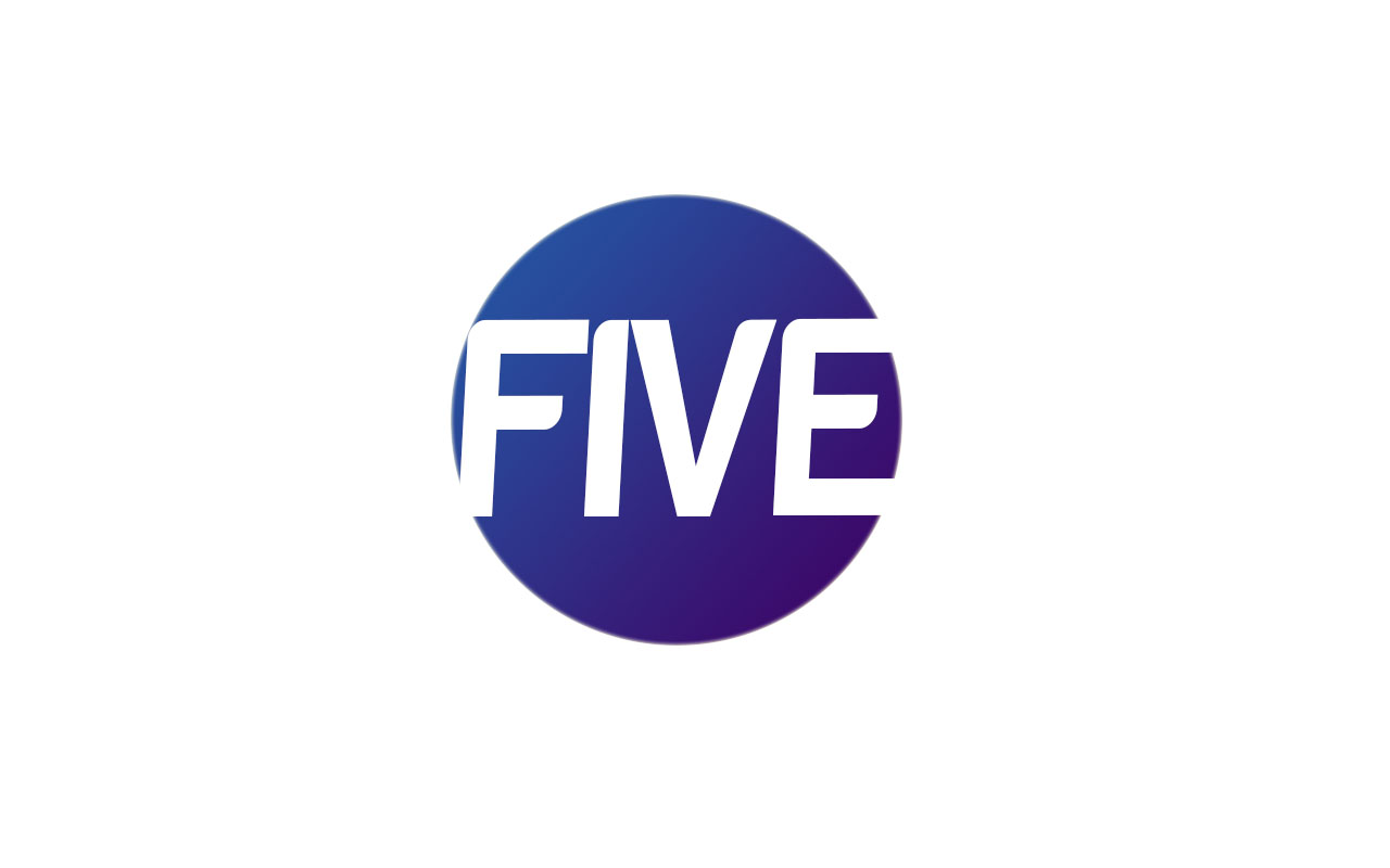
And make sure you ditch the 90s colours. They were bad at the time, they are worse now. Also, I do not like the font in the last logo in that post earlier. The one with lots of circles isn't very nice either. The gradient circular one is my favourite. It could be versatile with colours - just like the ITV logo is for idents and shows. Stay clear of harabara. It's awful.
5 Live could be a slogan if it moved around like a human haha!
Is that a joke? Just checking because 5 Live already exists.
You haven't really listened to Brekkie's advice about taking a few weeks to practice. It has promise, but at a later date, you'll look back disapointed. You need to look at it at a later date before uploading to see if it's the best you can do. If it isn't then work on it with a fresh pair of eyes. Then, carry on doing this. Only when it is the best thing you can do, should you upload. This doesn't take a few hours or a few days. It takes a few weeks. At that point there will still be a few tweaks to make. People might not like the font or the colours. Then you make those tweaks which don't take long at all. Once the foundations are there, which takes a while, you should be ready to rock. And from then on, it is ok to just make adjustments or additions.
At least you followed the mdta example of posting lots of ideas. But even Martin wasn't perfect when he started. As he has said elsewhere on the forum, he started out like you, but here's the difference: he didn't upload his mocks. Some things are best kept on your PC. Now you might as well carry on now, because there's no stopping you! But please think carefully about that advice. Don't react poorly to this constructive criticism by kicking up a fuss and complaining that you haven't had any constructive criticism. People afe free to say what they want to on this forum (OBVIOUSLY TO A CERTAIN EXTENT) but you know what I mean. If people say the mock is cr*p then maybe they're right. Look at RainbowDash's mocks. Let's be honest - we do get idiots and trolls on this forum but they would've been banned. Nobody who has posted on this thread is a troll. The whole point is of this place is that you can have your opinion. Yes, it is really annoying when people in the gallery are rude and destructive, but when there is constructive criticism, but the mocker reacts poorly to it, that is ridiculous. So be careful.
Now I am no mocking guru, but what I've said here is completely valid.
Sorry for the rant.
Anyway, good luck with the mock.
And make sure you ditch the 90s colours. They were bad at the time, they are worse now. Also, I do not like the font in the last logo in that post earlier. The one with lots of circles isn't very nice either. The gradient circular one is my favourite. It could be versatile with colours - just like the ITV logo is for idents and shows. Stay clear of harabara. It's awful.
Last edited by ASO on 28 May 2014 10:08pm
DE
Is that a joke? Just checking because 5 Live already exists.
You really haven't listened to Brekkie's advice about taking a few weeks to practice. It has promise, but at a later date, you'll look back disapointed. You need to look at it at a later date before uploading to see if it's the best you can do. If it isn't then work on it with a fresh pair of eyes. Then, carry on doing this. Only when it is the best thing you can do, should you upload. This doesn't take a few hours or a few days. It takes a few weeks. At that point there will still be a few tweaks to make. People might not like the font or the colours. Then you make those tweaks which don't take long at all. Once the foundations are there, which takes a while, you should be ready to rock. And from then on, it is ok to just make adjustments or additions.
At least you followed the mdta example of posting lots of ideas. But even Martin wasn't perfect when he started. As he has said elsewhere on the forum, he started out like you, but here's the difference: he didn't upload his mocks. Some things are best kept on your PC. Now you might as well carry on now, because there's no stopping you! But please think carefully about that advice. Don't react poorly to this constructive criticism by kicking up a fuss and complaining that you haven't had any constructive criticism. People afe free to say what they want to on this forum (OBVIOUSLY TO A CERTAIN EXTENT) but you know what I mean. If people say the mock is cr*p then maybe they're right. Look at RainbowDash's mocks. Let's be honest - we do get idiots and trolls on this forum but they would've been banned. Nobody who has posted on this thread is a troll. The whole point is of this place is that you can have your opinion. Yes, it is really annoying when people in the gallery are rude and destructive, but when there is constructive criticism, but the mocker reacts poorly to it, that is ridiculous. So be careful.
Now I am no mocking guru, but what I've said here is completely valid.
Sorry for the rant.
Anyway, good luck with the mock.
And make sure you ditch the 90s colours. They were bad at the time, they are worse now. Also, I do not like the font in the last logo in that post earlier.
Yes it was supposed to be funny but nobody saw it haha. It doesn't matter.
I hope you can see ASO that I have put a lot of effort in though? I'm still working and now that HenryL96 has taken an interest we will have a mock news studio to go with it - which I think is incredible. What is your favourite out of the possible ones I uploaded? I'm guessing none of the ones that feature the 90's colours heavily - maybe the circles?
I was really impressed with my very first one way back at the start and it knocked me a bit when I was told to scrap it. Was that one actually any good/could it be better now I'm using photoshop?
I reinforce although these designs are just basic ideas that are able to be bettered when a certain one is chosen.
Thanks, ASO. I appreciate your comment.
5 Live could be a slogan if it moved around like a human haha!
Is that a joke? Just checking because 5 Live already exists.
You really haven't listened to Brekkie's advice about taking a few weeks to practice. It has promise, but at a later date, you'll look back disapointed. You need to look at it at a later date before uploading to see if it's the best you can do. If it isn't then work on it with a fresh pair of eyes. Then, carry on doing this. Only when it is the best thing you can do, should you upload. This doesn't take a few hours or a few days. It takes a few weeks. At that point there will still be a few tweaks to make. People might not like the font or the colours. Then you make those tweaks which don't take long at all. Once the foundations are there, which takes a while, you should be ready to rock. And from then on, it is ok to just make adjustments or additions.
At least you followed the mdta example of posting lots of ideas. But even Martin wasn't perfect when he started. As he has said elsewhere on the forum, he started out like you, but here's the difference: he didn't upload his mocks. Some things are best kept on your PC. Now you might as well carry on now, because there's no stopping you! But please think carefully about that advice. Don't react poorly to this constructive criticism by kicking up a fuss and complaining that you haven't had any constructive criticism. People afe free to say what they want to on this forum (OBVIOUSLY TO A CERTAIN EXTENT) but you know what I mean. If people say the mock is cr*p then maybe they're right. Look at RainbowDash's mocks. Let's be honest - we do get idiots and trolls on this forum but they would've been banned. Nobody who has posted on this thread is a troll. The whole point is of this place is that you can have your opinion. Yes, it is really annoying when people in the gallery are rude and destructive, but when there is constructive criticism, but the mocker reacts poorly to it, that is ridiculous. So be careful.
Now I am no mocking guru, but what I've said here is completely valid.
Sorry for the rant.
Anyway, good luck with the mock.
And make sure you ditch the 90s colours. They were bad at the time, they are worse now. Also, I do not like the font in the last logo in that post earlier.
Yes it was supposed to be funny but nobody saw it haha. It doesn't matter.
I hope you can see ASO that I have put a lot of effort in though? I'm still working and now that HenryL96 has taken an interest we will have a mock news studio to go with it - which I think is incredible. What is your favourite out of the possible ones I uploaded? I'm guessing none of the ones that feature the 90's colours heavily - maybe the circles?
I was really impressed with my very first one way back at the start and it knocked me a bit when I was told to scrap it. Was that one actually any good/could it be better now I'm using photoshop?
I reinforce although these designs are just basic ideas that are able to be bettered when a certain one is chosen.
Thanks, ASO. I appreciate your comment.
DE
Thank you.
So the purple/blue one just with different font?
Do you mean italics in this one or the coloured circles?
I imagine you would say for me to work on the gradient one then, yes?
Thanks.
P.S. This ones colours come roughly from my very first one - was it the donut shape you didn't like in that one besides the font?
I've updated the comment now - the gradient one is the least worst.  I don't like the multiple circles one either. The font shouldn't be italic in these logos IMO because I think it looks awful.
I don't like the multiple circles one either. The font shouldn't be italic in these logos IMO because I think it looks awful.
Thank you.
So the purple/blue one just with different font?
Do you mean italics in this one or the coloured circles?
I imagine you would say for me to work on the gradient one then, yes?
Thanks.
P.S. This ones colours come roughly from my very first one - was it the donut shape you didn't like in that one besides the font?
AS
Thank you.
So the purple/blue one just with different font?
Do you mean italics in this one or the coloured circles?
I imagine you would say for me to work on the gradient one then, yes?
Thanks.
P.S. This ones colours come roughly from my very first one - was it the donut shape you didn't like in that one besides the font?
The full circle is better. Hate harabara. And I hate the use of italics for any logo.
I've updated the comment now - the gradient one is the least worst. I don't like the multiple circles one either. The font shouldn't be italic in these logos IMO because I think it looks awful.
I don't like the multiple circles one either. The font shouldn't be italic in these logos IMO because I think it looks awful.
Thank you.
So the purple/blue one just with different font?
Do you mean italics in this one or the coloured circles?
I imagine you would say for me to work on the gradient one then, yes?
Thanks.
P.S. This ones colours come roughly from my very first one - was it the donut shape you didn't like in that one besides the font?
The full circle is better. Hate harabara. And I hate the use of italics for any logo.
DE
The gradient circular one is my favourite. It could be versatile with colours - just like the ITV logo is for idents and shows. Stay clear of harabara. It's awful.
Are you meaning like the way the very first one adapted its gradient. Like Dallas would have a gold circle?
5 Live could be a slogan if it moved around like a human haha!
The gradient circular one is my favourite. It could be versatile with colours - just like the ITV logo is for idents and shows. Stay clear of harabara. It's awful.
Are you meaning like the way the very first one adapted its gradient. Like Dallas would have a gold circle?