Too much gradient and I do not think the word 'Five' going to end of the circle looks neat. Actually looks quite amateurish
I have started to reduce the gradient as ASO suggested removing the background from one of the previews. Not sure how dynamics will change now that is done but I'm sure they will.
I'm really sorry you feel that way :/ I'm such a fan of that I think it allows for the stuff I've done and feel without it it doesn't look as good.
Thanks for your interest in the mock. Please continue to share you views, thanks again.
Regarding whether to use caps for news, how long do you think it would take to make it caps and adjust the kerning to show it alongside the current one? Less time than it took to write this post on my phone probably. So now you need to add lots of ideas based on our comments (some with caps and some with different gradients) and then pick the best. I am getting a bit tired of giving the same advice about this repetitively. In future I only wish to have to give feedback on the look of the mock itself.
Regarding whether to use caps for news, how long do you think it would take to make it caps and adjust the kerning to show it alongside the current one? Less time than it took to write this post on my phone probably. So now you need to add lots of ideas based on our comments (some with caps and some with different gradients) and then pick the best. I am getting a bit tired of giving the same advice about this repetitively. In future I only wish to have to give feedback on the look of the mock itself.
I was just wondering a very simple thing. There is no point uploading one with/one without. I think the gradient is fine and I have discussed with HenryL96 (as we are doing the news studio) about gradients and nothing needs to be changed. The next time you see news here may well be when we have a fully completed studio to go with it!
Another thing I was working on was a promo for a programme - like I did with the other logos. Now, having watched this back I realise that the video almost unexpectedly cuts to the image. This was my very first attempt at using after effects and although not perfect the end segment in which the circle rotates hopefully portrays the idea I have. Nevertheless, now I have made this it will allow other promos much easier to create as I have all the animation needed. Please respect that this was my first usage of the software and have in mind the idea that should come across. This is just a basic design that will be improved once feedback is received.
Here it is:
If this was to be really used be Channel 5 when making the trailer they would have say a character stand in a position from the promo just staring and the circle rotation on top of them as opposed to it on an image.
I was just wondering a very simple thing. There is no point uploading one with/one without. I think the gradient is fine and I have discussed with HenryL96 about gradients and nothing needs to be changed.
Why did HenryL96 say to change the gradients then?
Another thing I was working on was a promo for a programme - like I did with the other logos. Now, having watched this back I realise that the video almost unexpectedly cuts to the image. This was my very first attempt at using after effects and although not perfect the end segment in which the circle rotates hopefully portrays the idea I have. Nevertheless, now I have made this it will allow other promos much easier to create as I have all the animation needed. Please respect that this was my first usage of the software and have in mind the idea that should come across. This is just a basic design that will be improved once feedback is received.
If this was to be really used be Channel 5 when making the trailer they would have say a character stand in a position from the promo just staring and the circle rotation on top of them as opposed to it on an image.
Right, if this was actually used on TV, would you be pleased? Do you really think that this is readable.
I was just wondering a very simple thing. There is no point uploading one with/one without. I think the gradient is fine and I have discussed with HenryL96 about gradients and nothing needs to be changed.
Why did HenryL96 say to change the gradients then?
Improving constantly, but hate the black in the news logo, needs to be more subtle, and I would remove the gradient from 'NEWS' personally.
Thank you ASO. I have a feeling he's only listening to comments that conform with his vision, but is struggling to see beyond and realise that there are massive flaws with this. I've messaged him a video of Watch. UKTV to show him exactly what he should be thinking about with gradients and a circular logo, but he's still going to continue with this flat circle with masked letters.
I think this really unfair. After you posted that Henry I spoke to you in pm - as we are doing the news studio together. I explained clearly to you that I really liked the gradient and you say it was fine? I then offered you a lighter colour.
As far as the WATCH and UKTV is concerned I think I have shown here maybe not explicitly but I want to make sure I have the groundwork before jumping and losing the progress I have made. Henry, we discussed that obviously WATCH was done by
professionals and I said that I would like to do that but it would be more basic.
I'm sorry if anyone is confused but I have certainly not intended to create confusion.
Another thing I was working on was a promo for a programme - like I did with the other logos. Now, having watched this back I realise that the video almost unexpectedly cuts to the image. This was my very first attempt at using after effects and although not perfect the end segment in which the circle rotates hopefully portrays the idea I have. Nevertheless, now I have made this it will allow other promos much easier to create as I have all the animation needed. Please respect that this was my first usage of the software and have in mind the idea that should come across. This is just a basic design that will be improved once feedback is received.
If this was to be really used be Channel 5 when making the trailer they would have say a character stand in a position from the promo just staring and the circle rotation on top of them as opposed to it on an image.
Right, if this was actually used on TV, would you be pleased? Do you really think that this is readable.
Thanks for your interest.
Totally understand what you are saying and I will be working to make this better.
I suppose as others have been claiming that I should "upgrade" the logo I imagine this is where it would occur. However, this is just a basic design to see if the rotation is liked. You have identified that it's a bit unreadable and so I'll make that better.
Thanks again. I will have a better one of these hopefully in a couple of weeks.
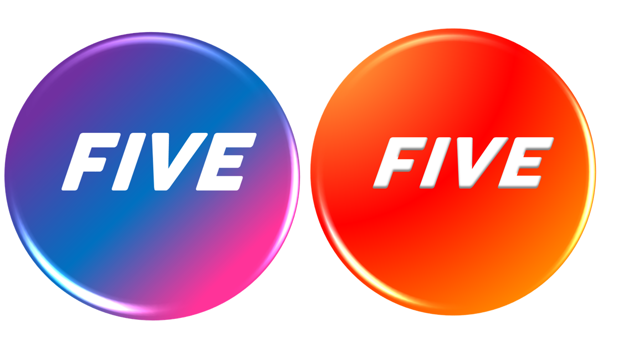
Been looking through your mock and I really appreciate the work you are doing with this mock. However, I must say i agree with what others have said about the logo being a bit 'flat' and not standing out as much. I have attached some similar logos to yours using Bevels in PowerPoint you can create a logo that stands out a bit more. I have used gradients as this is something you are clearly interested in using yourself. I hope these ideas help you in the process of creating and improving your mock.
Been looking through your mock and I really appreciate the work you are doing with this mock. However, I must say i agree with what others have said about the logo being a bit 'flat' and not standing out as much. I have attached some similar logos to yours using Bevels in PowerPoint you can create a logo that stands out a bit more. I have used gradients as this is something you are clearly interested in using yourself. I hope these ideas help you in the process of creating and improving your mock.
Thank you very much I'm glad you like the mock.
Yes, those really help to make it stand out and I think the bevel you have used would be a great attribute to my logo and I think whilst I work on the logo over the coming weeks it is something that should be added.
I think the bevel would work excently with the FIVE that "overlaps".
Really appreciate your interest along with your efforts here, many thanks!