The Gallery

FIVE - a return to pre 2011 Channel 5

Channel 5 is a name, FIVE is a brand. (May 2014)

This site closed in March 2021 and is now a read-only archive
DE
declan
V4 of the mock begins:

At least v4 if you don't count all the logos that never made it past the selection process a couple of pages ago haha.

So I have opted for a different shape - a square!

It's all change as I have ditched the infamous gradients and the circles in hope that these are more appealing. I decided it was best that instead of uploading promo screens first it is best that I give you the sister channels first thus creating a brand identity. I designed the following: five, five hd, five +1, five news, five star and milkshake (which is the first attempt in this whole mock).

I plan to develop these over coming days and weeks with the addition of five USA and then promotion screens, EPGs and DOGs for each. Personally, I think these are some of the best - if not the best - that I have done but, maybe I'm bias.

Remember these will most definitely grows arms and legs and become so much more (well hopefully Wink)

So without further ado:

*

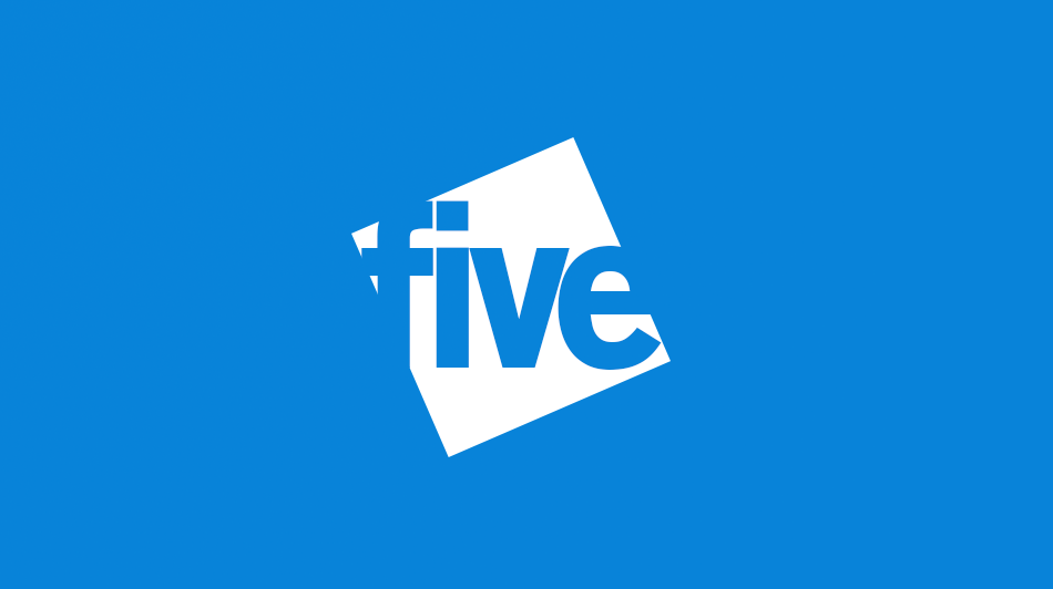
The main logo. Instead of caps I have used lower casing and I think this works best here.

*

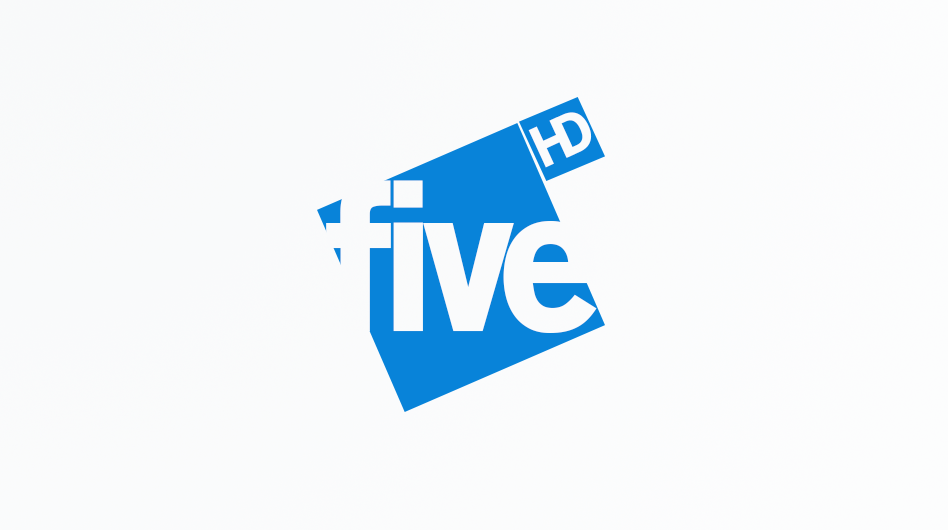
five HD features here with inversed colours.

*

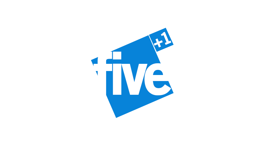
five +1 features also with inversed colours.

*

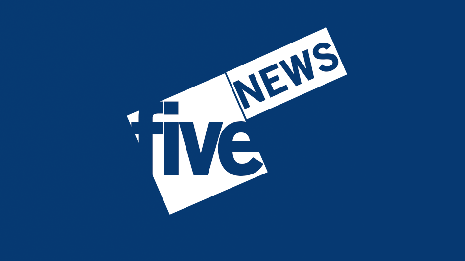
five NEWS. This I think is probably the most fitting news mock I've done. I think the design and colour give it some formalness - which news should have.

*

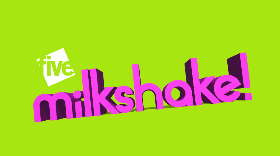
A playful version of the milkshake logo. Colours and design to match viewers - children.

*

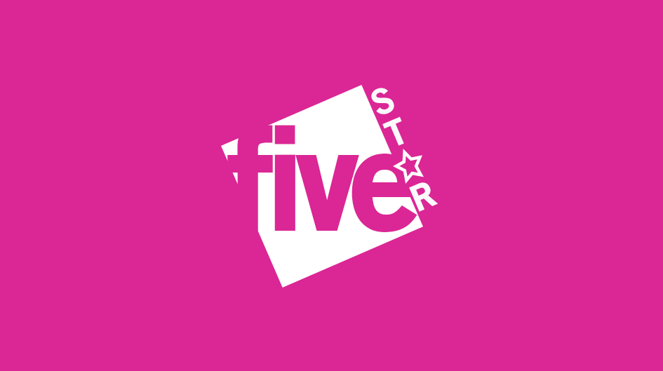
five STAR. This logo is bright and vibrant the way I see five STAR. The "A" has been replaced with a star.

I really hope you like these and think they are improvements. I think the potential with these shines through and can't wait to explore them in more detail if liked.

Thanks everyone!
Last edited by declan on 8 June 2014 3:47pm - 3 times in total
HJ
HJL
I really like these!! Think they show promise, and when developed into a more detailed package of graphics, could work really well!!
I'm thinking that the logo for Five News will work really well, and that the actual Five logo is adaptable. Would like to know how you would do the logo in the top left of the screen, as it could look cluttered. Would you propose the use of '5' rather than Five or do you have another Idea??

Also, I am so happy that you've ditched the gradients and Circles! It was crippling any creativity and originality!
DE
declan
I really like these!! Think they show promise, and when developed into a more detailed package of graphics, could work really well!!
I'm thinking that the logo for Five News will work really well, and that the actual Five logo is adaptable. Would like to know how you would do the logo in the top left of the screen, as it could look cluttered. Would you propose the use of '5' rather than Five or do you have another Idea??

Also, I am so happy that you've ditched the gradients and Circles! It was crippling any creativity and originality!


Thank you for the positivity!

Yeah, I believe that they could really grow fantastically. Not sure, some would argue that by rebranding as "five" you lose the right to carry a 5 and although I am working against the current logo I believe that BBC TWO often use both and it works fine. Nevertheless, I think that using "five" as the DOG might not look too bad but I'll see how things go and maybe upload multiple ones?

Hope that everyone else is happy with them like you!
AS
ASO
I'm really angry - I've been working on a 5 Mock myself which has a very similar logo! You don't mind if I upload it in the future anyway do you? I've been working on it since before you first started!

The logo itself is exactly what I envisaged when I gave you some advice a while back. HD and +1 are nice variations. I do have a problem with the News one - it's not formal enough. I don't think NEWS should be rotated. Milkshake is really nice. 5* is as well. I would like to see an improvement of the 5 NEWS logo and am looking forward to a 5 USA and 5+24. I am hoping that you don't make 5+24 just like the 5+1 and HD though.

SO much better. Easily the best you've done. Nice! Smile Happy ASO! You seem to have really listened finally!
DE
declan
ASO posted:
I'm really angry - I've been working on a 5 Mock myself which has a very similar logo! You don't mind if I upload it in the future anyway do you? I've been working on it since before you first started!

The logo itself is exactly what I envisaged when I gave you some advice a while back. HD and +1 are nice variations. I do have a problem with the News one - it's not formal enough. I don't think NEWS should be rotated. Milkshake is really nice. 5* is as well. I would like to see an improvement of the 5 NEWS logo and am looking forward to a 5 USA and 5+24. I am hoping that you don't make 5+24 just like the 5+1 and HD though.

SO much better. Easily the best you've done. Nice! Smile Happy ASO! You seem to have really listened finally!


Some competition hehe?

I am very happy that you are a fan of these and like all the different things! I will head back to the drawing board to work on the news one and see what can be done! Dear Lord, forgot about +24 - is it just me that forgets that even exists haha? I had a USA one but upon reflection it wasn't very good so ditched it. However, will work on USA, NEWS and +24 along with all the rest of the things I stated in the v4 post.

So happy you are a fan. I do agree with both you and Henry the best I have done.

THANK YOU!
TW
tweedledum
I like these, much improved over your last designs. Vibrant, fresh and overall really nice. If you were trying to 'recreate' the Five 2002 logo, it did not have the dot on top of the 'i'.
DE
declan
I like these, much improved over your last designs. Vibrant, fresh and overall really nice. If you were trying to 'recreate' the Five 2002 logo, it did not have the dot on top of the 'i'.


Thank you very much I appreciate that.

No, I see that the font actually looks similar now you have pointed it out but it wasn't an intention.

Thanks again.
DE
declan
I like these, much improved over your last designs. Vibrant, fresh and overall really nice. If you were trying to 'recreate' the Five 2002 logo, it did not have the dot on top of the 'i'.


Actually, now you say it might not be such a bad idea to ditch the dot. I think it looks great - like everyone else - but wonder what it would look like minus the dot. Will maybe upload that as a suggestion.
AS
ASO
Oh dear, I'm sure this wasn't intentional but this mock is very similar to this http://www.tvforum.co.uk/thegallery/channel-5-refresh-39648/ - You might have to think again or do something spectacular.

http://s30.postimg.cc/zbk071pxd/5_LOGOS.jpg
DE
declan
ASO posted:
Oh dear, I'm sure this wasn't intentional but this mock is very similar to this http://www.tvforum.co.uk/thegallery/channel-5-refresh-39648/ - You might have to think again or do something spectacular.

http://s30.postimg.cc/zbk071pxd/5_LOGOS.jpg


OMG!AHHHHHHH!

This was completely unintentional. If I could swear on here. AHH!

I cannot express my shock and upset in words. This sucks!

WHAT AM I SUPPOSED TO DO! Crying or Very sad
DE
declan
An even bigger shock is just how similar my new look news one is

*

HOW DOES THIS HAPPEN! Confused
DE
declan
Right, dealing with this dilemma.

The two designs are looking to change channel 5 so bound to include similar things such as sister channels - obviously.

The unfortunate thing is they do carry similar aspects probably most noticeable the box. However, they do take different approaches. Mine goes for five whilst this one goes for 5. I haven't had a chance to look at this thread yet been too busy panicking but is this developed any further - mine will be. The logos for other things - except news - are not exactly mirrored. Whilst this design has boxes for HD and +1 like mine this chooses to have them overlap while I choose not to.

I have worked so hard on mine and this is just devastating. I was SO, SO happy when I got raving reviews and was really motivated to continue and expand. Mine will continue to go in the direction I have planned if everybody is happy for me to continue.

In all honesty, this was probably my last attempt at this. I have uploaded multiple designs and wasn't even sure how this would go. I am not sure I can come back from this if asked to ditch all of this. So, my question is can I continue?

Thanks ASO for bringing this to my attention.

Newer posts