


DE
Ok, so instead of a square I have used a star shape, what do you think?
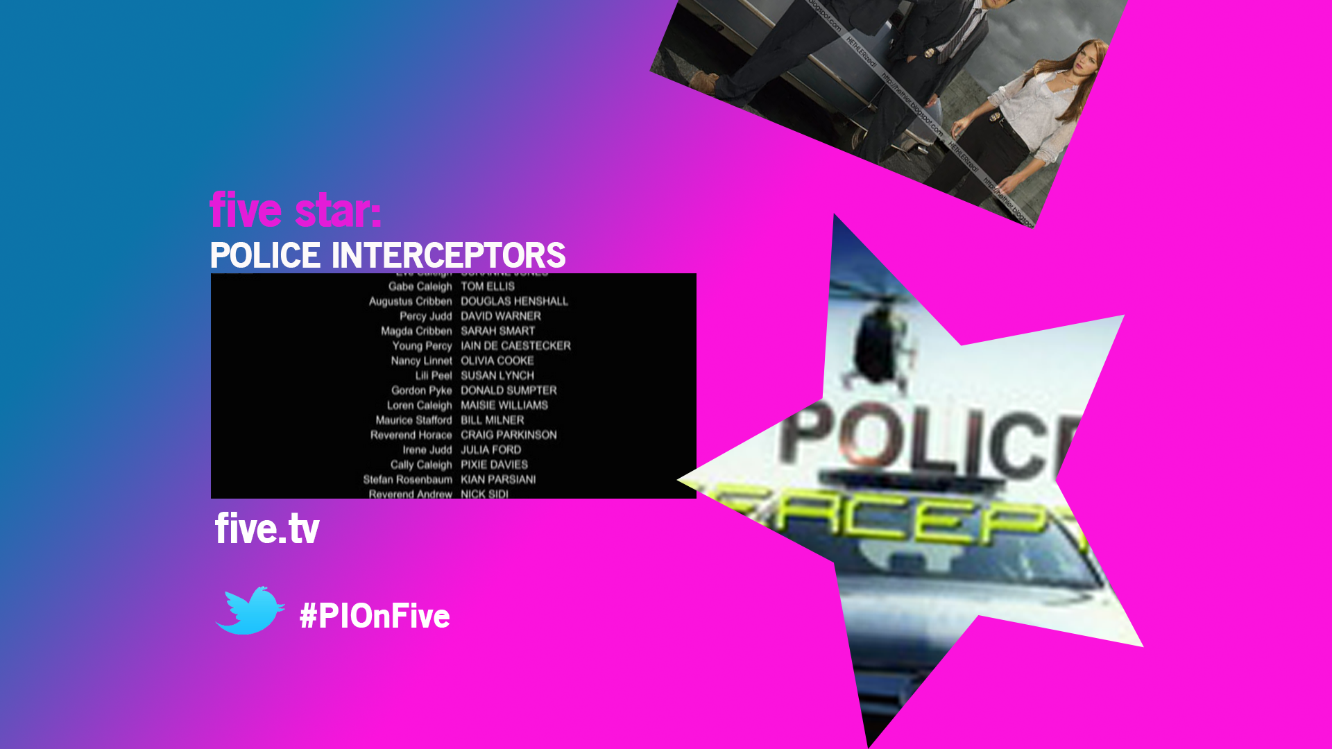
For five* why not have a star instead of a square for the EPG?
Ok, so instead of a square I have used a star shape, what do you think?
DE
Thanks for your feedback.
I had a square initially but another member suggested a star to make it more in line with five star. If you look back a page you can see it with the square you might prefer that?
I admit the gradient looks silly but it wouldn't appear like that on TV. When the announcer had finished saying "the mentalist up next on five", they would proceed to say "whilst over on five star" at this point the colouring would switch to five star's pink coming in from the side that the five star square/star comes from.
Specifically the text "five star" on the most recent image? I shall adjust the kerning.
Do you like the other things? I haven't heard anything back referring to the DOGs, promo screens and the tonight screen. I'm presuming "no news is good news"? Only I wish to draw up some more promo screens for other programmes and continue the tonight screens but would rather focus on one specific design that the gallery likes best.
Thanks again for the feedback.
That star looks wrong - it needs sharper points., I'd drop the garish pink and blue powerpoint gradient too, it cheapens your work. Play around with the kerning on the 'five star' legend too, it just looks like text slapped together in a text box!
Thanks for your feedback.
I had a square initially but another member suggested a star to make it more in line with five star. If you look back a page you can see it with the square you might prefer that?
I admit the gradient looks silly but it wouldn't appear like that on TV. When the announcer had finished saying "the mentalist up next on five", they would proceed to say "whilst over on five star" at this point the colouring would switch to five star's pink coming in from the side that the five star square/star comes from.
Specifically the text "five star" on the most recent image? I shall adjust the kerning.
Do you like the other things? I haven't heard anything back referring to the DOGs, promo screens and the tonight screen. I'm presuming "no news is good news"? Only I wish to draw up some more promo screens for other programmes and continue the tonight screens but would rather focus on one specific design that the gallery likes best.
Thanks again for the feedback.
DE
I agree it doesn't look right. As the transition between five and five star occurs it would end like this (the transition itself would take seconds:
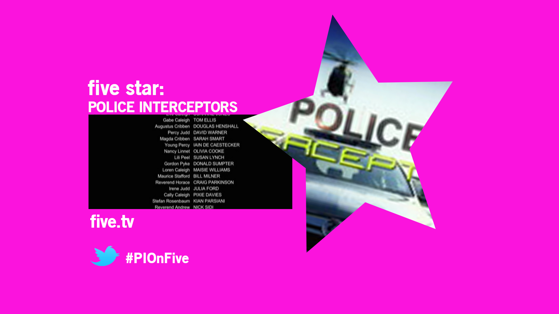
Alternatively instead of the colour switching when the announcer talks about sister channels it could easily just stay the same colour?
As in "that's your logo" are you saying for the DOG or that whole five star logo - ditching this?
I agree with Mike about the gradient - it's hideous. Remember what I was saying about subtlety in gradients? You've gone over the top.
I agree it doesn't look right. As the transition between five and five star occurs it would end like this (the transition itself would take seconds:
Alternatively instead of the colour switching when the announcer talks about sister channels it could easily just stay the same colour?
As in "that's your logo" are you saying for the DOG or that whole five star logo - ditching this?
DE

This one is the best IMO. I think you should write five above it and that's your logo.
This?

This one is the best IMO. I think you should write five above it and that's your logo.
This?
AS
That would be fine with a white background.
To add to all this here is a five USA logo, what do you think?

That would be fine with a white background.
AS
This one is the best IMO. I think you should write five above it and that's your logo.
This?
Yes, just make the five line up with the STAR - make them the same width. Looking better.
This one is the best IMO. I think you should write five above it and that's your logo.
This?
Yes, just make the five line up with the STAR - make them the same width. Looking better.
DE
That would be fine with a white background.
Your wish is my command

Thanks for your feedback. Can I ask which, if any, of the promo screens?
To add to all this here is a five USA logo, what do you think?
That would be fine with a white background.
Your wish is my command
Thanks for your feedback. Can I ask which, if any, of the promo screens?