Just from seeing the caps, the titles are very Channel Four News, as people have been saying, and the grey and yellow set reminds me of mid-90s ITN. Straps look far too big.
The one thing I do really like is the desk, very nice.
I really liked this. The music is modern and excellent, I love how radical a departure it is. It will take some getting used to for some people but it's brought the programme bang up to date. It feels very authoritative.
The new titles are going to be really good I reckon. Remember we've got variations of the movement to see. They look really slick, swooshing past iconic photos of the day:
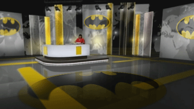
so the Theatre of News is dead... long live the Batcave of News!
At least it looks a little lighter for the mid-morning summary. However, I can't help thinking that all of this could've been achieved with a 'real' set.
I think they forgot the vital thing - if you're gonna tie in the news with the channel brand, make sure the channel brand is good enough. Never been a fan of the yellow and black of ITV1 so not a huge fan of this. It's not dreadful though, but not mind-blowing. Just need to sort out those captions.
I wonder if this will be the last major relaunch of ITV News before ITV gives up on it all together?
However, I think the titles were a great idea in principle, but they look terrible - and the main reason for that is all the stupid turns, which make them look very Windows Movie Maker! It would have been better if the camera just panned vertically down a line of 'hero panels' into the studio shot.
:-(
A former member
So the official names are the ITV News at 5.30, 1.30, 6.30 and Ten ?