GM
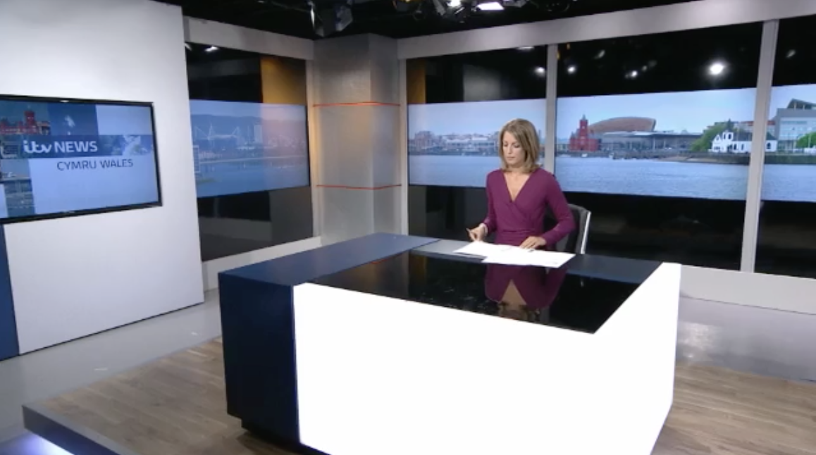
Woah...huh?! Who thought that looked good? There are some decent elements to this new set scheme ITV is using but there are somethings defo wrong with this version.
Firstly the major problem as most have point out are the black bars. I just dont get it. Sorry. I find it odd. I think it they were going to do a virtual window. they could have taken a few large format LCD's and turned them vertical and kept the "mullions" between the windows and it would have more window like. Here is an example of how NBC affiliates are achieving the virtual window feeling.
KNBC-4 - LA
http://assets.tvnewscheck.com/asset/image/file/KNBC_anchors.jpg/env/preview/aspect/original/align/full
Secondly, who did the lighting....yeeesh! Its lit up like a government benefit office. The light is cold and harsh. They likely using the cooler more efficient lights possibly. But it makes the presenter look like a talking cadaver. Needs some gels to warm up the set and create some depth. Everything looks flat. Then you get those "dead spots" in the corners, especially by the silvery-looking column. It actually could have turned out quite nice, but IMO opinion didnt quite make it. So sad.
Why does this need to be compared to a local US news set? They have nothing in common...