BH
PE
Pete
Founding member
A fantastic blog on the new look, certainly seems very promising and more so than the ugly beta.bbc.co.uk they've had going. Hopefully that was just a live test of ideas :S
In other news, Speak Your Branes is to move onto the new BBC iD sign in system. Naturally, this is an example of their nuliebour supporting evil ways and an attempt to censor the public. PUBLISH THIS IF YOU DARE.
In other news, Speak Your Branes is to move onto the new BBC iD sign in system. Naturally, this is an example of their nuliebour supporting evil ways and an attempt to censor the public. PUBLISH THIS IF YOU DARE.
AS
Asa
Admin
Very interesting blog piece. Obviously a lot of thought has gone into this and clearly they wanted to get away from the "Web 2.0"-esque design in favour of something distinctly their own.
The only thing I'm not sure about is moving all the navigation to the top - the obvious benefit of vertical is that you can add links to new sections without having to worry about squishing it into 974px.
And the clock seems to be staying!
The only thing I'm not sure about is moving all the navigation to the top - the obvious benefit of vertical is that you can add links to new sections without having to worry about squishing it into 974px.
And the clock seems to be staying!
BE
Oh wow, now that looks really exciting! A thoroughly interesting read on the underlying design of the site, as well as where they have drawn their inspiration from. The grid idea is an excellent one. Although the web 2.0 version has served us extremely well, it was always bound to start looking dated at some point. The new design looks clean and timeless, and suits the BBC down to the ground. Now if only the TV Pres department could take some cues...( ECP designers, I'm looking at you).
Can't wait to see it in action!
Can't wait to see it in action!
DV
Another blinder of a blog today, covering all things related to developing the BBC Website for Mobiles
more�.
BBC Internet Blog
more�.
BBC Internet Blog
PA
Agreed.
The new iPlayer page idea at http://www.bbc.co.uk/blogs/bbcinternet/2010/02/a_new_global_visual_language_f.html looks good as well.
Nice new nav bar:
http://www.bbc.co.uk/blogs/bbcinternet/img/24-nav.jpg
The new iPlayer page idea at http://www.bbc.co.uk/blogs/bbcinternet/2010/02/a_new_global_visual_language_f.html looks good as well.
Nice new nav bar:
http://www.bbc.co.uk/blogs/bbcinternet/img/24-nav.jpg
AN
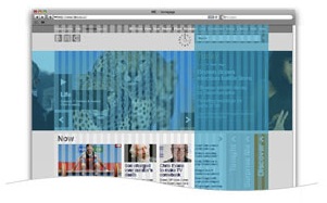
I'm really a fan of this - their existing homepage is a bit clunky, and I absolutely hate the proposed beta homepage that hopefully is never going to see the light of day now.
Really interesting that they're thinking of dropping the masthead - after all of the effort they've gone to getting it on every page, they just drop it? I can see it being implemented in some way, but I really like the clean look that they're going for. I actually suspect that they'll drop the big BBC logo, because it has created some awkward looking designs - particularly the channels, which look really weird by themself without the correctly-positioned BBC logo next to them.
And if that image above is the homepage, I'm a fan. It looks like they're completely dropping the modular look of the current design, although I'd imagine there will be some level of customisation below the fold. A couple of other things that look like they're part of that homepage prototype...
http://www.bbc.co.uk/blogs/bbcinternet/img/16-type.jpg
This is the bit underneath the feature area? I really like this idea, and it seems really practical - I'd guess 'Discover' would be a random selection of content like the current feature area.
http://www.bbc.co.uk/blogs/bbcinternet/img/19-type.jpg
I think this is on the right of the feature area, making the stand-out right column that the blog talks about. It looks like it could be live - that would be a really neat feature, and it looks really fresh compared with what we're used to in terms of BBC online design.
I really like the idea of the carousel expanding to the edge of the page aswell - that would look really bold.
I really hope we see something like this as the final design - it could just end up like the really nice ITV.com prototype that ended up as, well...they're still trying to fix it.
GO
Not fussed on that office blind effect though.
If this is the new homepage, it looks great...
Not fussed on that office blind effect though.