The Gallery

FIVE - a return to pre 2011 Channel 5

Channel 5 is a name, FIVE is a brand. (May 2014)

This site closed in March 2021 and is now a read-only archive
DE
declan
I'm afraid declan the latest efforts really are a step back - they don't look that good at all. Pretty much everything from the font to the colours to the logos just doesn't seem to work I'm afraid.


That's fair enough.

Thank you for replying in a friendly manner and explaining why it wasn't adequate. Don't worry I'm working on different ones to offer.

Thanks again, I appreciate your feedback!
DE
declan
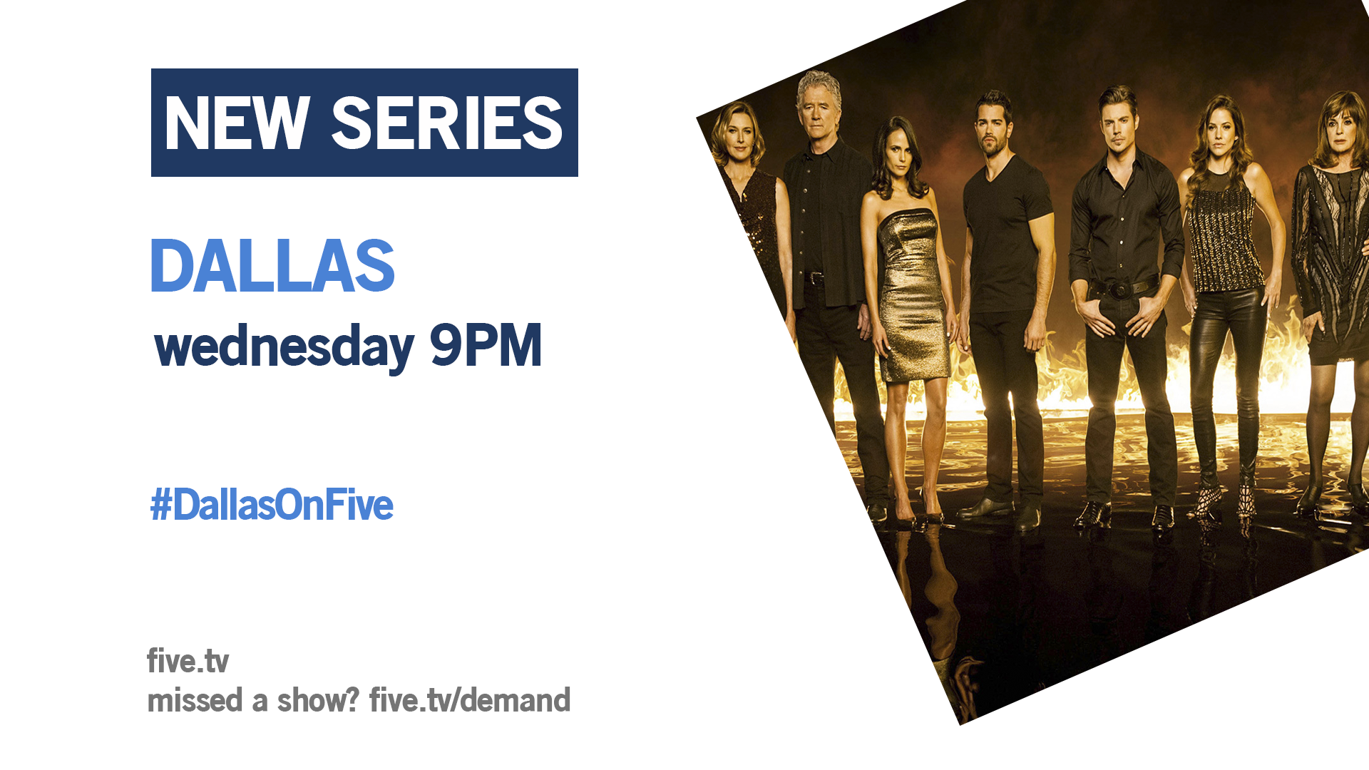
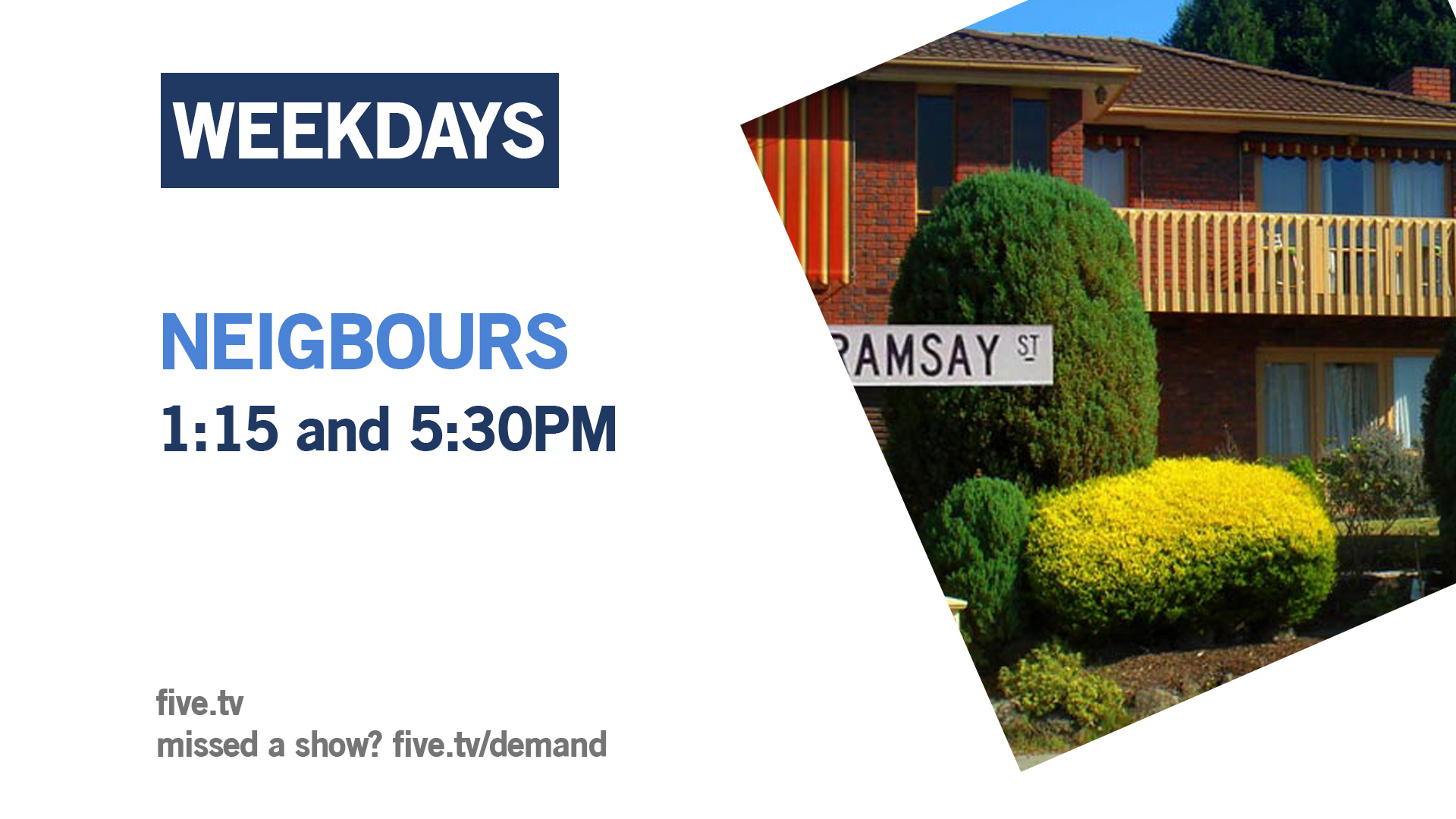
Here is a different design for promotions it follows the TONIGHT screen with the logo moving place.

*

*

*

I have other designs in the woodwork but I actually like these, but what do you think?

Looking into new font but wonder if these promos make font look good?

Thanks for taking time to look at the mock.
TW
tweedledum
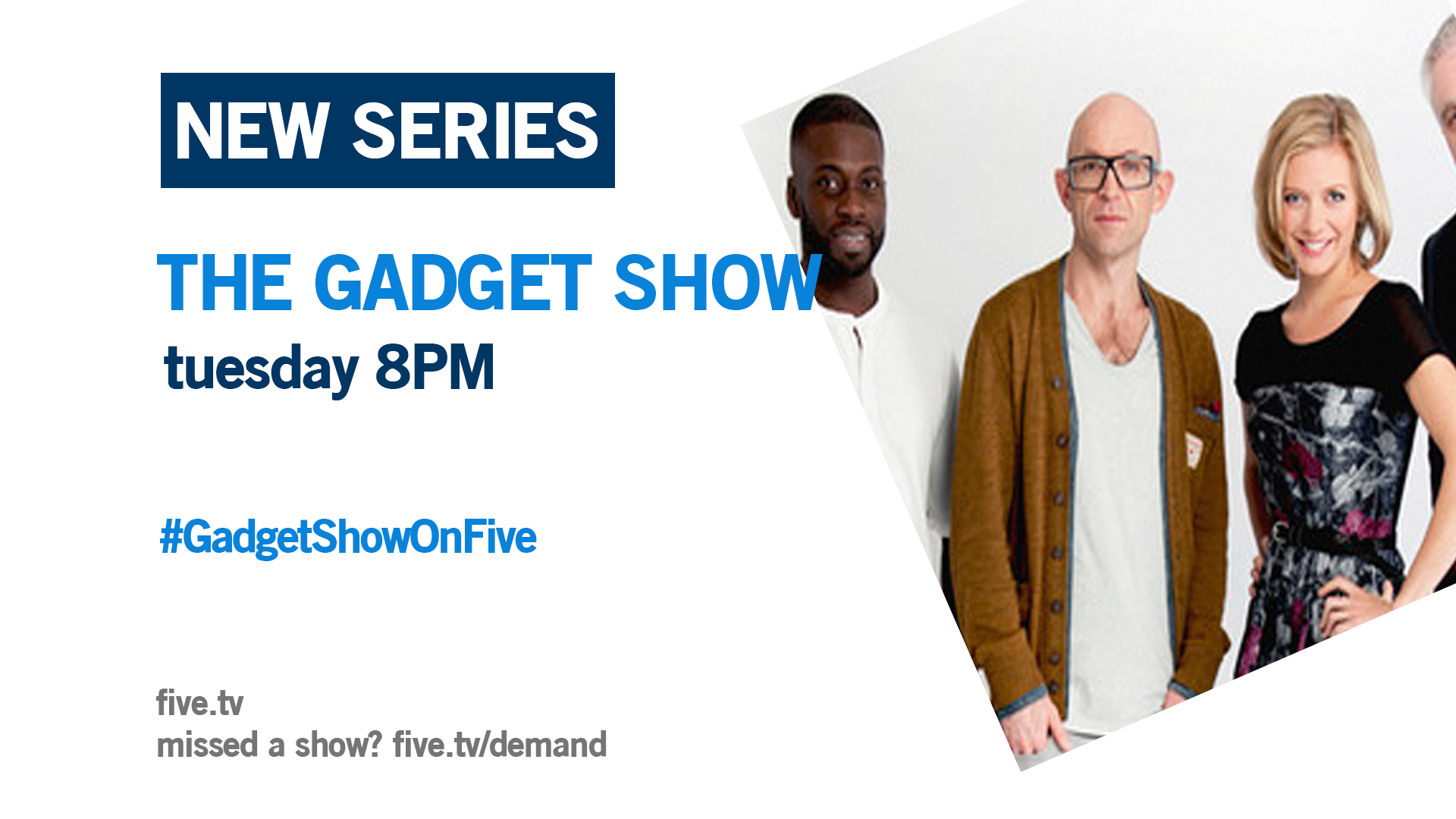
Instead of 'weekdays' etc being in the blue box, I would have the programme title. I don't like the font on these, I think personally it makes it look unprofessional.
DE
declan
Instead of 'weekdays' etc being in the blue box, I would have the programme title. I don't like the font on these, I think personally it makes it look unprofessional.


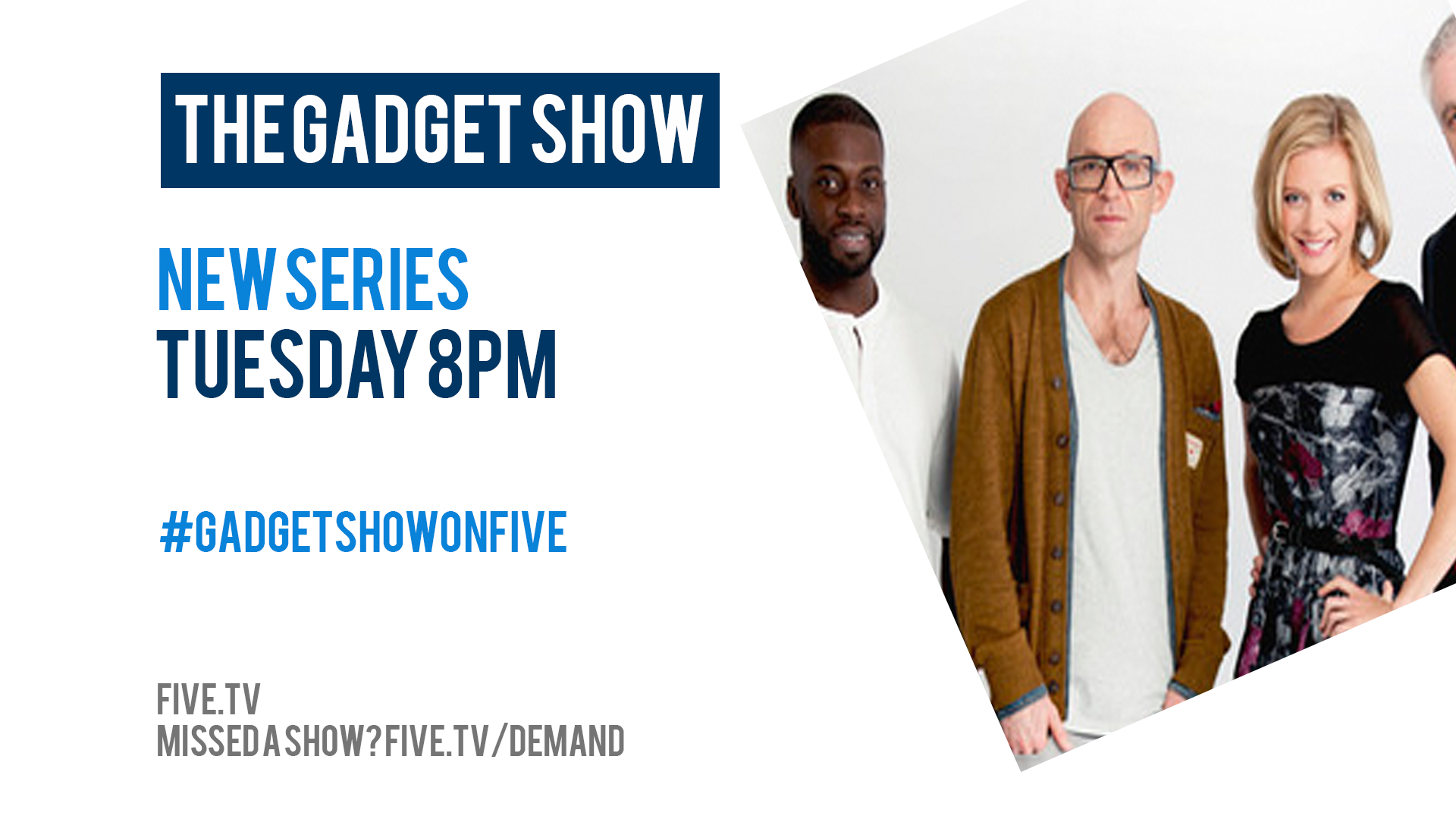
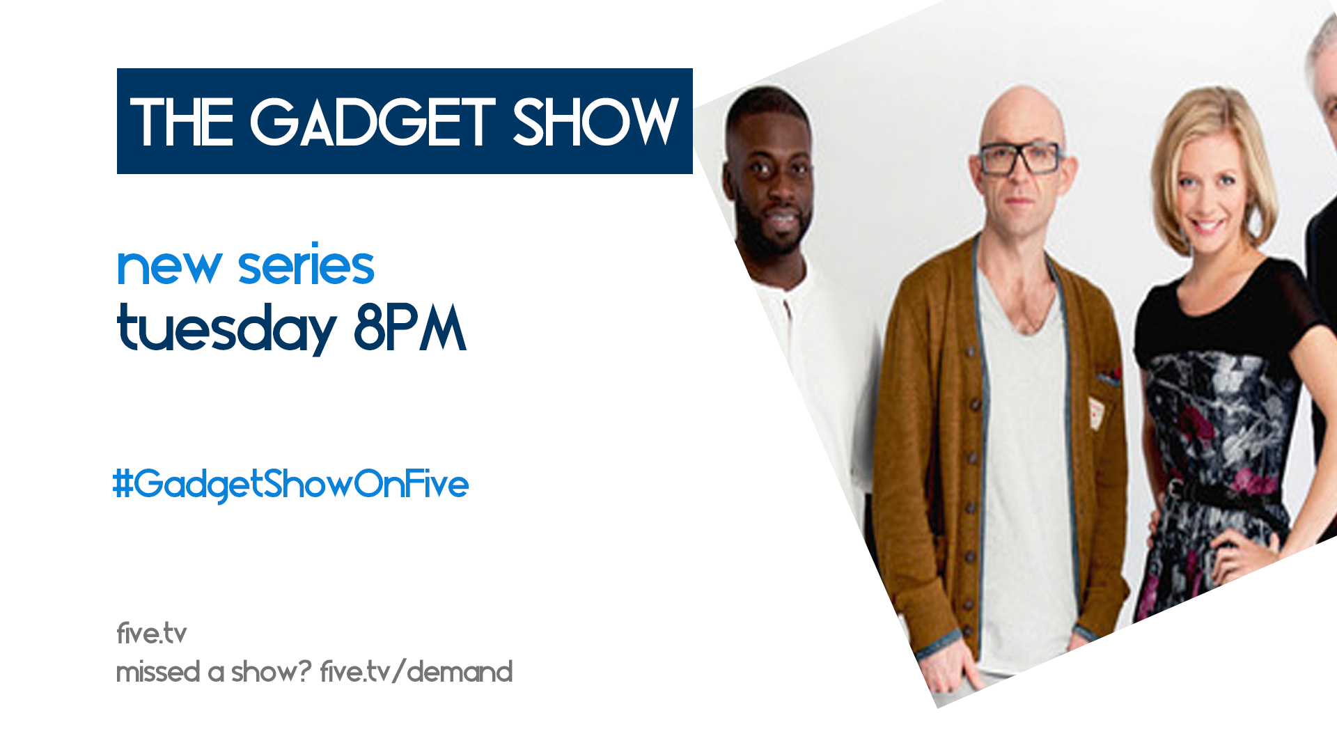
I agree that placing the title in the box might give it more emphasis. Here is what I have done:

Put the title in the box,
Offered different fonts.

I have a favourite out of these - one I do think looks better than those above, so here they are:

*

*

*

*

*

I hope you like these. I am currently working on the other aspects people weren't in favour of and will upload them when they are ready to be.

Thanks for taking time to look at my mock.
TW
tweedledum
I like the top one, but I think the logo and a proper background are better.
DE
declan
I like the top one, but I think the logo and a proper background are better.


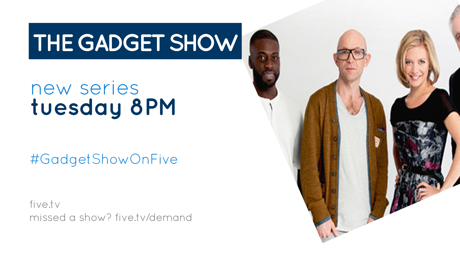
Yes! That is the one I liked best. I'll mess around with that font and maybe revert back to the image being the background so that I can incorporate the logo with "five" more. When I start to do this unfortunately it goes crazy with colours clashing but, I'll see what can be done.
PF
PFML84
In the 4th one down, what is that font called? The one with the points on the edges of the letters?
DE
declan
Paddy posted:
In the 4th one down, what is that font called? The one with the points on the edges of the letters?


It's a font called "London"

I got it from dafont.com - http://www.dafont.com/london-between.font
NR
NthnRw
Why not use the original font (Gloriola)?
DE
declan
Why not use the original font (Gloriola)?


Channel 5's original font? For the promo screens?
PF
PFML84
Did Channel 5 ever use Gloriola on screen or was it for their website only? Their website still uses it, it was one of the many things that weren't changed by Desmond when he bought the channel. Now Viacom own it, perhaps they will give the channel and the website a much needed graphical overhaul as well as a programming overhaul too.
AS
ASO
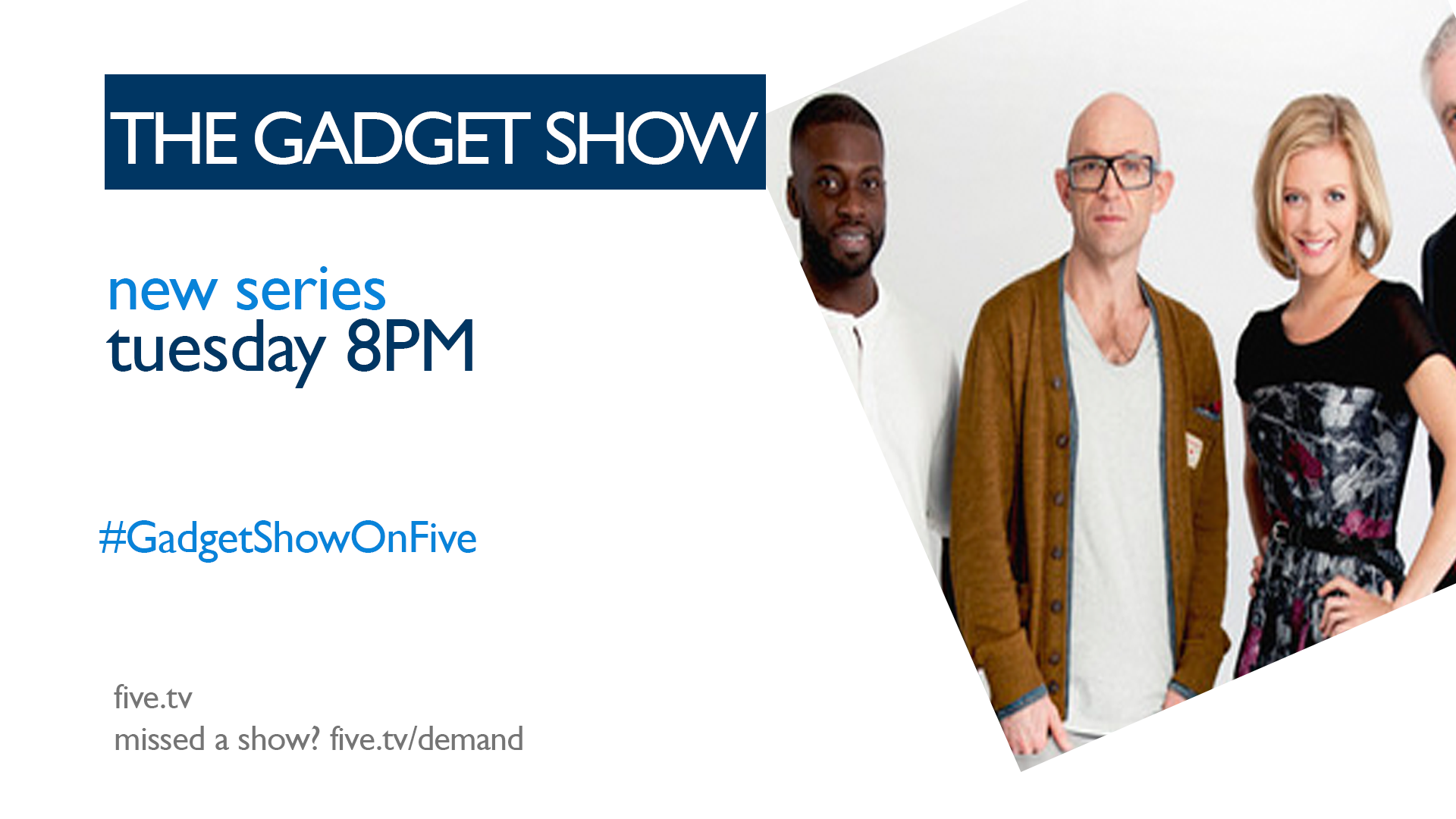
I think the first one is the best.

Why on earth did you stretch the image of the Gadget Show? It looks horrendous. Use a larger image as well as it is such bad quality.

Newer posts