DE
I appreciate this as I know that you haven't always been the biggest fan of the mock.
Ah the first comment on the tonight screen - you said the first image right? I really like that but I was presuming nobody commented because it was ok.
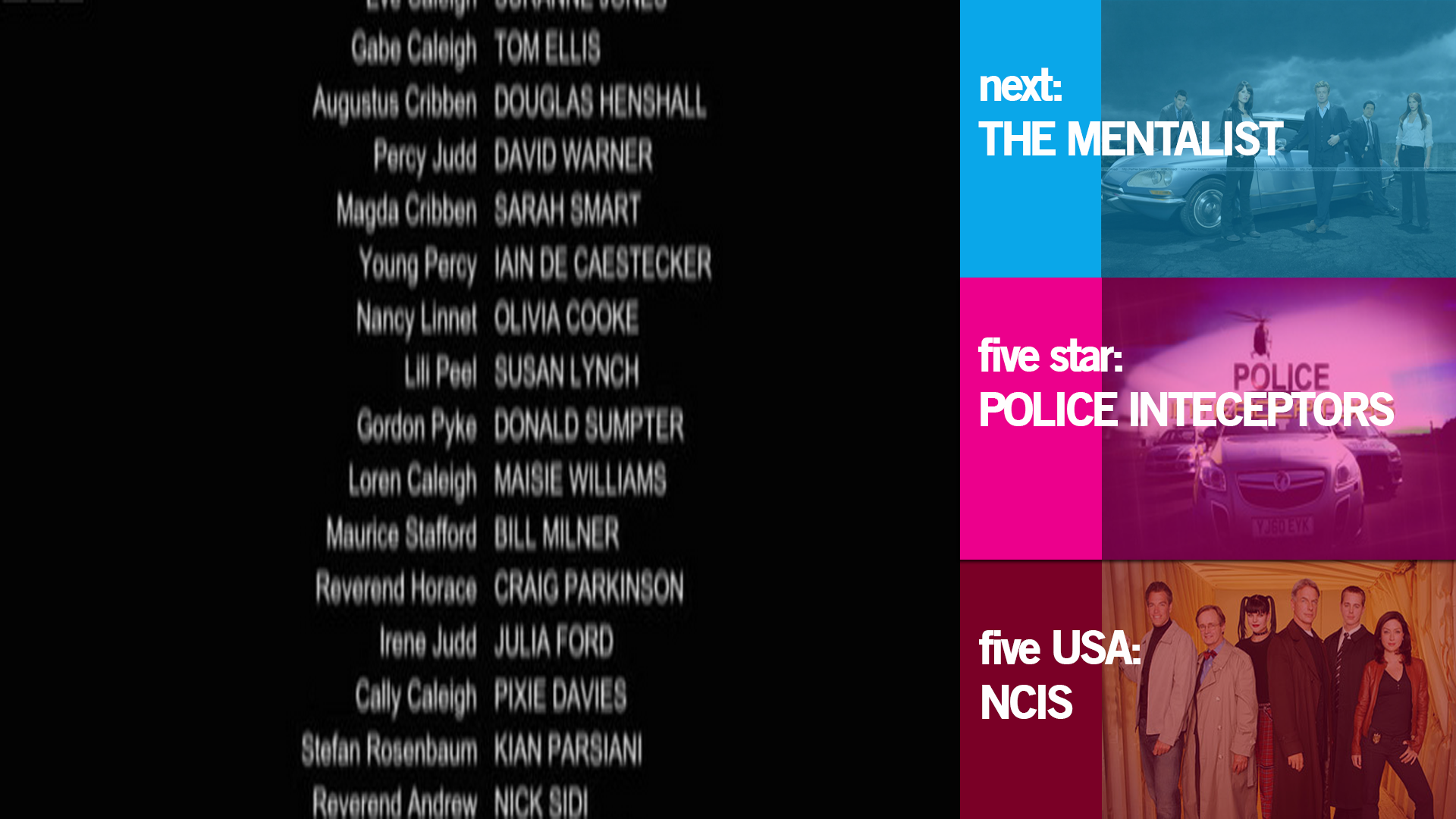
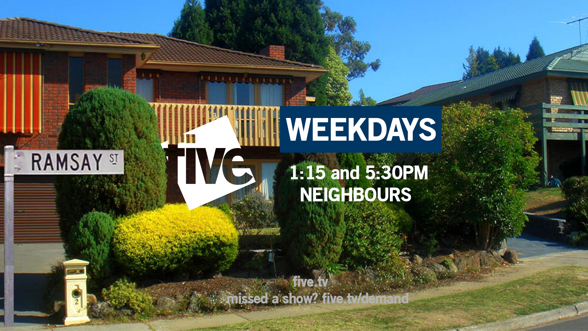
I uploaded a variety of neighbour promos because earlier in the mock it was suggested that instead of uploading one design I should what another mocker does and upload many for members to choose from, but I can understand if you didn't enjoy seeing that many of them. I have been working on the promo screens and especially the ECPs.
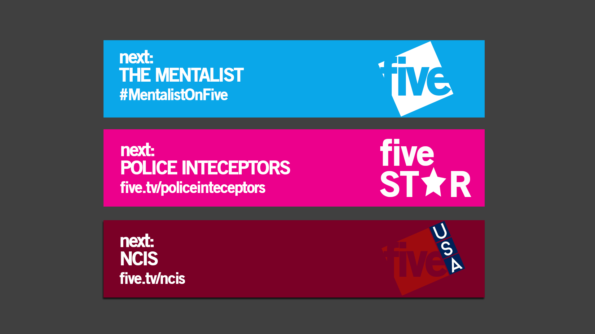
I hadn't really planned on changing the colour scheme and did have the vision of each channel having their own colour schemes - blue for five, pink for five star etc. ASO has been really helpful and recently suggested having a different colour for promo screens. However, I'll probably avoid placing over a picture like you've said which means I keep the blue and please everybody - same colour scheme and not placed horribly over a picture with clashing.
I can't emphasis how much it means to hear some positive feedback from you - I mean that in the nicest terms - because in the past, and now I look back rightfully, you were judgemental. I don't have anything available now and probably won't for a couple of days/into next week - if that - and when things are uploaded I'll stick to a specific aspect rather than loads of different things at a time.
Pizza haha? Once I have promo screens and stuff that goes with the main channel I will pursue the sister ones in more depth and get round to their presentation.
I agree that this is an improvement. It's funny I look back at page one and know how much it meant to me and how disheartened I was receiving the comments I did but even I am confused at some of the simple mistakes I was making.
Thanks again, Brekkie.
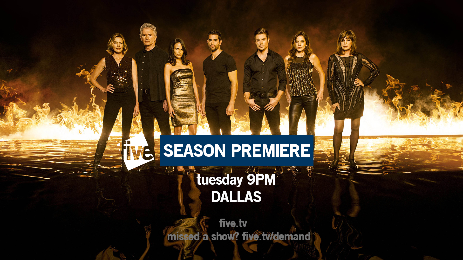
The first pic in your new post this morning showed exactly why you should work on these away from the forum before coming back and posting - a significant improvement on your earlier efforts.
However you then seemed to post pretty much everything else you've probably created in recent weeks and it kind of becomes a mess again. All those varients of the Neighbours endboard don't look great and the ECPs aren't much better.
IMO look at those couple of blue on white logos and work from there - stick to that simple colour scheme and ensure the blue never appears directly over an image. I do think you're definately improving and you do have the beginning of something, but less is definately more.
P.S. Five USA on white looks quite promising (though makes me want pizza, and I don't even like pizza!). Your Five Star designs essentially need scrapping and starting again.
I appreciate this as I know that you haven't always been the biggest fan of the mock.
Ah the first comment on the tonight screen - you said the first image right? I really like that but I was presuming nobody commented because it was ok.
I uploaded a variety of neighbour promos because earlier in the mock it was suggested that instead of uploading one design I should what another mocker does and upload many for members to choose from, but I can understand if you didn't enjoy seeing that many of them. I have been working on the promo screens and especially the ECPs.
I hadn't really planned on changing the colour scheme and did have the vision of each channel having their own colour schemes - blue for five, pink for five star etc. ASO has been really helpful and recently suggested having a different colour for promo screens. However, I'll probably avoid placing over a picture like you've said which means I keep the blue and please everybody - same colour scheme and not placed horribly over a picture with clashing.
I can't emphasis how much it means to hear some positive feedback from you - I mean that in the nicest terms - because in the past, and now I look back rightfully, you were judgemental. I don't have anything available now and probably won't for a couple of days/into next week - if that - and when things are uploaded I'll stick to a specific aspect rather than loads of different things at a time.
Pizza haha? Once I have promo screens and stuff that goes with the main channel I will pursue the sister ones in more depth and get round to their presentation.
I agree that this is an improvement. It's funny I look back at page one and know how much it meant to me and how disheartened I was receiving the comments I did but even I am confused at some of the simple mistakes I was making.
Thanks again, Brekkie.