The Gallery

FIVE - a return to pre 2011 Channel 5

Channel 5 is a name, FIVE is a brand. (May 2014)

This site closed in March 2021 and is now a read-only archive
DE
declan
*
*
*
*
*


Hi everyone,

I, like many others, have got bored of Channel 5's current branding. I decided to take some time to draw up how I would change it. I suppose a part of me hopes that now viacom have bought Channel 5 they will alter the branding and possibly use something like this.

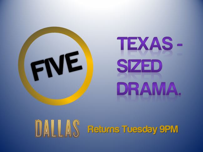
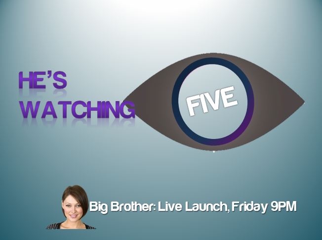
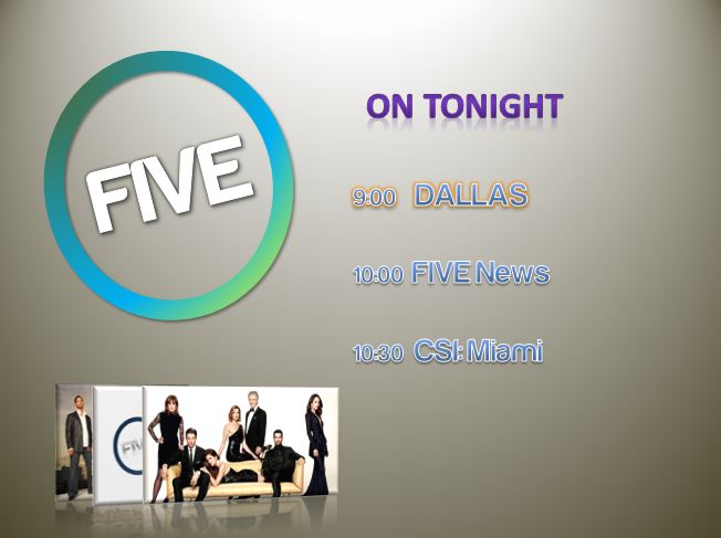
My first dramatic change - if you will -was reverting back to the "five" as opposed to "channel 5". The branding is very similar to the 2008 - 2011 branding as I believe this was the broadcasters branding at its finest. I must admit, I even tried to locate the "FIVE" font used in those logos.

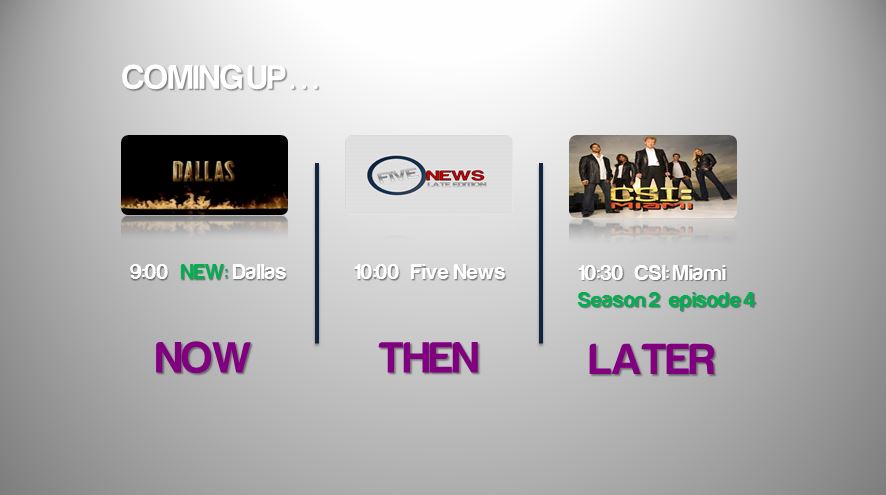
As you will see the circle changes colours depending on its location. For example, when advertising what is coming up a blueish/greenish logo is present compared to the main purple/blue one.

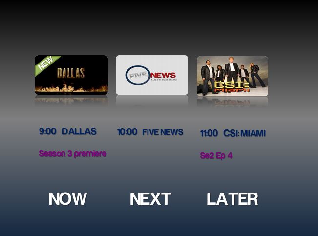
Whilst on the topic of the coming up preview, I was unsure which of my two was best; the list with images in bottom left or the horizontal preview - please let me know.

This is my first upload here so I ask for positive criticism where possible. I hope you like what I have done and please feel free to request anything.
Last edited by declan on 24 May 2014 1:02am - 2 times in total
AG
AxG
I don't like it, as it's a typical PowerPoint mock using all the affects and Harabara.

First image: looks promising, although not in 16:9. (PowerPoint can do 16:9)
Second image: Certainly 'Texas' side text, and a horrid reflection.
Third image: Terrible kerning.
Fourth image: Unreadable, reflection, and a glow.
Fifth image: see above.

Scrap it, start again and read the Guide to Mocking.
DE
declan
Hi thanks for your comments.

I understand what you are saying. I was hoping to at least create a good first impression and you said that it "looks promising".

I was planning on looking at other softwares but decided to keep it simple to begin.

I am going to take on board your comments and possibly work through the night to present better images. Do you like the harabara font or would you suggest a different font entirely?

Which our of the two previews - if any - do you prefer (4th or 5th?)
DE
declan
Here is the first image but in 16:9
*
DE
declan
Along with the new 16:9 main logo I've looked at the others and given them a shake up too. Hoping this is more favourable and again, any requests please tell me.

*

With this one I've went for a gold background to match the Dallas logo. The font is now also gold to match the theme of this preview.

*

This one has a few changes. I have updated the eye along with title to match the upcoming series. The colours are more fitting also.

*

Still a bit stuck with this, however, I have changed a couple of things. I have separated each programme with lines. The colour of the font is now white to make it more readable. Furthermore, instead of the "new" banner across the Dallas picture it now says "New:" in green before the title. The green continues below CSI: Miami to include information about the series and episode.

With these displays I hope to have showcased the ways in which the logo circle changes depending on the programme being advertised or its situation. I admit the preview isn't brilliant, nevertheless, considering Channel 5's current preview screens I believe it is certainly an improvement.

Thanks.
LE
Leah
There are so many problems with this mock. Countless issues.

But without writing an essay post telling you how to make it less rubbish, there are some fundamental questions:

- Could you imagine this on TV?
- Does it look good?
- Is it skilful?
- Have you put time, effort and care into this mock? Or at least does it look like you have?

If the answer to any of these questions is 'no' then the mock is not good enough. Sadly, the answer to all of these is no.

The concept is great. 'Giving C5 personality' is what you have attempted so well done. The first picture is promising. The logo is ok. I like the circle with the gradient. Harabara is ok for the logo, but do try to stick to a more readable font for the everything else. It's actually a horrible font which has been so overused here on the gallery.

You've just used word art on PowerPoint for God's sake. It's really boring and not skilful at all. People say PowerPoint is really limited and every single mock produced on it is crap. But that is not true at all. We've had some really brilliant PowerPoint mocks - see ASO's mocks. PowerPoint used with some other cheap or free software can be really good. Obviously After Effects would be much better. But this is really not good enough.
AS
ASO
Leah posted:
We've had some really brilliant PowerPoint mocksPowerPoint used with some other cheap or free software can be really good.

TorontoCommons' mock of CPAC is great
Last edited by ASO on 24 May 2014 1:51pm
DE
declan
Hi Leah, thank you for your extensive review.

I was actually thinking about this on TV when I awoke this morning. I'm not sure if the promotions for Dallas and Big Brother and that are acceptable. I must admit, you rarely see a block image with the logo and advertisement nowadays. What I plan to do is to place an image somewhere that will then break up the background.

I'm pleased, like the rest of you, with the first image and I do like the others but I know they can be improved - my question to myself is how I do that.

I know that I put a lot of time into this mock. It may not appear that way but, without trying to get off lightly, I would go away and come back and spend time pondering whilst in powerpoint trying to add features.

Apart from the logo, I'm going to change the font on everything to something clearer - possibly just a standard one.

How do you feel about the logo changing colours like I've shown? Do you want me to continue doing this or would you prefer the colour to stay the purple/blue one?

I have visited this site regularly - even before I was a member - and have seen ASO's designs which are really good. I had a glance of TorontoCommons' CPAC last night and couldn't believe he completed it on powerpoint.

I do want to use AfterEffects as I know its possibilities. I just find it confusing when I open it. Nevertheless, I use sony vegas and many say the two are similar and so I think perseverance is key.

I really am grateful for your comments and I will improve this!
DO
dosxuk
---
Last edited by dosxuk on 2 June 2014 5:52pm
AS
ASO
Hi Leah, thank you for your extensive review.

I was actually thinking about this on TV when I awoke this morning. I'm not sure if the promotions for Dallas and Big Brother and that are acceptable. I must admit, you rarely see a block image with the logo and advertisement nowadays. What I plan to do is to place an image somewhere that will then break up the background.

I'm pleased, like the rest of you, with the first image and I do like the others but I know they can be improved - my question to myself is how I do that.

I know that I put a lot of time into this mock. It may not appear that way but, without trying to get off lightly, I would go away and come back and spend time pondering whilst in powerpoint trying to add features.

Apart from the logo, I'm going to change the font on everything to something clearer - possibly just a standard one.

How do you feel about the logo changing colours like I've shown? Do you want me to continue doing this or would you prefer the colour to stay the purple/blue one?

I have visited this site regularly - even before I was a member - and have seen ASO's designs which are really good. I had a glance of TorontoCommons' CPAC last night and couldn't believe he completed it on powerpoint.

I do want to use AfterEffects as I know its possibilities. I just find it confusing when I open it. Nevertheless, I use sony vegas and many say the two are similar and so I think perseverance is key.

I really am grateful for your comments and I will improve this!

Great response to Leah's feedback. Personally, I think you should keep on changing the colours of the logo. I really hope you improve and one of the first ways of doing that is getting rid of the cheap looking glows and shadows and reflections, and also to change the font.

Take a look at a few recent mocks and see if you can find DTV's 5 point feedback.
DE
declan
Harabara is a very very poor font. The kerning and letter alignment are terrible.

It's not bad for logos, where you can spend time to sort out the bugs, but for general text it's unusable.


I'm changing the font for everything apart from the logo. I have actually found one that looks quite good and the kerning is nice.
DE
declan
I appreciate that ASO. I think I will and have a few more colour schemes in mind which I am going to showcase next time I upload images.

As for the glows, shadows and reflections I am going to scrap them. I personally don't mind them but the overall census is that they are crap. Therefore, they will be gone next time you see my images.

I'll take a look for that 5 point feedback.

Thanks.

Newer posts