The Newsroom

BBC Breakfast

From 6am (April 2012)

This site closed in March 2021 and is now a read-only archive
MD
mdtauk
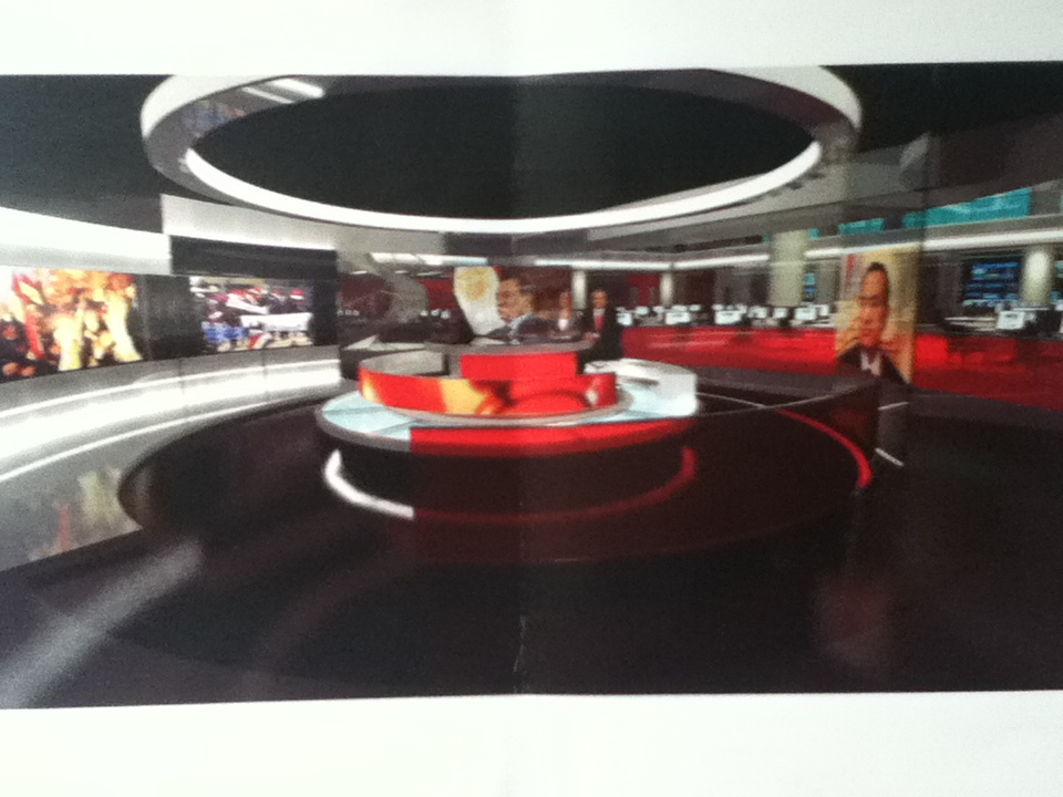
I don't have an issue with the size of the studio. Just it's height, and the messy lines and angles with all the light boxes, and metal frames and columns etc. The nice thing about the barco screens, is that it reduces the clutter and disjointed elements which make up the set.

Clean lines, and minimalism is my cup of tea.
SE
Square Eyes Founding member
Daily Mirror in typical tabloid over reaction alert.

http://www.mirror.co.uk/3am/tv-film-news/bbc-breakfast-makes-salford-switch-786562
MO
Moz
Don't like the big borders between the background screens.
Don't like the vertical 'banners' on the background.
Don't like the sparse furniture on the background.
Don't like the low ceiling.
Don't like the extreme close ups.
MW
Mike W
Moz posted:
Don't like the big borders between the background screens.
Don't like the vertical 'banners' on the background.
Don't like the sparse furniture on the background.
Don't like the low ceiling.
Don't like the extreme close ups.


Like that it's not Daybreak.
HA
harshy Founding member
Does anyone have any HD Stills of the graphics, or HD Video?


I do but are we allowed to post it?
AN
Andrew Founding member


It does show how far Breakfast have come that a studio move now gets covered in a tabloid.

In the Breakfast News era and even the pre-Natasha Kaplinsky era of Breakfast, I doubt it was ever mentioned in the tabloids. Shows half the problem Daybreak have trying to get a niche.
DF
DrewF
Does anyone have any HD Stills of the graphics, or HD Video?


I do but are we allowed to post it?


Sure, what would be the problem with it?
MO
Moz
I just think that at a time the rest of the news is preparing to move into this...
*
...Breakfast moving into this...

http://a8.sphotos.ak.fbcdn.net/hphotos-ak-prn1/549080_428548143825996_127439507270196_1854421_961508409_n.jpg

...is a tad disappointing!
:-(
A former member
Breakfast titles screen capture - 1920x1080 (stretched from broadcast 1440x1080), compression artefacts as broadcast.
SR
SomeRandomStuff
This is clearly better than what we had in London... and i like the fact that something major is now coming from the North. Very Happy

I didnt like the set when i first saw it, but after months of NWT being in there... i've kind of got used to it. Thats not to say the set doesnt have its flaws but its a massive improvement on the crappy blurry grey barco screens, even if it is a bit more... "cosy".

Lets face it... based on those artist impressions Studio E at BH is going to be the most impressive looking News Studio IN THE WORLD. (I will be amazed if they don't show it off as much as possible on BBC World News.) I doubt even the other 3 real studios in the suite will come close to how huge Studio E will look on screen with that massive newsroom behind it.

So what if our Breakfast studio is a little bit on the crappy side... at least its not TVMocker14... er... Daybreak.
IT
itsrobert Founding member
Breakfast titles screen capture - 1920x1080 (stretched from broadcast 1440x1080), compression artefacts as broadcast.


My God, why can't they align the logos with the clock? Is that so hard?! I don't think they've ever managed to achieve that.

Overall, I don't think it's terrible. Yes, the studio is definitely claustrophobic compared to TC7. That was the first thing I noticed this morning. But, I think the warm lighting is an improvement. It makes the programme feel more cosy and is suitable for early morning TV. I'm glad the titles and music haven't changed that much as I quite like them. Not a patch on the 2000-2006 titles, of course, but not bad. I do think Martin's mocks are better, though.

The one thing I found off putting was the camera angles used. The perspective is all over the place, especially when Bill was looking over the back of the sofa at the screen. Really awkward. But, given the size of the studio I don't think much can be done about it. Not keen on the wide shot either - the lighting grid takes up practically half of the screen!
SR
SomeRandomStuff
Breakfast titles screen capture - 1920x1080 (stretched from broadcast 1440x1080), compression artefacts as broadcast.


My God, why can't they align the logos with the clock? Is that so hard?! I don't think they've ever managed to achieve that.


...the clock isnt meant to be on screen at the same time as the titles end board.

Newer posts