MU
Not that I'm aware of - just the music and graphics refresh.
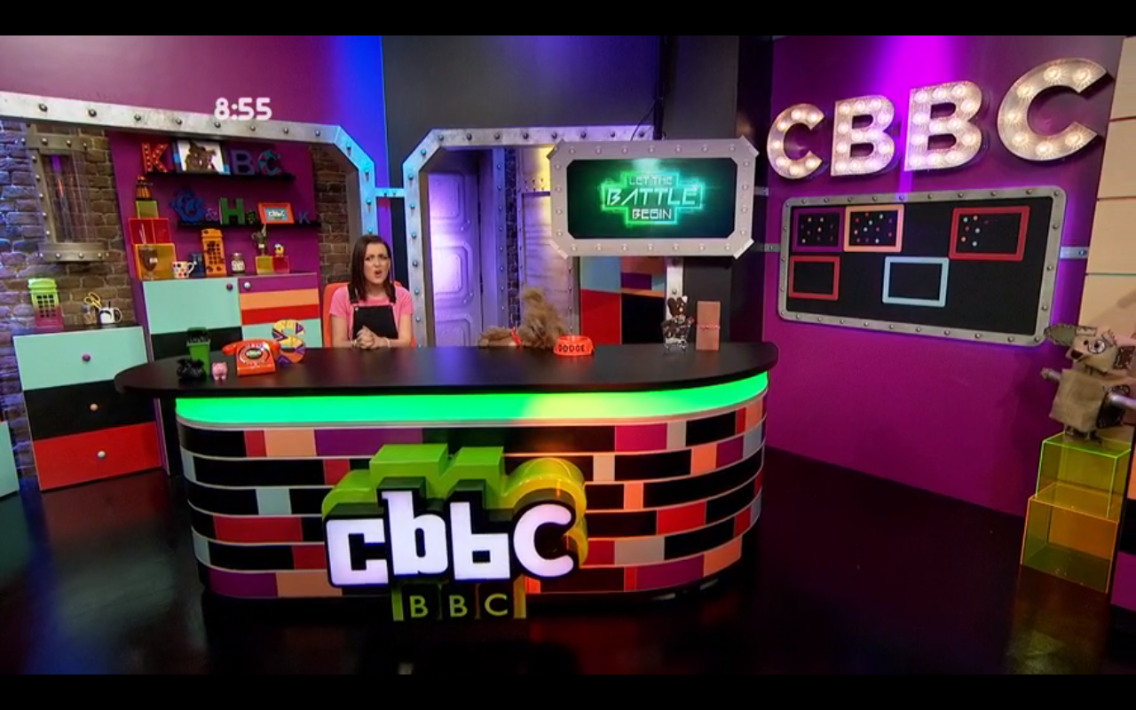
They did give it a bit of a make over. Had a technology theme and had cubes everywhere to link in with the app I think. Was not the best design. But what I could tell was that they were trying to used more floor space and use more colour lighting. So that might effect the new look. They have had updates before but they have never said new set so it's an interesting one. I think they were live Saturday so they only really had 2 1/2 days to rebuild. So unless it's somewhere new I guess it won't be a massive change. Just main changes to the current set.
I didn't notice the cubes, they change the desk features all the time so didn't realise it was to tie in with the app. As for the neon lights, they're often barely in shot so hence me not noticing them. Thanks for pointing it out!
I hated the set from 2006ish when it was greenscreened. Seemed lazy and looked awful.
I hope they've either moved into a new, larger space, or they have completely redesigned the little area they have. I hate the fact that the visible door in the rear of the set leads directly into the corridor outside. If ever I watch Jeremy Kyle I often see vulger participants being lairy and annoying in that very corridor, completely ignoring the Blue Peter ship, Dare Devil door and that CBBC branded door Slightly dangerous on CBBC's behalf IMO...
Could someone record the 8:15 link tomorrow? I'll have left the house just before then to catch the train. Thanks!
Did they not redecorate parts of the set recently - painting the bottom of the desk purple and changing the background slightly?
Not that I'm aware of - just the music and graphics refresh.
They did give it a bit of a make over. Had a technology theme and had cubes everywhere to link in with the app I think. Was not the best design. But what I could tell was that they were trying to used more floor space and use more colour lighting. So that might effect the new look. They have had updates before but they have never said new set so it's an interesting one. I think they were live Saturday so they only really had 2 1/2 days to rebuild. So unless it's somewhere new I guess it won't be a massive change. Just main changes to the current set.
I didn't notice the cubes, they change the desk features all the time so didn't realise it was to tie in with the app. As for the neon lights, they're often barely in shot so hence me not noticing them. Thanks for pointing it out!
I hated the set from 2006ish when it was greenscreened. Seemed lazy and looked awful.
I hope they've either moved into a new, larger space, or they have completely redesigned the little area they have. I hate the fact that the visible door in the rear of the set leads directly into the corridor outside. If ever I watch Jeremy Kyle I often see vulger participants being lairy and annoying in that very corridor, completely ignoring the Blue Peter ship, Dare Devil door and that CBBC branded door
Slightly dangerous on CBBC's behalf IMO...
Could someone record the 8:15 link tomorrow? I'll have left the house just before then to catch the train. Thanks!
Last edited by Multi on 26 May 2015 9:02am
 Nice little nod to the past. The last set had Edd the Duck, which I thought was a good touch.