The Gallery

BBC: Square/Icon Rebrand 2019

Bringing the BBC back it's consistency. (April 2019)

This site closed in March 2021 and is now a read-only archive
CC
ccateni
dbl posted:
AxG posted:
This concept has been done before on the mocks section, but I don't find it consistent, whilst it is in a way, the idea of the inconsistencies on the numbers themselves just puts me off; and then fitting words in a small box especially 'Parliament' is just last minute 'that'll do'.

Indeed, they're okay - but not ready for primetime. Just seems a little unfinished, I'm not keen on the numerals, especially 1.

Compared to the current one? I think just a minor change in color could be all they need.
DO
dosxuk
Three of the logos have interesting, creative icons. The rest look like someone exploring a font list. There are two completely different styles going on here.
JF
JetixFann450


I decided to re-do the menu and I have made it so the BBC logo stays on screen while the branding surrounding it changes.


AxG posted:
Indeed, they're okay - but not ready for primetime. Just seems a little unfinished, I'm not keen on the numerals, especially 1.

While I do think it has imperfections, the main goal was to make new logos for the BBC's channels and I do think I have rushed some ideas, especially the News and Parliament logos.


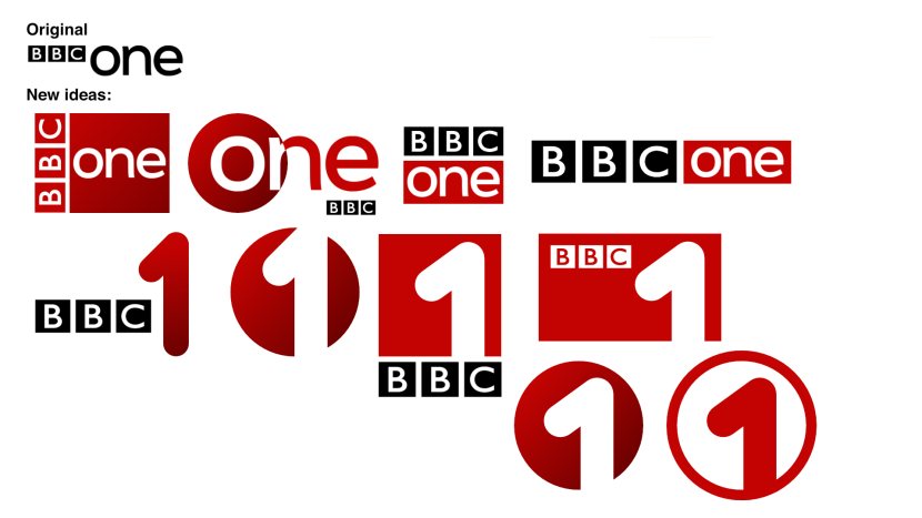
These were the bunch of ideas I originally had for BBC1 and I was originally going to go for the style of circles, but I decided to stick with squares as it was a more well known shape for app icons.
*

Thanks for the criticism, though. I'll try and see what I can do to make this feel less rushed out.


Compared to the current one? I think just a minor change in color could be all they need.

What do you mean by colour exactly? I did try to replicate the current colour schemes of the BBC channels in the logos, but I can understand it may need some minor changes in design and colour. Thanks for the suggestion though.


Three of the logos have interesting, creative icons. The rest look like someone exploring a font list. There are two completely different styles going on here.

I did use Reith Sans for both the BBC3, BBC4/Arts and BBC News logo, although I did use a light Helvetica on the Parliament logo to match it's current branding. I would have to agree that there are two different styles going on, and I'll try to fix this issue as I can.
EL
elmarko
You know what? All of this isn’t half bad at all. I’m not sure it’s *amazing* but I’m pretty impressed at how good some of them look.
lukeshep and Woodpecker gave kudos
LU
lukeshep
I like the logo where the BBC logo is sideways.
WO
Woodpecker
https://www.youtube.com/watch?v=YuAMHAb55UE

I tried giving the 1 a bit of character. These are my results.

The first sting would probably be used for more sci-fi/fiction oriented programming. Second one could be used for dramas. Third one is for entertainment and light-hearted programming. Fourth one could be used for documentary programmes and fifth one is obviously for sports programming. I will make more stings for programming like comedy, food and nature but the idea is that you could make a 1 sting out of anything, really.


I must say, I think that idea has an awful lot of potential, and could take BBC One's branding into a bold new direction. It actually reminds me a fair bit of the (fantastic, IMO) idents/stings used by the Dutch channel RTL 5 in the early 2000s:

TVVT, SuperDave and lukeshep gave kudos
AA
Aaron_2015
Personally, I don’t think these new logos are an improvement on what any of the BBC channels have at the moment. I do like the stings/idents for BBC One, but the rest of the rebrand is far too simplistic. I’m not sure if a simple ‘1’ in a red box is any more effective than ‘one’ in a red box. You could also consider a wider range of things (eg. Promos, trailers, ECPs).
BR
Brekkie
Can definately see your vision for BBC1 and how that could develop. I appreciate you want to keep the current excellent idents for BBC2 and have made a logo to fit that, but think the curve needs to be far more subtle like the idents, and now those BBC2 idents are in place it's frustrating BBC1 didn't run more with the animated idents they had briefly running in January a couple of years ago as actually they would complement each other quite nicely, and your ideas kind of reminded me about them - just simple ideas executed well.
JF
JetixFann450
Personally, I don’t think these new logos are an improvement on what any of the BBC channels have at the moment. I do like the stings/idents for BBC One, but the rest of the rebrand is far too simplistic. I’m not sure if a simple ‘1’ in a red box is any more effective than ‘one’ in a red box. You could also consider a wider range of things (eg. Promos, trailers, ECPs).


While the main idea was to try and make the channels have individual icons, I do understand that these ideas are a bit too simple. I did create these logos in an attempt to make the BBC channels stand out from the other channels on TV, and making the icons work on social media and other forms of media was the basic idea I was trying to go for. Since BBC2 has the curve to identify itself with, I found that BBC1 could do with a numeral "1" again because the channel needed a symbol to match it's other counterparts. I will try to develop some new ideas as I have the time to do so.


Can definately see your vision for BBC1 and how that could develop. I appreciate you want to keep the current excellent idents for BBC2 and have made a logo to fit that, but think the curve needs to be far more subtle like the idents, and now those BBC2 idents are in place it's frustrating BBC1 didn't run more with the animated idents they had briefly running in January a couple of years ago as actually they would complement each other quite nicely, and your ideas kind of reminded me about them - just simple ideas executed well.


I did try to make the BBC2 logo a simple line of the curve, but it wouldn't have worked in the way that I wanted it to, so I went with a more obvious logo to properly help it be recognizable. I do think it does need some ideas for the branding surrounding it but on it's own, it's a decent idea that I believe turned out okay.

Update: I decided to create some new generic stings for BBC1. I used some unused BBC One jingles for Oneness: https://vimeo.com/223146035
Last edited by JetixFann450 on 4 May 2019 2:02am - 2 times in total
HA
harshy Founding member
It’s much better then oneness that’s for sure.
SuperDave, lukeshep and JetixFann450 gave kudos
:-(
A former member
Can we have an “it’s better than Oneness” klaxon like on QI for The Gallery?
NYTV and JetixFann450 gave kudos
DO
dosxuk
Can we have an “it’s better than Oneness” klaxon like on QI for The Gallery?

Newer posts