The Gallery

BBC: Square/Icon Rebrand 2019

Bringing the BBC back it's consistency. (April 2019)

This site closed in March 2021 and is now a read-only archive
JF
JetixFann450
To bring BBC's network of channels back it's consistency and to keep up with modern times, I designed these new square logos to adapt the BBC network and to work in different areas, such as on social media or on BBC iPlayer.

*

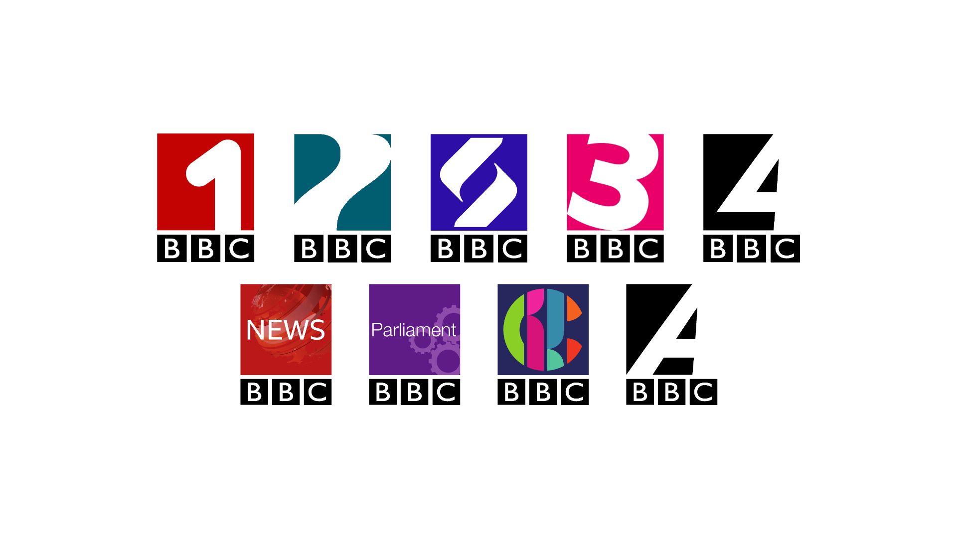
You may notice there's a BBC4 logo with an A instead. This is my idea for BBC Arts, as the idea was to make it into a block on BBC4 showcasing arts content on the BBC. Also, BBC3 was given a logo, despite it still being online to bring it in line with it's other counterparts on TV.

The main reason for this rebrand was to give the network consistency and also work on social media, as these examples show.

**
*

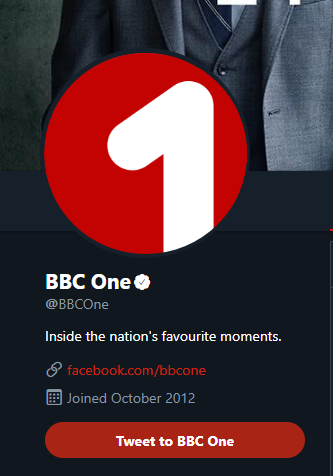
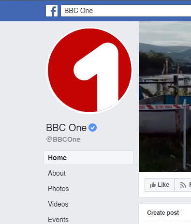
It doesn't require any BBC logos, only the name itself and the symbol. People see logos all the time, so having a symbol will easily help BBC1 and it's other channels be identifiable to the viewers.

With this new logo idea in mind, I decided to create a concept ident for what could be BBC1:


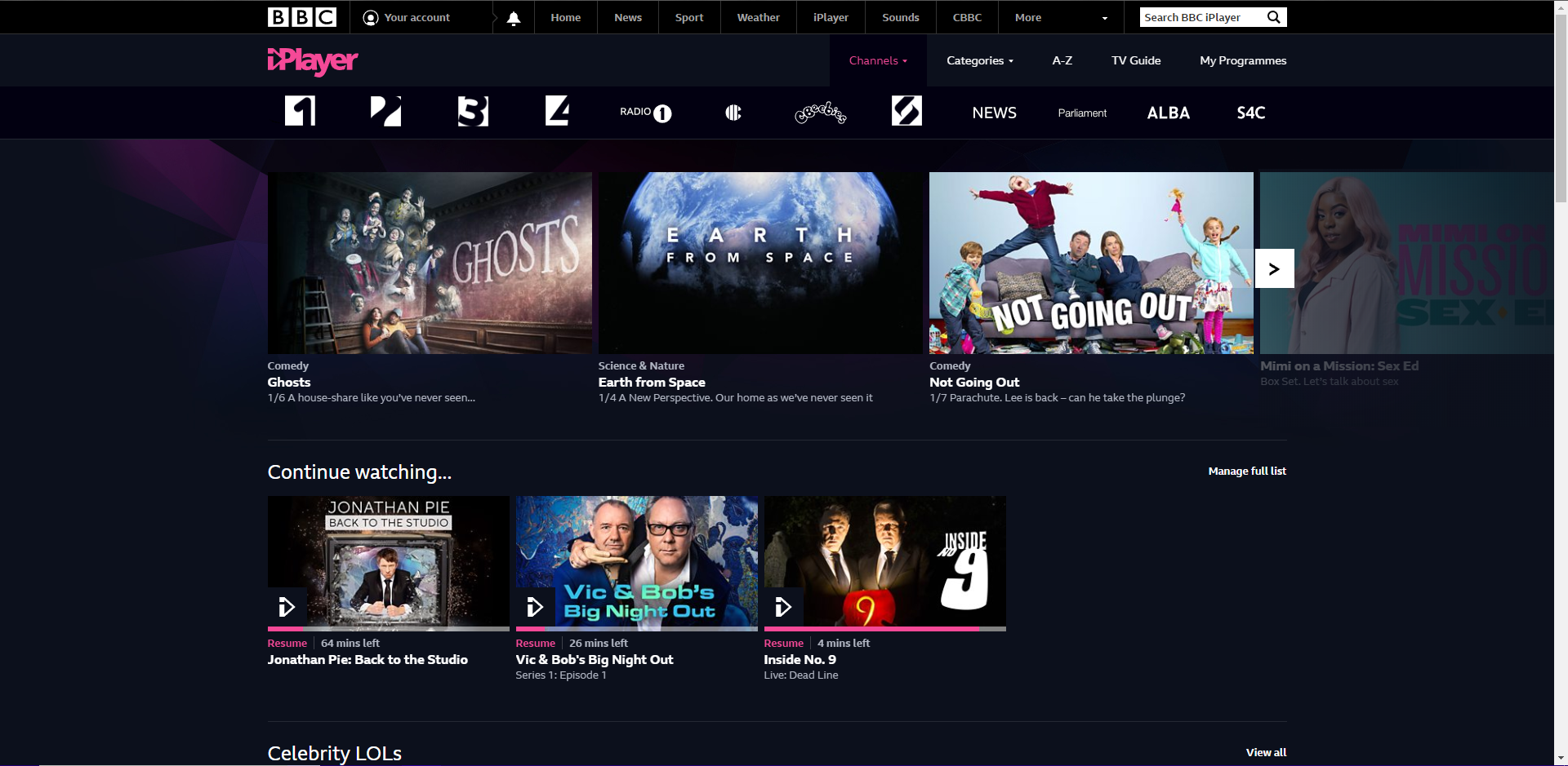
And a menu to go with it, showing what's on other channels. I did re-use audio from an older BBC menu but it's not far off with the ideas that may come in mind:


These are some of the ideas I had in keeping the BBC consistent in this modern age. Any criticism is gladly appreciated and I'd love your feedback on this idea.
Last edited by JetixFann450 on 11 March 2020 5:06pm - 2 times in total
JO
Josh
Relatively good so far.
Some things to work on:
* I'd add a bit of character to the idents. It will get very boring after a while seeing a 1 just pop up and slide to the left of the screen for however many junctions there are in a day.
* You talk about consistency, but where is the CBeebies logo? Yes, it is a unique logo but you should be consistent with all the channels. The same goes for BBC Alba.
* As for the menu, for stuff like BBC One and Three, maybe have it so an image from the show is in the number? Also, with all the logos being the same height and width, perhaps keep the BBC logo where it is throughout the menu and just have the channel's identity move.

Apart from this, I think it's amazing and with a bit of work, it could be really effective. Smile
AG
AxG
This concept has been done before on the mocks section, but I don't find it consistent, whilst it is in a way, the idea of the inconsistencies on the numbers themselves just puts me off; and then fitting words in a small box especially 'Parliament' is just last minute 'that'll do'.
RO
rob Founding member
Not bad so far, the news and parliament boxes need a bit more work I think.
JF
JetixFann450
Josh posted:
Relatively good so far.
Some things to work on:
* I'd add a bit of character to the idents. It will get very boring after a while seeing a 1 just pop up and slide to the left of the screen for however many junctions there are in a day.
* You talk about consistency, but where is the CBeebies logo? Yes, it is a unique logo but you should be consistent with all the channels. The same goes for BBC Alba.
* As for the menu, for stuff like BBC One and Three, maybe have it so an image from the show is in the number? Also, with all the logos being the same height and width, perhaps keep the BBC logo where it is throughout the menu and just have the channel's identity move.

Apart from this, I think it's amazing and with a bit of work, it could be really effective. Smile


I did skip CBeebies and BBC Alba because I thought that they didn't need them. CBeebies' logo wouldn't work in a box unless you cram all the letters into one box and I'm pretty sure the idea has been done before. BBC Alba is a simple case, just put the star icon in the top right corner, add 'ALBA' text in Reith, and then you got this:

*

As for the BBC1 idents, I do agree that they do need a bit of character in them (or at least different music) in order to not have them be boring or stuck in viewer's minds. I'll try and edit some ideas to show off what I mean.

AxG posted:
This concept has been done before on the mocks section, but I don't find it consistent, whilst it is in a way, the idea of the inconsistencies on the numbers themselves just puts me off; and then fitting words in a small box especially 'Parliament' is just last minute 'that'll do'.

rob posted:
Not bad so far, the news and parliament boxes need a bit more work I think.


I did try to emulate the BBC Parliament logo in a light Helvetica, I was even tempted to put the metal cogs in the logo like I did for BBC News. But instead I just used 2D cogs to try and replicate the branding. I do have to agree with you that it is small and is barely readable on small screens. I may even just use pure red for BBC News and use a 2D globe for it. I'll take these ideas into consideration.
LU
lukeshep
I love these! Just the right amount of consistency, but each channel keeps it’s personality. The News and Parliament logos could be tweaked slightly, but apart from that, 4/5, great mock!
JF
JetixFann450


I tried giving the 1 a bit of character. These are my results.

The first sting would probably be used for more sci-fi/fiction oriented programming. Second one could be used for dramas. Third one is for entertainment and light-hearted programming. Fourth one could be used for documentary programmes and fifth one is obviously for sports programming. I will make more stings for programming like comedy, food and nature but the idea is that you could make a 1 sting out of anything, really.
Last edited by JetixFann450 on 25 April 2019 4:09pm - 2 times in total
LY
Lynetwork
https://www.youtube.com/watch?v=YuAMHAb55UE

I tried giving the 1 a bit of character. These are my results.

Those are some really good examples of giving the 1 more character. The regular version could work as a generic/news ident.


I think people have done this concept before but you've definitely done it a bit better. I still think there are issues - the Three logo is probably best left as it is, and I'm not sure about Four either, but the Scotland logo is near-perfect. I've warmed to One because of the videos you've done showing how it would look on screen, Two is just fine but it works great with the Curve idents, and I like the menu.

The only thing that comes to mind is in the first picture - could the BBC logos be colour coordinated with the channel logos? That might look better than the contrast of the black with each channel's different colour.
lukeshep, Sh1ruba and JosiahStuart gave kudos
NL
Ne1L C
https://www.youtube.com/watch?v=YuAMHAb55UE

I tried giving the 1 a bit of character. These are my results.


It has a bit of a retro 70s feel. I like it.
SH
Sh1ruba
Although BBC3 would probably be better off using the II! symbol, I really like this.
Would really like to see some more of this
CC
ccateni
I love this look, I would really like to see ident examples for all the channels/programs (because news is also a program) that you designed. But I would do a three that looks more like this instead of the 3 used. Its good, but this three looks better.


Heres another example of where the guy got the three from in case you were wondering. (same creator, but he made a different look with it before the block 3 design he made later.
https://www.youtube.com/watch?v=gl1UKwKX8fc
DB
dbl
AxG posted:
This concept has been done before on the mocks section, but I don't find it consistent, whilst it is in a way, the idea of the inconsistencies on the numbers themselves just puts me off; and then fitting words in a small box especially 'Parliament' is just last minute 'that'll do'.

Indeed, they're okay - but not ready for primetime. Just seems a little unfinished, I'm not keen on the numerals, especially 1.

Newer posts