LG
I love the concept of having these more symbolic logos that can be identified at a glance, I really like the BBC II! logo and wondered what could be done to give a similar effect for the other brands.
I know that some say changing BBC Ones colouring to orange is better as red is identified with Parliament and News but for me, One has always been Red over the other two. I think orange is a little too relaxed for me. I like that you’ve used the wave for Two but it seems a little too thin to be a Two, I think in that instance it’s the only one where you’d really have to know the branding of the channel to get what it is, so it could be hit or miss but I like the colours. Four does seem quite bulky in comparison to the others - I think the two and three feel quite creative whereas One and Four are literally just the numbers. It also throws me off slightly that the BBC logo is centred and the One is tucked to the right, maybe bringing it in lien would make it stand out a bit more?
That aside, I like your channel menu and am interested to see where this goes. I think the hardship with this is you’re totally reinventing the brand, which I love and the ideas you have are taking it to a really fresh new level but with the BBC being quite classic, you’re always going to have a bit of a jarring feeling so the existing logo against any new suggestions. Keep doing what you’re doing, I’m really intrigued to see more.
:-(
A former member
Brilliant. Well done.
JF
Thanks for your feedback. I really enjoy reading suggestions to make my ideas a lot more improved and more up-to-date with the new mediums that the BBC would end up running across.
I agree with your comment that the BBC brand is 'quite classic', especially as the current logo has been in use since 1997 (nearly 23 years) and has had different branding alongside the channel and radio brands. In my eyes, I don't think the BBC logo needed any modification.
I was going to take a radical take on the logo, based on the influence of other European networks like NPO and DR, but I found it really only needed to complement the consistency of the branding, in this case the squares which work alongside the currently existing logo.
As for the suggestions towards the channel logos itself, I think that with BBC1 using yellow, it's a radical change and would bring a more warmer colour to the channel, not confusing it with the BBC News brand. I originally did have a 'river' design based on the curve which was posted earlier, but I found by 'slimming the curve' and colouring both sides as different shades, people would instantly identify it was BBC2.
As for BBC4, I think the usage of the logo could be symbolic of the channel's output, especially as the cutting edge channel of the BBC.
I love the concept of having these more symbolic logos that can be identified at a glance, I really like the BBC II! logo and wondered what could be done to give a similar effect for the other brands.
I know that some say changing BBC Ones colouring to orange is better as red is identified with Parliament and News but for me, One has always been Red over the other two. I think orange is a little too relaxed for me. I like that you’ve used the wave for Two but it seems a little too thin to be a Two, I think in that instance it’s the only one where you’d really have to know the branding of the channel to get what it is, so it could be hit or miss but I like the colours. Four does seem quite bulky in comparison to the others - I think the two and three feel quite creative whereas One and Four are literally just the numbers. It also throws me off slightly that the BBC logo is centred and the One is tucked to the right, maybe bringing it in lien would make it stand out a bit more?
That aside, I like your channel menu and am interested to see where this goes. I think the hardship with this is you’re totally reinventing the brand, which I love and the ideas you have are taking it to a really fresh new level but with the BBC being quite classic, you’re always going to have a bit of a jarring feeling so the existing logo against any new suggestions. Keep doing what you’re doing, I’m really intrigued to see more.
I know that some say changing BBC Ones colouring to orange is better as red is identified with Parliament and News but for me, One has always been Red over the other two. I think orange is a little too relaxed for me. I like that you’ve used the wave for Two but it seems a little too thin to be a Two, I think in that instance it’s the only one where you’d really have to know the branding of the channel to get what it is, so it could be hit or miss but I like the colours. Four does seem quite bulky in comparison to the others - I think the two and three feel quite creative whereas One and Four are literally just the numbers. It also throws me off slightly that the BBC logo is centred and the One is tucked to the right, maybe bringing it in lien would make it stand out a bit more?
That aside, I like your channel menu and am interested to see where this goes. I think the hardship with this is you’re totally reinventing the brand, which I love and the ideas you have are taking it to a really fresh new level but with the BBC being quite classic, you’re always going to have a bit of a jarring feeling so the existing logo against any new suggestions. Keep doing what you’re doing, I’m really intrigued to see more.
Thanks for your feedback. I really enjoy reading suggestions to make my ideas a lot more improved and more up-to-date with the new mediums that the BBC would end up running across.
I agree with your comment that the BBC brand is 'quite classic', especially as the current logo has been in use since 1997 (nearly 23 years) and has had different branding alongside the channel and radio brands. In my eyes, I don't think the BBC logo needed any modification.
I was going to take a radical take on the logo, based on the influence of other European networks like NPO and DR, but I found it really only needed to complement the consistency of the branding, in this case the squares which work alongside the currently existing logo.
As for the suggestions towards the channel logos itself, I think that with BBC1 using yellow, it's a radical change and would bring a more warmer colour to the channel, not confusing it with the BBC News brand. I originally did have a 'river' design based on the curve which was posted earlier, but I found by 'slimming the curve' and colouring both sides as different shades, people would instantly identify it was BBC2.
As for BBC4, I think the usage of the logo could be symbolic of the channel's output, especially as the cutting edge channel of the BBC.
Last edited by JetixFann450 on 16 March 2020 3:46pm
JF
I decided to create little stings in between programmes, such as this one from BBC3.
As for other BBC channels, I've been unable to, mainly because BBC2 and BBC4 don't exactly have their own soundtracks and finding one that'd suit the channel would be a bit impossible. I could use the Curve idents as music, but I don't necessarily see that working in my eyes.
As for other BBC channels, I've been unable to, mainly because BBC2 and BBC4 don't exactly have their own soundtracks and finding one that'd suit the channel would be a bit impossible. I could use the Curve idents as music, but I don't necessarily see that working in my eyes.
SL
SpencerLent
Don’t know why you can use Curve soundtrack. Why not make stings for BBC2?
SL
SpencerLent
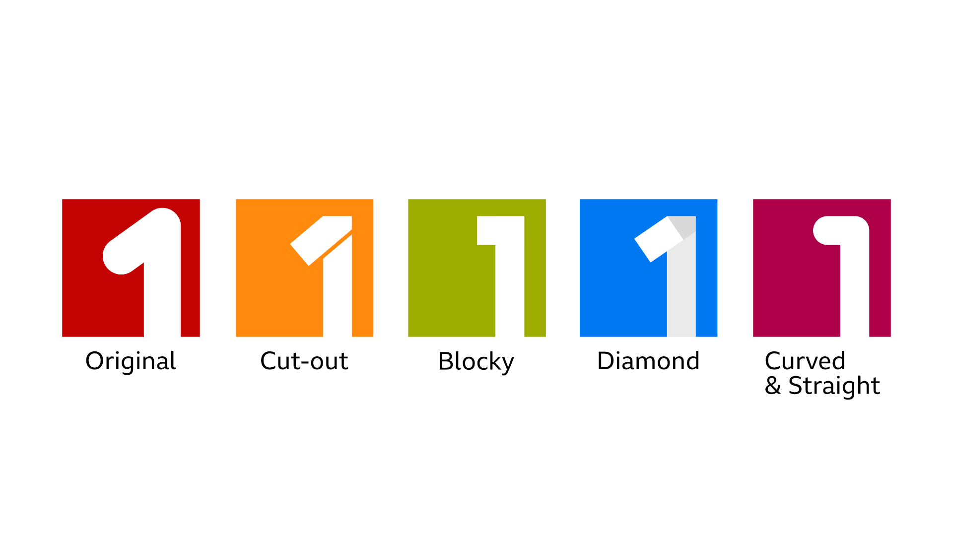
Decided to create multiple designs for the new "1". Which one do you like the most?
Of course, I colour coded it to distinguish each one, it depends on if the colour suits BBC1 more.
I like the cut-out design.
JF
And here's my sting for BBC1. Not the best choice of clips but the ones I had at hand while making it.
I think that's really the issue of rebranding the BBC's main channel, especially one as more focused as BBC One. The best rebrand, in my eyes, is one that radically changes itself from the norm and differentiates itself from others. The most difficult part of this was deciding which 1 would suit the channel after I found many members didn't like the "rounded 1" and I found that the cut-out one would work since it also implies the lifestyle and daytime programming, but also something which the user could easily identify.
I know you've been banned, but I might as well respond as he's got a good point as to why I haven't produced a BBC2 sting yet. I could produce one easily, but the problem is finding the right soundtrack that would suit the channel. Of course, I know NPO 2 have done a great job making a soundtrack which is calm and soothing, and represents it's output, but the issue with BBC2 is that they don't exactly have a soundtrack to identify itself with. The "curve" idents could easily be remixed, but I want the stings to differentiate with the actual idents, not to replicate them.
And here's my sting for BBC1. Not the best choice of clips but the ones I had at hand while making it.
Out of those 5, the 'best' one is Blocky, but I couldn't see any of them being genuine on screen symbols for BBC ONE.
I think that's really the issue of rebranding the BBC's main channel, especially one as more focused as BBC One. The best rebrand, in my eyes, is one that radically changes itself from the norm and differentiates itself from others. The most difficult part of this was deciding which 1 would suit the channel after I found many members didn't like the "rounded 1" and I found that the cut-out one would work since it also implies the lifestyle and daytime programming, but also something which the user could easily identify.
Don’t know why you can use Curve soundtrack. Why not make stings for BBC2?
I know you've been banned, but I might as well respond as he's got a good point as to why I haven't produced a BBC2 sting yet. I could produce one easily, but the problem is finding the right soundtrack that would suit the channel. Of course, I know NPO 2 have done a great job making a soundtrack which is calm and soothing, and represents it's output, but the issue with BBC2 is that they don't exactly have a soundtrack to identify itself with. The "curve" idents could easily be remixed, but I want the stings to differentiate with the actual idents, not to replicate them.
JF
I decided to do another version of the BBC3 sting I posted earlier, but with a slightly different transition, since I want to try and give every channel their own sort of personality (I'm currently thinking of a "Curve" transition but the issue is that it's vertical instead of horizontal, which could be confusing)
I decided to do another version of the BBC3 sting I posted earlier, but with a slightly different transition, since I want to try and give every channel their own sort of personality (I'm currently thinking of a "Curve" transition but the issue is that it's vertical instead of horizontal, which could be confusing)
CO
Hi JetixFann420,
I know it kinda isn't a TV station (to be exact it is a mobile app), but maybe you could do BBC Sounds?
My concept is that the icon could be a S (which kind of looks like a musical note) and behind it musical notes are falling in the background.
I know it kinda isn't a TV station (to be exact it is a mobile app), but maybe you could do BBC Sounds?
My concept is that the icon could be a S (which kind of looks like a musical note) and behind it musical notes are falling in the background.