
JU
Loving it! Although, maybe its time to see some other parts, now?
I am happy with the
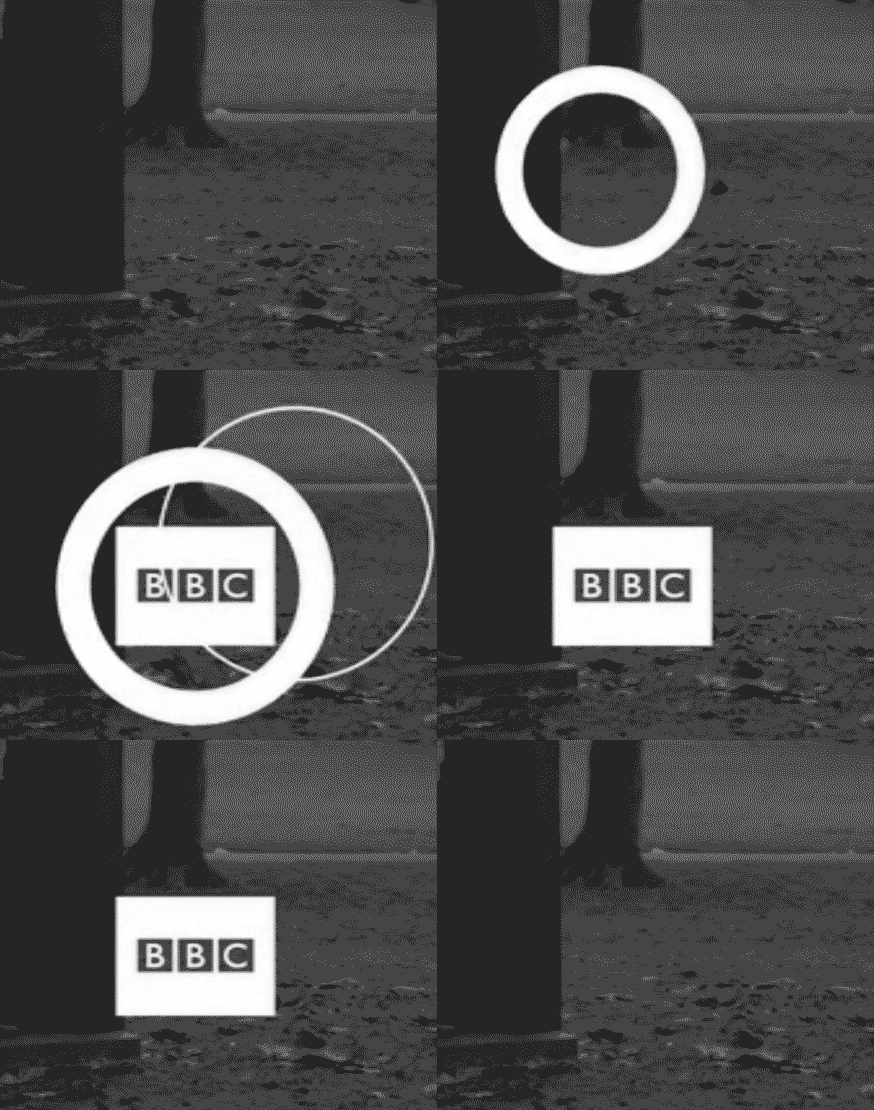
BBC
logo formation now, and again, tweaked the
BBC News
one

Loving it! Although, maybe its time to see some other parts, now?
MD
I want to do the BBC World News and BBC Politics logos, just to complete the set. Then I will need to come up with on-screen layouts, and then will have to do one or two examples of channel branding.
The logos are as far as I have gotten in terms of this current restart of the project. Happy to entertain ideas and comments. I am feeling this out in small steps.
The logos are as far as I have gotten in terms of this current restart of the project. Happy to entertain ideas and comments. I am feeling this out in small steps.
SH
Shiruba98
Will there be box formations for CBBC and CBeebies?
Will be interesting to see what they would look like.
Will be interesting to see what they would look like.
MD
No idea with CBBC and CBeebies. It may make sense for only the cross-promotions to used boxed logos, but I will give it some thought.
I have done the BBC Politics formation, but I am not happy with it. Will have to give the execution some thought. The gears forming the box and logo, however I like - just not keen on how I have used them so far...

I have done the BBC Politics formation, but I am not happy with it. Will have to give the execution some thought. The gears forming the box and logo, however I like - just not keen on how I have used them so far...
PA
Re: the gears, I think it's similar to your first main BBC logo with the circles, in that its asymmetrical formation feels a bit 'off'. I know the BBC News one does form from one side, but 'left to right' seems more logical than 'right to left'? Possibly because of the direction we read.
I would try either having the gears appear from left to right, or have them converge from opposite corners for symmetry. And the box appears a bit fast, or perhaps that's me. Certainly compared to the other versions it does, or maybe it was deliberate?
Just ideas though, I have no idea if they would look good in reality. Hope you don't mind me offering them!
Love the evolution though, really fun to follow!
I would try either having the gears appear from left to right, or have them converge from opposite corners for symmetry. And the box appears a bit fast, or perhaps that's me. Certainly compared to the other versions it does, or maybe it was deliberate?
Just ideas though, I have no idea if they would look good in reality. Hope you don't mind me offering them!
Love the evolution though, really fun to follow!