The Gallery

BBC re-branding V4

Still fumbling for a strong idea... (October 2015)

This site closed in March 2021 and is now a read-only archive
BR
Brekkie
The execution of your work is as superb as always mdta and you always manage to take a fairly simple (sometimes existing) idea and just make it look so much better.

My only issue is with the box branding having fallen apart quite spectacularly across the BBC portfolio in recent years is whether it's worth limiting yourself to boxed logos. Although I do think they look far better than the linear alternatives you've posted I'm just not convinced that beyond the main channel logos they actually work any more.

That aside though and certainly prefer the colour versions over the simple outlines, but do like what you're trying to achieve in animating them. Also probably not intentional but quite like the sidebar used on these and perhaps that is a device the BBC could bring back to easily distinguish between promos for each channel, both unifying the brand and allowing the channels to have their own identity at the same time.
MD
mdtauk
The execution of your work is as superb as always mdta and you always manage to take a fairly simple (sometimes existing) idea and just make it look so much better.

My only issue is with the box branding having fallen apart quite spectacularly across the BBC portfolio in recent years is whether it's worth limiting yourself to boxed logos. Although I do think they look far better than the linear alternatives you've posted I'm just not convinced that beyond the main channel logos they actually work any more.

That aside though and certainly prefer the colour versions over the simple outlines, but do like what you're trying to achieve in animating them. Also probably not intentional but quite like the sidebar used on these and perhaps that is a device the BBC could bring back to easily distinguish between promos for each channel, both unifying the brand and allowing the channels to have their own identity at the same time.

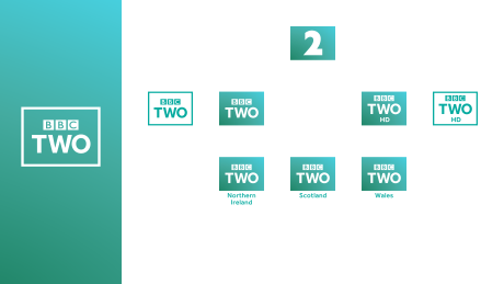
I think with these recent logos I have made, the box acts as a unifying force that brings all the logos together. The different sized boxes, and the different colours, some plain and some with gradients, are what is contributing to the mess of the current branding IMO.

Removing the boxes, brings us back to individual logos, which do not sit well beside each other. Unless you bring it right back to the 1997 idea of using a single font, and single formation. I originally tried that, but it didn't seem to sit well with people, and what looked right for one channel, seemed odd for another.

So that is where I am at so far.
CO
Colorband
ASO posted:
*

But is it just me that sees a swastika?


I think that's a Buddhist swastika, as apposed to a... well, you know.
BA
bilky asko
ASO posted:
*

But is it just me that sees a swastika?


I think that's a Buddhist swastika, as apposed to a... well, you know.


Indeed - I created this handy guide in 2012 for this very situation.

BA
bilky asko
After that last post, I feel I should comment on this mock.

Spent hours getting this BBC Two formation to work...
*


This is the part of the mock that stands out for me as completely new, and I really do like it. You've managed to apply this sort of effect on all the main channels, and I feel it's an effect you could include in all of the presentation. It has hints of the new Channel 4 News, but I reckon you could develop your application further.
Warbler and Aaron_2015 gave kudos
MD
mdtauk
BBC Three is done, and I am happy with it. You have the play symbol as a subtle hint that BBC Three will be Online only.
*

And to bring the other logos together...
*
*
*
PA
pad
Absolutely love those! The formations are fab.

I almost feel the "2" numeral (or indeed the play shape, the circle, etc) should hover for a moment (just a second) in the full shape (e.g. the 2 numeral or the circle) before expanding further into the box. But that might not look as good as it seems in my head.

Awesome work though, love the colourless logos. It's a fresh and innovative approach.
Warbler and SomeRandomStuff gave kudos
MD
mdtauk
pad posted:
Absolutely love those! The formations are fab.

I almost feel the "2" numeral (or indeed the play shape, the circle, etc) should hover for a moment (just a second) in the full shape (e.g. the 2 numeral or the circle) before expanding further into the box. But that might not look as good as it seems in my head.

Awesome work though, love the colourless logos. It's a fresh and innovative approach.

With the "Three" formation, the play symbol did not register without a pause. Once you have the pause in, it becomes very prominent. I don't think the others would benefit from having a prominent pause. I know you could argue that the 2 from the BBC Two could/should be obvious, but I would imagine the branding for the channel would feature the 2 anyway, and so, it would be redundant to make a focus of it on the logo forming on screen.
DO
dosxuk
I agree, and would file it under "delight" - little things that you don't notice at first but that put a smile on your face when you notice them.
SomeRandomStuff and bilky asko gave kudos
MD
mdtauk
BBC News
*
SR
SomeRandomStuff
I am absolutely in love with these box animations.
CH
channelsurfer
The box animations are absolutely brilliant. Little details like this work wonders.

Newer posts