See this is what happens when modern attitudes about design (which have produced some of the dourest, uninteresting, generic idents in our time) are applied to historical classics.
Agreed. The reason given undervalues the scope of moods the set was intended to encompass (which continued right through to the final additions).
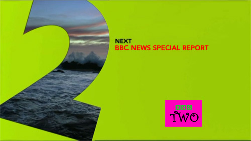
Because the 2 doesn't move around the screen enough. *sigh*
I still don't like the box in the corner, regardless of whether it says "BBC TWO" or "50 Years". It makes me long for the 1997 to 2000 days when the logo was centralised on all BBC channels, didn't vary in font or colour and was big enough to read properly!
Adding something like Powder to the set would help a lot (the 2 does all of the moving, although I guess it might look ropey in HD) as something to use to go into more serious programmes. Are they using Swan into Newsnight generally?
Adding something like Powder to the set would help a lot (the 2 does all of the moving, although I guess it might look ropey in HD) as something to use to go into more serious programmes. Are they using Swan into Newsnight generally?
I think they often use Paint Pot into Newsnight.
Do they have original film that they can go back to for any of these idents or was tape used for any/all of them?