TV Home Forum

The X Factor 2014:

The pink X, and the ratings dip again, (February 2014)

This site closed in March 2021 and is now a read-only archive
DE
declan
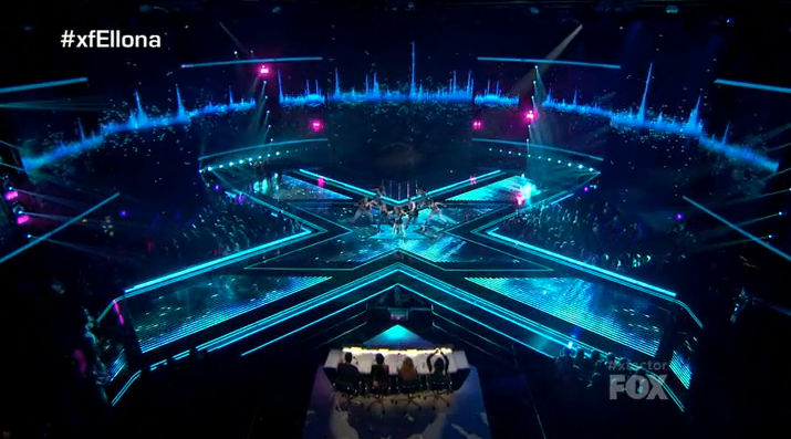
Whilst I'm in the criticism mood, can I just say that I feel the overall presentation in terms of set, on screen-graphics and the bloody judge's desk is weak. I get that in the USA there is more competition and obviously the team wanted to pull out all the stops to make the whole show look polished but the UK show deserves to be modernised a bit.


You have to consider the fact that XF USA had double the budget of XF UK. I'd imagine the American sets are the property of Fox seeing as they paid for them.


Good point.

Makes you question why they would spend apparently £1million on a promo that IMO isn't great as opposed to recreating some of they great sets. I get that in order to get viewers to watch the show they have to invest heavily in promotion but the idea of "all out war" I think could have been done on a much lower budget.
GO
gottago
I'd imagine the American sets are the property of Fox seeing as they paid for them.

I'd say that's very unlikely and the sets belong to Fremantle, at least that's how it works in the UK.
BR
Brekkie

Is that not the live show stage?

Yes it is. The "4 chair challenge" did use an X-stage too (the same one), but it wasn't the studio set.


That said the UK version does look like a cheap immitation (surely they could have shipped the US one over - it's not as if they're using it!) and is missing the 4 raised end points where the chairs sat during Bootcamp and were used for the results during the live shows.
DE
declan

Is that not the live show stage?

Yes it is. The "4 chair challenge" did use an X-stage too (the same one), but it wasn't the studio set.

http://www.youtube.com/watch?v=Jq96Yazmzyg

That said the UK version does look like a cheap immitation (surely they could have shipped the US one over - it's not as if they're using it!) and is missing the 4 raised end points where the chairs sat during Bootcamp and were used for the results during the live shows.


Ah thank you Brekkie for the set clarification.

Couldn't agree more. The UK one has needed some TLC for the graphics and stuff. I don't think they actually have a clear outline for what they want. The bootcamp set looks poor - albeit a mobile phone picture - but also the change from the more serious colours of dark blue and red to the light blue and pink. How do they actually intend to convey "all out war" with these colours and the same old lack of effort when it comes to stages and other on-screen graphics?
:-(
A former member
I'm not sure that describing it as light blue and pink is doing it any justice. It's still dark and modern looking, you make it sound like a My Little Pony playset.

There are indications of a change in titles and graphic changes this year, however I thought that last years slightly more understated style at the start of the series was good. Obviously viewing figures dictated that this got dropped and big shouty man came back, but look back 3 or 4 years and you can see a big difference and improvement in the look of the show. I think the time has come for a proper refresh though, and the videos I have seen from the arena auditions suggest this is happening. Don't forget that any changes usually happen for the live shows and not the series start.

I never understood why the Eurostile font graphics were never used here like in the US and Australia. Someone here that works on the graphics REALLY loves Gill Sans. The Australian show in particular is worth a watch just to see the things that they do differently (it seems a bit younger and funkier).
DE
declan
I'm not sure that describing it as light blue and pink is doing it any justice. It's still dark and modern looking, you make it sound like a My Little Pony playset.


*

This lacks that darkness and seriousness for me.

Quote:
There are indications of a change in titles and graphic changes this year, however I thought that last years slightly more understated style at the start of the series was good.


I would love a title refresh. I like the outer space thing and think it is better than what preceded it but the horrible city shots look awful IMO. I can't remember what you mean by titles and graphics.

Quote:
Obviously viewing figures dictated that this got dropped and big shouty man came back,


I'm not certain but don't think he was ever dropped and was always going to be there for the lives regardless of viewing figures.

Quote:
Don't forget that any changes usually happen for the live shows and not the series start.


Never understood why they did this, I would say that it's because they expect viewing to be higher but I think that more people watch the auditions for the whole mixture of acts.

Quote:
I never understood why the Eurostile font graphics were never used here like in the US and Australia. Someone here that works on the graphics REALLY loves Gill Sans.


Me neither, it seems weird that they didn't introduce it. It suits the show a lot better I think.
AL
alexhduk
But remember X Factor USA changed their branding to the pink and blue but kept their titles exactly the same?
HJ
HJL
The Four Chair Challenge in America (which was their equivalent last year to bootcamp) used a similar shaped stage to the live shows although the lighting effects on the surface were much more simple:

The whole setting for the 4 Chair Challenge was grand- being in a theatre rather than an Wembley arena.

I personally think that these changes are making it better, although nobody is in a position to complain about/ judge the changes, when they haven't even aired yet.

Also nobody is being very realistic about the cost of shipping tonnes of set and equipment from the USA to the UK, and whilst the advert was a waste of money to some people, the adverts are never cheep!
MO
Mouseboy33
After the cancellation of XFactor US, its highly unlikely that the components that were used to create the stage structure is hardly sitting in a warehouse in the LA basin. The judges table who knows..but the stage is likely being used on other productions like Rising Star, etc.
SE
Square Eyes Founding member
Back to red for the '6 Chair Challenge'

*

*
DE
declan
Thank God.

If this is it lit up and ready to go how poor.
5A
5adaytelly
It's probably only going pink and blue because they are going to broadcast this series in the US too.

Newer posts