MW
Unfortunately it's probably people like you in marketing causing such rebrands - most of the general public aren't that stupid and soon make the connection between the four squares and "ITV1", hence giving them a strong branding device.
Something like the Yorkshire Chevron or Granada G would never be created nowadays.
Or even the Central Cake. Of all the ITV Regional logos, the cake takes the biscuit for being the most modern, timeless and elegant ones there is (without the 3D rendering) and could easily work on screen today, the Granada 'g' device wouldn't and the Yorkshire chevron was dated when it was used! It seems to be beyond companies these days to get their logos right, even this forum's beloved BBC logo (and I LOVE it myself) isn't too great, but therein lies it's glory - it doesn't need bevels and gradients because on its own it makes a strong and striking impact that sums up the organisation it represents. ITV need a BBC style system and also need to ensure they don't get the 'me too' culture that the BBC has, keep it strong, consistent and simple and they can't go far wrong.
That logo was always ghastly, as was their 'three blue squares and a yellow one' branding device. What was that even supposed to achieve? Why slap four boxes on a trailer and leave the audience to work out it means ITV1, when 'four squares' is hardly a unique enough concept to ever build any sort of audience connection with it.
Unfortunately it's probably people like you in marketing causing such rebrands - most of the general public aren't that stupid and soon make the connection between the four squares and "ITV1", hence giving them a strong branding device.
Something like the Yorkshire Chevron or Granada G would never be created nowadays.
Or even the Central Cake. Of all the ITV Regional logos, the cake takes the biscuit for being the most modern, timeless and elegant ones there is (without the 3D rendering) and could easily work on screen today, the Granada 'g' device wouldn't and the Yorkshire chevron was dated when it was used! It seems to be beyond companies these days to get their logos right, even this forum's beloved BBC logo (and I LOVE it myself) isn't too great, but therein lies it's glory - it doesn't need bevels and gradients because on its own it makes a strong and striking impact that sums up the organisation it represents. ITV need a BBC style system and also need to ensure they don't get the 'me too' culture that the BBC has, keep it strong, consistent and simple and they can't go far wrong.
PA
I think this could easily be adapted for the 21st century:
http://hub.tv-ark.org.uk/images/itvmidlands/itv_midlands_images/central/idents/itvcentral2_ident1993a.jpg
There's something about the V design that's timeless I feel.
http://upload.wikimedia.org/wikipedia/en/thumb/2/2c/ITV_logo_1989-1998.svg/200px-ITV_logo_1989-1998.svg.png
The coloured portion could change per channel too for channel logos.
AM
Just one problem....
Where would the 1/2/3/4/C/News go?
I think this could easily be adapted for the 21st century:
http://hub.tv-ark.org.uk/images/itvmidlands/itv_midlands_images/central/idents/itvcentral2_ident1993a.jpg
There's something about the V design that's timeless I feel.
http://upload.wikimedia.org/wikipedia/en/thumb/2/2c/ITV_logo_1989-1998.svg/200px-ITV_logo_1989-1998.svg.png
The coloured portion could change per channel too for channel logos.
http://hub.tv-ark.org.uk/images/itvmidlands/itv_midlands_images/central/idents/itvcentral2_ident1993a.jpg
There's something about the V design that's timeless I feel.
http://upload.wikimedia.org/wikipedia/en/thumb/2/2c/ITV_logo_1989-1998.svg/200px-ITV_logo_1989-1998.svg.png
The coloured portion could change per channel too for channel logos.
Just one problem....
Where would the 1/2/3/4/C/News go?
JO
I have them here!

Apparently, 1 isn't happy but say they'll go along with it, 2's is blatantly botched so have refused to take it, 3 plan on playing theirs in reverse and 4 will use their version until 2019.
Sorry, just don't share the love for that late 80s/early 90s relic. Over designed, outdated, bleugh.
Just one problem....
Where would the 1/2/3/4/C/News go?
Where would the 1/2/3/4/C/News go?
I have them here!
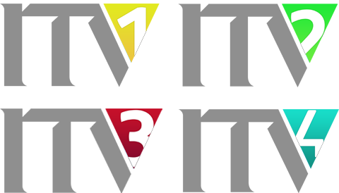
Apparently, 1 isn't happy but say they'll go along with it, 2's is blatantly botched so have refused to take it, 3 plan on playing theirs in reverse and 4 will use their version until 2019.
Sorry, just don't share the love for that late 80s/early 90s relic. Over designed, outdated, bleugh.
CH
I have them here!
Apparently, 1 isn't happy but say they'll go along with it, 2's is blatantly botched so have refused to take it, 3 plan on playing theirs in reverse and 4 will use their version until 2019.
Sorry, just don't share the love for that late 80s/early 90s relic. Over designed, outdated, bleugh.
Indeed. I think that logo is vile.
Just one problem....
Where would the 1/2/3/4/C/News go?
Where would the 1/2/3/4/C/News go?
I have them here!
Apparently, 1 isn't happy but say they'll go along with it, 2's is blatantly botched so have refused to take it, 3 plan on playing theirs in reverse and 4 will use their version until 2019.
Sorry, just don't share the love for that late 80s/early 90s relic. Over designed, outdated, bleugh.
Indeed. I think that logo is vile.
FA
This is an idea how it could be done, modern font, same idea, but with a modern edge:
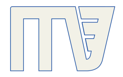
I think this could easily be adapted for the 21st century:
http://hub.tv-ark.org.uk/images/itvmidlands/itv_midlands_images/central/idents/itvcentral2_ident1993a.jpg
There's something about the V design that's timeless I feel.
http://upload.wikimedia.org/wikipedia/en/thumb/2/2c/ITV_logo_1989-1998.svg/200px-ITV_logo_1989-1998.svg.png
The coloured portion could change per channel too for channel logos.
http://hub.tv-ark.org.uk/images/itvmidlands/itv_midlands_images/central/idents/itvcentral2_ident1993a.jpg
There's something about the V design that's timeless I feel.
http://upload.wikimedia.org/wikipedia/en/thumb/2/2c/ITV_logo_1989-1998.svg/200px-ITV_logo_1989-1998.svg.png
The coloured portion could change per channel too for channel logos.
This is an idea how it could be done, modern font, same idea, but with a modern edge:
VM
Unfortunately it's probably people like you in marketing causing such rebrands - most of the general public aren't that stupid and soon make the connection between the four squares and "ITV1", hence giving them a strong branding device.
Something like the Yorkshire Chevron or Granada G would never be created nowadays.
Or even the Central Cake. Of all the ITV Regional logos, the cake takes the biscuit for being the most modern, timeless and elegant ones there is (without the 3D rendering) and could easily work on screen today, the Granada 'g' device wouldn't and the Yorkshire chevron was dated when it was used! It seems to be beyond companies these days to get their logos right, even this forum's beloved BBC logo (and I LOVE it myself) isn't too great, but therein lies it's glory - it doesn't need bevels and gradients because on its own it makes a strong and striking impact that sums up the organisation it represents. ITV need a BBC style system and also need to ensure they don't get the 'me too' culture that the BBC has, keep it strong, consistent and simple and they can't go far wrong.
I disagree with that - the cake looks rather dated now whilst the Granada G and Yorkshire chevron look timeless. I mean, look at this...
http://hub.tv-ark.org.uk/images/itvnorthwest/itv_northwest_images/idents/granada_ident_1995a-01.jpg
The Central Cake meanwhile just looks too similar to the 80s style design of the 89 ITV logo.
That logo was always ghastly, as was their 'three blue squares and a yellow one' branding device. What was that even supposed to achieve? Why slap four boxes on a trailer and leave the audience to work out it means ITV1, when 'four squares' is hardly a unique enough concept to ever build any sort of audience connection with it.
Unfortunately it's probably people like you in marketing causing such rebrands - most of the general public aren't that stupid and soon make the connection between the four squares and "ITV1", hence giving them a strong branding device.
Something like the Yorkshire Chevron or Granada G would never be created nowadays.
Or even the Central Cake. Of all the ITV Regional logos, the cake takes the biscuit for being the most modern, timeless and elegant ones there is (without the 3D rendering) and could easily work on screen today, the Granada 'g' device wouldn't and the Yorkshire chevron was dated when it was used! It seems to be beyond companies these days to get their logos right, even this forum's beloved BBC logo (and I LOVE it myself) isn't too great, but therein lies it's glory - it doesn't need bevels and gradients because on its own it makes a strong and striking impact that sums up the organisation it represents. ITV need a BBC style system and also need to ensure they don't get the 'me too' culture that the BBC has, keep it strong, consistent and simple and they can't go far wrong.
I disagree with that - the cake looks rather dated now whilst the Granada G and Yorkshire chevron look timeless. I mean, look at this...
http://hub.tv-ark.org.uk/images/itvnorthwest/itv_northwest_images/idents/granada_ident_1995a-01.jpg
The Central Cake meanwhile just looks too similar to the 80s style design of the 89 ITV logo.
DJ
This is an idea how it could be done, modern font, same idea, but with a modern edge:
no that logo was so dated lol
I think this could easily be adapted for the 21st century:
http://hub.tv-ark.org.uk/images/itvmidlands/itv_midlands_images/central/idents/itvcentral2_ident1993a.jpg
There's something about the V design that's timeless I feel.
http://upload.wikimedia.org/wikipedia/en/thumb/2/2c/ITV_logo_1989-1998.svg/200px-ITV_logo_1989-1998.svg.png
The coloured portion could change per channel too for channel logos.
http://hub.tv-ark.org.uk/images/itvmidlands/itv_midlands_images/central/idents/itvcentral2_ident1993a.jpg
There's something about the V design that's timeless I feel.
http://upload.wikimedia.org/wikipedia/en/thumb/2/2c/ITV_logo_1989-1998.svg/200px-ITV_logo_1989-1998.svg.png
The coloured portion could change per channel too for channel logos.
This is an idea how it could be done, modern font, same idea, but with a modern edge:
no that logo was so dated lol