


MF
OK, we want to make it so that you can improve, and not being too harsh when it's your first attempt at these.
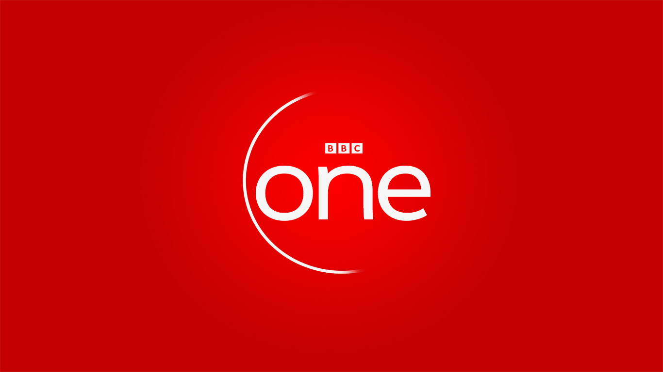
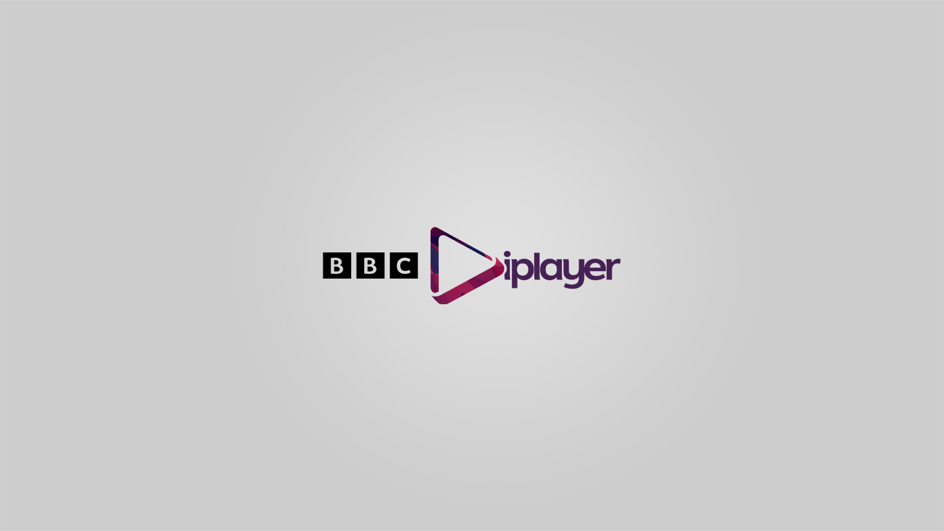
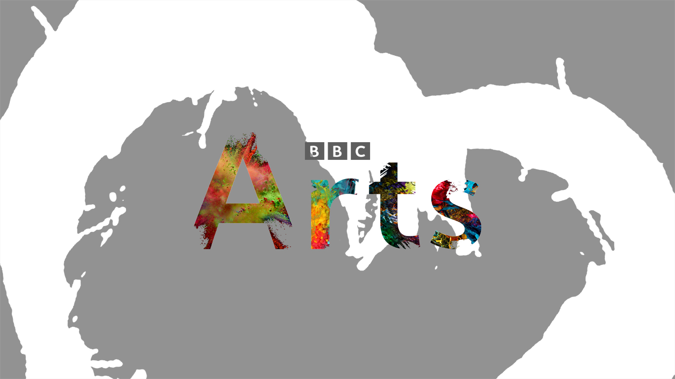
The BBC Arts and BBC iPlayer are your best ones here. I'd say scrap BBC 1 and 2 (they're awful and wouldn't be worth improving) and focus on improving Arts and iPlayer.
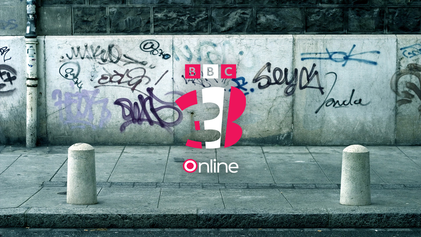
You can improve World News but you need to add some red into it and partially base it on the current look.
You should also use a bigger BBC logo on your mocks, and the proper one, not a small version.
1/5, but if you focus on Arts and iPlayer, it could get better.
The BBC Arts and BBC iPlayer are your best ones here. I'd say scrap BBC 1 and 2 (they're awful and wouldn't be worth improving) and focus on improving Arts and iPlayer.
You can improve World News but you need to add some red into it and partially base it on the current look.
You should also use a bigger BBC logo on your mocks, and the proper one, not a small version.
1/5, but if you focus on Arts and iPlayer, it could get better.
JD
JDN
First of all welcome. Nice effort. Love the BBC 2 logo. Well done!
TO
I like the Arts logo, and quite like the iPlayer logo, although the play triangle is too close to the i and makes it hard to read at first glance.
The BBC blocks in all but the iPlayer logos are too small. I don't see why they need to be so small.
The World News one is nice but needs some colour to make it stand out a bit, it looks quite dull at the minute.
Don't like the BBC 2 logo at all, but the BBC One logo isn't too bad, but nothing special.
It would be good to know how each of these would animate and look on screen. I hope you work with this and improve/expand it.
TM
Good effort 
My suggestions is that you could make the BBC Arts have paint over the background and move the player icon and BBC logo over to the left more as it looked very squashed with the Iplayer wording.
I would also suggest that you don't make the '2' multi-coloured, looks better with just the dark green and I would make the World News background red instead of grey.
Well done though, would love to see you attempt BBC II!, BBC Four and maybe BBC Sport


TM
Please use the official BBC logo, first of all. I admire you trying to have a go at creating your own logo, but the official BBC logo is pretty much perfect as is. The second version of BBC Arts is great, iPlayer I'm mixed on.
I reckon you're onto something with that BBC Two mock. Keep going with it.
One thing I feel these mocks need is something which unifies all the brands together.
I reckon you're onto something with that BBC Two mock. Keep going with it.
One thing I feel these mocks need is something which unifies all the brands together.