
AA
Rather than persisting with Twitter sized icons, why not start thinking about how these logos can be integrated into endboards and trailers?
AE
This one:

is better. Much better.
Thank you for taking my criticism on board and being consistent in your design of the logos.
Although you should either make the 'online' stand out (as in either black or white) or removing the 'online' altogether.
is better. Much better.
Thank you for taking my criticism on board and being consistent in your design of the logos.
Although you should either make the 'online' stand out (as in either black or white) or removing the 'online' altogether.
CO
Haven't been here in a while, let's see what he's...
No. BBC 2 and 3 are just wrong. FOUR is off-center. No.
First one seems a bit too complicated, what with the stuff at the bottom.
Second one is good. Better then before. But take out the map of Europe and Asia from the BBC World News logo - I live in America and I get that on my satellite box.

No. BBC 2 and 3 are just wrong. FOUR is off-center. No.
First one seems a bit too complicated, what with the stuff at the bottom.
Second one is good. Better then before. But take out the map of Europe and Asia from the BBC World News logo - I live in America and I get that on my satellite box.
AE
Oh, and one other thing, yeah, Aaron_2015 is right, instead of it being square you should make the logos the same shape as the actual BBC TV Channel logos, If you look carefully, they are not sqaure, they are like this:

Focus on the shape of the logos, not the actual logos when looking at this picture and comparing it to your design logos.
Oh, and one other thing, yeah, Aaron_2015 is right, instead of it being square you should make the logos the same shape as the actual BBC TV Channel logos, If you look carefully, they are not sqaure, they are like this:
Focus on the shape of the logos, not the actual logos when looking at this picture and comparing it to your design logos.
BR
Amazing how many mocks for BBC logos basically end up back with the box logos.
Keep going though iamqueeni - technically they're looking much better than your opening mocks, but they are lacking the creativity you came into this thread with. You probably need to set yourself a brief for each channel about what you (ignore us lot!) want the branding for each channel to say about the channel and go from there.
And please take note of that comment - it's very difficult to actually see your vision from just the logo. We need to see how it might work on screen.
Keep going though iamqueeni - technically they're looking much better than your opening mocks, but they are lacking the creativity you came into this thread with. You probably need to set yourself a brief for each channel about what you (ignore us lot!) want the branding for each channel to say about the channel and go from there.
I shall just say one last thing, Lambie-Nairn didn't put personality into the logos, it put it in the branding, idents etc.
And please take note of that comment - it's very difficult to actually see your vision from just the logo. We need to see how it might work on screen.
IA
[quote="Brekkie" pid="997139"]Amazing how many mocks for BBC logos basically end up back with the box logos.
Keep going though iamqueeni - technically they're looking much better than your opening mocks, but they are lacking the creativity you came into this thread with. You probably need to set yourself a brief for each channel about what you (ignore us lot!) want the branding for each channel to say about the channel and go from there.
Thank you I've totally messed all this up haha I'm just trying to improve
Keep going though iamqueeni - technically they're looking much better than your opening mocks, but they are lacking the creativity you came into this thread with. You probably need to set yourself a brief for each channel about what you (ignore us lot!) want the branding for each channel to say about the channel and go from there.
Thank you
I've totally messed all this up haha I'm just trying to improve


DT
Will somebody please think of the safezones!!!
Again I fail to see how this is any improvement on the current version - BBC One, and to a lesser extent BBC Two, just seem like poor knock offs of the current presentation set. Furthermore what is your problem with the BBC logo - it's readily available on the internet and please if you're going to recreate it note that the blocks aren't squares, the C lines up with the Bs and the letters are custom drawn and not an available version of Gill Sans.
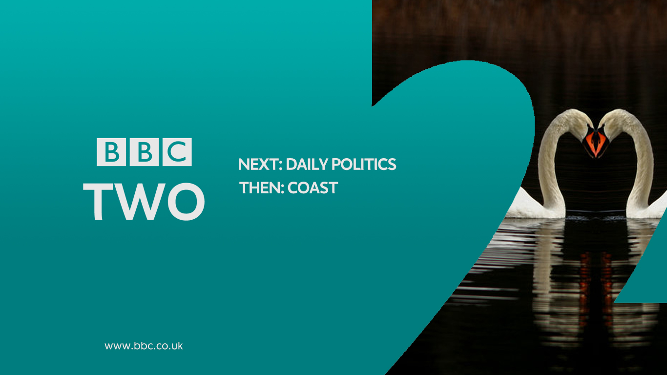
The BBC Two slide looks like a particularly quick knock up - the word two looks terrible and uncentred on the BBC logo even though it is and the whole word is poorly kerned. That combined with the two spelling mistakes in 'all new series coming soon' and the BBC One font url make it look like it was slapped together in 5 minutes. There is also no consistency in layout between the coming up and coming soon slides.
BBC One is using the existing font, shapes and colours just in a changed (for the worse) layout. The point of the circles in the current design is that it all links together - circling the 'o' of one which is in the centre of the screen. Having multiple circles in various parts of the screen is kind of detracting from the original principles of the circles design.
Again I fail to see how this is any improvement on the current version - BBC One, and to a lesser extent BBC Two, just seem like poor knock offs of the current presentation set. Furthermore what is your problem with the BBC logo - it's readily available on the internet and please if you're going to recreate it note that the blocks aren't squares, the C lines up with the Bs and the letters are custom drawn and not an available version of Gill Sans.
The BBC Two slide looks like a particularly quick knock up - the word two looks terrible and uncentred on the BBC logo even though it is and the whole word is poorly kerned. That combined with the two spelling mistakes in 'all new series coming soon' and the BBC One font url make it look like it was slapped together in 5 minutes. There is also no consistency in layout between the coming up and coming soon slides.
BBC One is using the existing font, shapes and colours just in a changed (for the worse) layout. The point of the circles in the current design is that it all links together - circling the 'o' of one which is in the centre of the screen. Having multiple circles in various parts of the screen is kind of detracting from the original principles of the circles design.
JD
JDN
Love these in a way. Your BBC One idea with using the circles in a different way really is a new look at things. Much more imaginitive than 'lets stick a circle in the middle of the screen'. Keel up the good work.
And please, the square logos are better than the old BBC boxes. Please do away with the old shape boxes.
And please, the square logos are better than the old BBC boxes. Please do away with the old shape boxes.
DT
Nope. I've tried but even though the words are going into my brain there's no way it'll be able to compute why anybody would think that.

The proper version is just clearly much better in every way.
And please, the square logos are better than the old BBC boxes. Please do away with the old shape boxes.
Nope. I've tried but even though the words are going into my brain there's no way it'll be able to compute why anybody would think that.

The proper version is just clearly much better in every way.
Last edited by DTV on 22 February 2016 8:07pm