DB
TBH, its not really 4:3 safe, more 14:9 safe. And by how they designed the graphics, it seemed like a snug place to put it. (Even though it could have been tweaked so much better)
Except gmb changed their graphics to fit more into the 4.3 safe areas. I will see what looks good in the morning when I next work on the graphics!! I am really grateful of all the feedback and the positive reception for my latest design.
TBH, its not really 4:3 safe, more 14:9 safe. And by how they designed the graphics, it seemed like a snug place to put it. (Even though it could have been tweaked so much better)
HJ
So you asked for me to improve the safe areas, to make better use of the area so here you are. I have made it so the 4:3 would have a straight line down the graphics whilst 16:9 viewers get the logo and hoops. Everything fits well IMO, and thanks Brekkie, I agree, white hoops work better, although they will change at the top of the story if a whole screen graphic is used, i.e the start of sport, entertainment, a Headline etc.
Personally love the clock and the rest of this graphic! I hope you all do too! Thank you for everyone's advice this evening, much appreciated!
EDIT: Just realised I didn't change the fonts to all be DIN. I think it could be too much, but will incorporate that into my next post either later tonight or in the morning! Sorry ASO.
AS
Trashy? How?
Well, it's your mock.
I meant everything BUT the hoops!
In all places or just the hoops, white would look trashy throughout the graphics IMO.
Trashy? How?
Well, it's your mock.
I meant everything BUT the hoops!
HJ
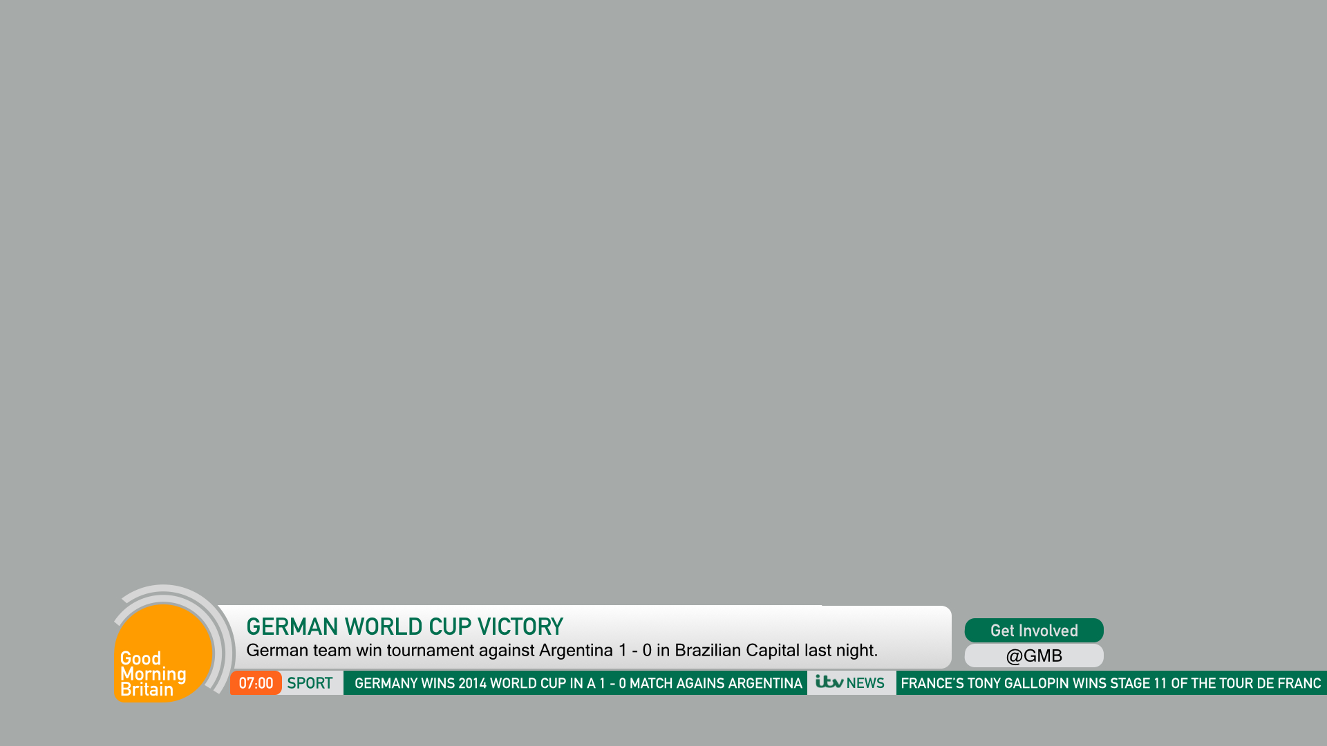
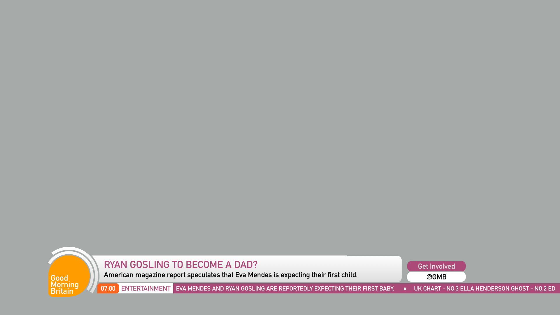
Here we go then, I have finished tweaking these graphics and I hope you like the end result. I have improved the safe area, the colours, the fonts and just about everything else, although the nature of the graphics remains, with the fundamental shapes, colours and logos. I really hope you like these!


And especially for ASO, hopefully to prove a point, I have the graphics with white rather than a grey gradient, which I think looks gaudy, tacky and definitely too in your face for breakfast telly.

Please inform me of any possible improvements, always want to make this better! and also let me know if you want to see more in white, despite my obvious dislike for this!
Thank you all in advance for any feedback.
And especially for ASO, hopefully to prove a point, I have the graphics with white rather than a grey gradient, which I think looks gaudy, tacky and definitely too in your face for breakfast telly.
Please inform me of any possible improvements, always want to make this better! and also let me know if you want to see more in white, despite my obvious dislike for this!
Thank you all in advance for any feedback.
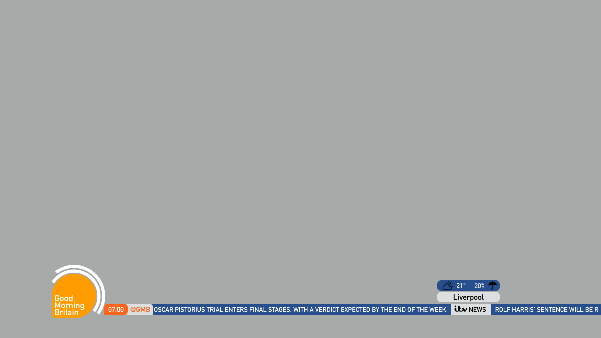
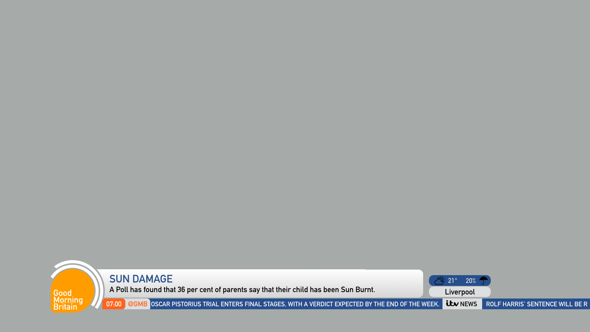
DK
The pink for entertainment is terrible, align it to the current purple. Find a middle ground for the straps, not pure white but not the obvious gradient you have. Try aligning the colours to the current colour palette, which is very nice, again get the actual logo in there as the font in your one is far too dull to be used in a logo.
HJ
Will do, but I won't be able to get the ITV logo in the ticker to be the same as the colour of the entertainment section, hence the change in colour! It wasn't me preferring pink!! I will re align some of the colours also, but the logo is staying, otherwise everything except the logo will be DIN which would look crazy and ****, so sorry, but this time Im going to have to play dumb to that little bit of advice. As for the gradient, I did work on it, but will continue with fresh eyes in the morning, But I really am not keen on the all white version, looks as bad as Simon Cowell's teeth.
The pink for entertainment is terrible, align it to the current purple. Find a middle ground for the straps, not pure white but not the obvious gradient you have. Try aligning the colours to the current colour palette, which is very nice, again get the actual logo in there as the font in your one is far too dull to be used in a logo.
Will do, but I won't be able to get the ITV logo in the ticker to be the same as the colour of the entertainment section, hence the change in colour! It wasn't me preferring pink!! I will re align some of the colours also, but the logo is staying, otherwise everything except the logo will be DIN which would look crazy and ****, so sorry, but this time Im going to have to play dumb to that little bit of advice. As for the gradient, I did work on it, but will continue with fresh eyes in the morning, But I really am not keen on the all white version, looks as bad as Simon Cowell's teeth.
AS
I agree with everything apart from the point about the logo.
The pink for entertainment is terrible, align it to the current purple. Find a middle ground for the straps, not pure white but not the obvious gradient you have. Try aligning the colours to the current colour palette, which is very nice, again get the actual logo in there as the font in your one is far too dull to be used in a logo.
I agree with everything apart from the point about the logo.
HJ
Hopefully this is an improvement, unfortunately for DanielK, I have remained with the logo, but everything else has been amended/ corrected.


Dont hesitate to give some pointers for improvement, if nothing else I'm extremely respondent, and always attempt to improve where possible!
Dont hesitate to give some pointers for improvement, if nothing else I'm extremely respondent, and always attempt to improve where possible!
Last edited by HJL on 21 July 2014 10:43am - 2 times in total