DK
Hmmm, try making the rings in the blue and turquoise colours and the clock as the colour of the rings now. Also, the ticker is poking out from behind the clock.
Is this an improvement??

Hmmm, try making the rings in the blue and turquoise colours and the clock as the colour of the rings now. Also, the ticker is poking out from behind the clock.
DK
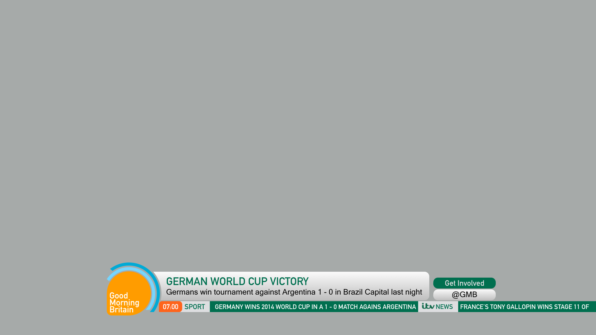
If this is liked, I will continue designing the rest of the package in due course!
A lot better, maybe tone down the gradient in that main strap. Then I'd go ahead.
If this is liked, I will continue designing the rest of the package in due course!
A lot better, maybe tone down the gradient in that main strap. Then I'd go ahead.
HJ
Will do!! I am also toning down the gradient as we speek!!
It is liked by me, but as I said - make all of it the same font - DIN. It needs to be consistent.
Will do!! I am also toning down the gradient as we speek!!
AS
Will do!! I am also toning down the gradient as we speek!!
Good.
On another note, these are sort of reminiscent of one of your older incarnations of your GMB mock on the old thread.
Can I just remind everyone of how much better these graphics are, compared to some that you made a while ago...
It is liked by me, but as I said - make all of it the same font - DIN. It needs to be consistent.
Will do!! I am also toning down the gradient as we speek!!
Good.
On another note, these are sort of reminiscent of one of your older incarnations of your GMB mock on the old thread.
Can I just remind everyone of how much better these graphics are, compared to some that you made a while ago...
OW
Will do!! I am also toning down the gradient as we speek!!
Good.
It is sort of reminiscent of one of your older incarnations of your GMB mock on the old thread.
Can I just remind everyone of how much better these graphics are, compared to some that you made a while ago...
Agree with ASO, I like this, defiantly a huge improvement on the previous GMB mocks.
It is liked by me, but as I said - make all of it the same font - DIN. It needs to be consistent.
Will do!! I am also toning down the gradient as we speek!!
Good.
It is sort of reminiscent of one of your older incarnations of your GMB mock on the old thread.
Can I just remind everyone of how much better these graphics are, compared to some that you made a while ago...
Agree with ASO, I like this, defiantly a huge improvement on the previous GMB mocks.
HJ
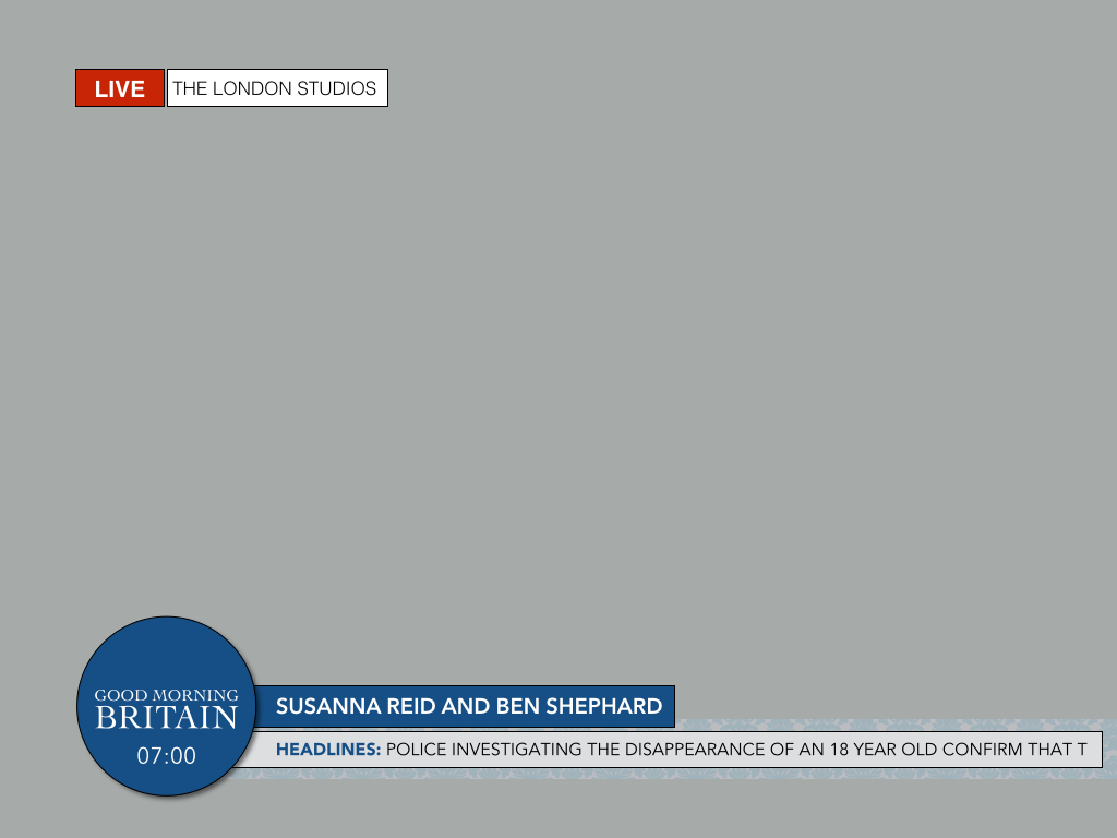
I am only going to get criticised for not sticking to the safe areas though. Plus if anything is moved out I don't ee ally want half a shape sticking in the 4:3 safe area. But things like the live strap will not stay on the 4:3 safe area. Just wait for the rest of the graphics!
Think the white rings out of the logo were best myself, but like how this has developed from something that was somewhat below par to something which looks half decent. My only criticism is it's far too 4:3 safe!
I am only going to get criticised for not sticking to the safe areas though. Plus if anything is moved out I don't ee ally want half a shape sticking in the 4:3 safe area. But things like the live strap will not stay on the 4:3 safe area. Just wait for the rest of the graphics!
DB
I am only going to get criticised for not sticking to the safe areas though. Plus if anything is moved out I don't ee ally want half a shape sticking in the 4:3 safe area. But things like the live strap will not stay on the 4:3 safe area. Just wait for the rest of the graphics!
Ignore 4:3 safe, most broadcasters have ditched it and used 16:9 safe since the Digital Switchover.
Think the white rings out of the logo were best myself, but like how this has developed from something that was somewhat below par to something which looks half decent. My only criticism is it's far too 4:3 safe!
I am only going to get criticised for not sticking to the safe areas though. Plus if anything is moved out I don't ee ally want half a shape sticking in the 4:3 safe area. But things like the live strap will not stay on the 4:3 safe area. Just wait for the rest of the graphics!
Ignore 4:3 safe, most broadcasters have ditched it and used 16:9 safe since the Digital Switchover.