HJ
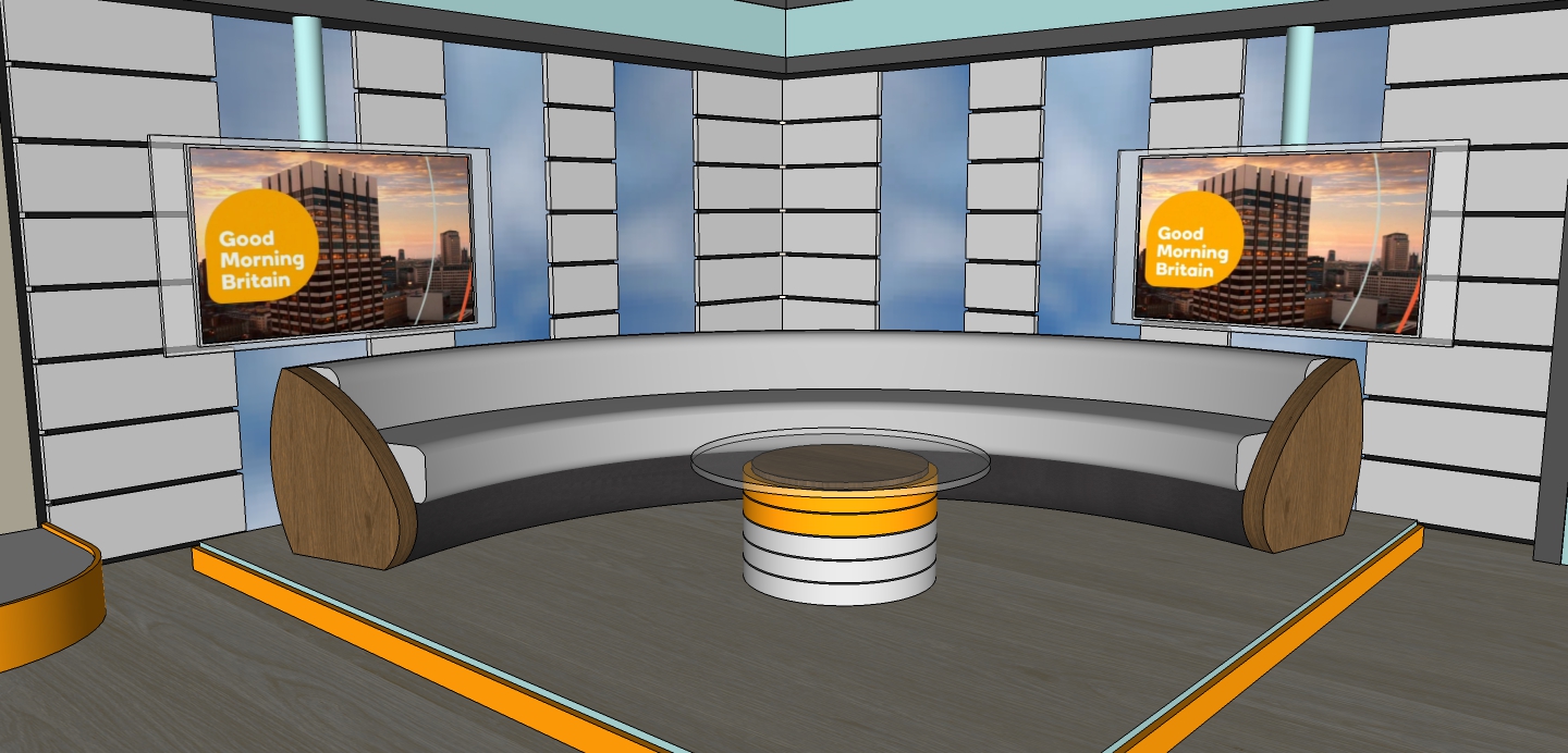
Im really grateful that you like the model! The whole point of this thread was to show of my Sketchup design!! It wasn't so much looking at a need for re-launching the show, with time and tweaks it will be a great show. But this could be a direction that the show took at the start, and I didn't want my model going to waste!!
Thanks everyone for your feedback!!
I think it's a nice design - not sure it's what Good Morning Britain needs, but as others have said you can see effort and thought has gone into it and overall it looks very smart, particularly for an unrendered Sketchup design. 4/5 from me.
Im really grateful that you like the model! The whole point of this thread was to show of my Sketchup design!! It wasn't so much looking at a need for re-launching the show, with time and tweaks it will be a great show. But this could be a direction that the show took at the start, and I didn't want my model going to waste!!
Thanks everyone for your feedback!!
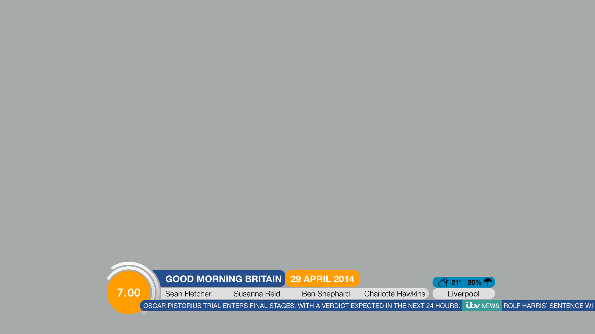
 , I will review it properly when I get a moment, but the schedule is
_006.jpg)