TV Home Forum

New look CBBC

Split from CBBC Channel (March 2016)

This site closed in March 2021 and is now a read-only archive
JA
JAS84
JAS84 posted:
If the trend for designing TV logos with apps and social media in mind continues then the BBC logo itself must surely be in danger.
Cbeebies certainly needs a new one then - it definitely isn't app icon friendly. The current one has been in place since it launched in 2002, and this will be the fourth CBBC logo it will have been used alongside.

I'd have thought that a Cbeebies rebound would be a bigger job than most, they have lots of generic interstitials that include the blobs and they appear in the background of some of their bedtime stories and the like.

It still works well I think, and of course the kids who watch it don't care how old or trendy it is

They don't need to drop the blobs - I was just commenting on the shape of the actual logo. They should evolve it rather than dumping all the brand recognition. The problem really is that the name doesn't easily split onto multiple lines, which means it never fitted the cross promotion boxes the way the other channels did.
MU
Multi
This was just uploaded and then deleted.

*
DB
dbl
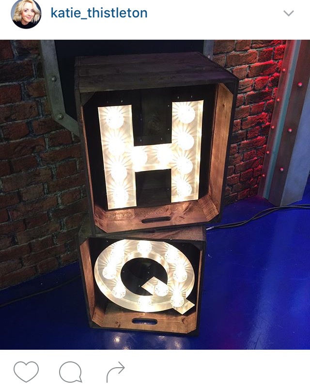
Perhaps they're going to use more of the studio space, like they did for the CBBC Anniversary programme?

Can't believe the current logo is 9 years old more or less!
Last edited by dbl on 13 March 2016 7:57pm
TC
TCOTV
So they are going to becoming live from "CBBC hq" tomorrow rather than the office? Felt like that way for a while.

Didn't CBBC only update the place in September? Identity as well?
CT
CT990
Variations of the New CBBC Logo and Relaunch Announcment

Last edited by CT990 on 13 March 2016 8:05pm
VM
VMPhil
JAS84 posted:
JAS84 posted:
eebies certainly needs a new one then - it definitely isn't app icon friendly. The current one has been in place since it launched in 2002, and this will be the fourth CBBC logo it will have been used alongside.

I'd have thought that a Cbeebies rebound would be a bigger job than most, they have lots of generic interstitials that include the blobs and they appear in the background of some of their bedtime stories and the like.

It still works well I think, and of course the kids who watch it don't care how old or trendy it is

They don't need to drop the blobs - I was just commenting on the shape of the actual logo. They should evolve it rather than dumping all the brand recognition. The problem really is that the name doesn't easily split onto multiple lines, which means it never fitted the cross promotion boxes the way the other channels did.

The logo is familiar enough at this point that it's probably easy enough to just shorten it to something like 'Cbeeb' when necessary, like how it was shortened to 'Chil' when CBBC had a DOG in the mid-90s.
BR
Brekkie
Noting that was just test pages I wonder if the broken vertical lines have been dropped in favour of the solid vertical lines which does look much better IMO, though does only really say "C". The abstract version can at least be interpreted as "CBBC" if you read it as such.

As others have said how it animates will be key - I suspect both elements will be seen on screen.
CT
CT990
Noting that was just test pages I wonder if the broken vertical lines have been dropped in favour of the solid vertical lines which does look much better IMO, though does only really say "C". The abstract version can at least be interpreted as "CBBC" if you read it as such.

As others have said how it animates will be key - I suspect both elements will be seen on screen.
I think that the idents will have it start off as the C and it would transition into the abstract version of the new logo
ST
steveboswell


That first image clearly says BBCC, not CBBC, but otherwise I quite like the look of this.
CT
CT990


That first image clearly says BBCC, not CBBC, but otherwise I quite like the look of this.

I like the look of the new logo too, it's a bit different but hopefully with the new look will come other new changes to the channel, I'm also interested to see how they use the logo as there are a few variations of it
CT
CT990
pad-e posted:
I can imagine everyone hating the new look BBC 1 and 2 logos when they launch if they are in a box and the BBC logo is at the top left instead of the centre. They've done it with BBC 3 and now CBBC (although the BBC 3 version on screen was centred, not aligned to the left but all promotional material had it on the left too).

Imagine that's what they did, designed all the channel logos as Roman Numerals and put them in boxes. I II III and IV. Laughing
I've done a mock up of what the BBC might do to the BBC One and BBC Two logos similar to what they've done with BBC Three and CBBC
Last edited by CT990 on 14 March 2016 3:12pm
JA
Jake
*

Newer posts