MD
Dullest, and worst use of Reith yet for a logo IMO
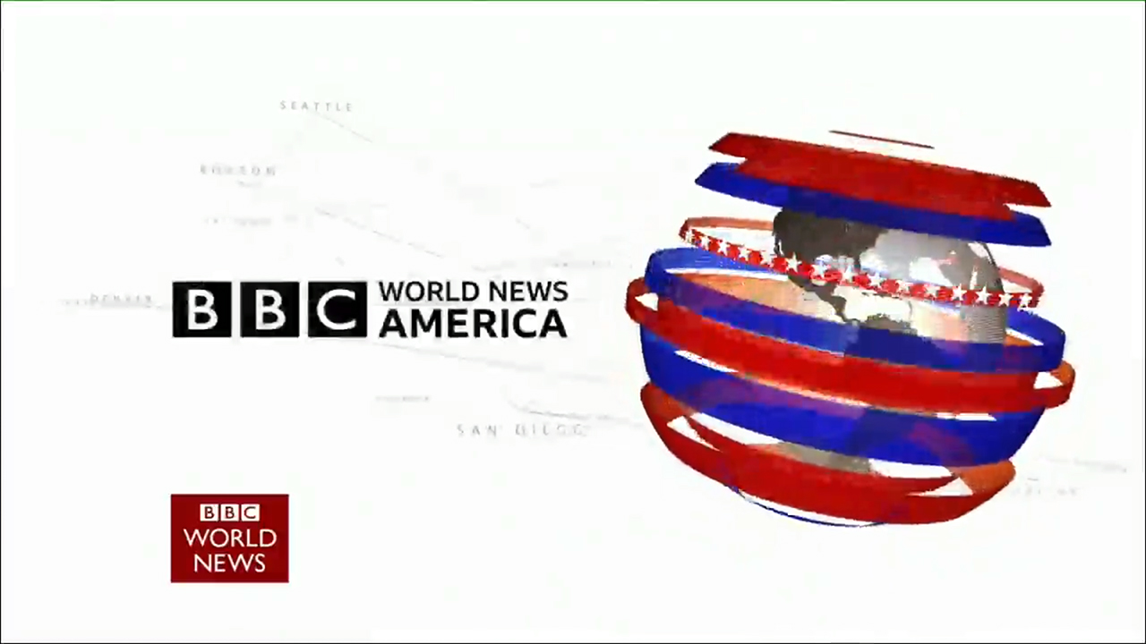
BBC World News America had its logo Reith’d.
Dullest, and worst use of Reith yet for a logo IMO
NE
From our very own Media Boy, looks like the News Channel Countdowns are getting Reithed on Monday morning.
Ohhhhhh hello Reith Countdown Player ... 08:58:30 15/07/2019 pic.twitter.com/NKju0XaS9O
— Chris Cook (@chrisckmedia) July 12, 2019
JW
Chris Cook just tweeted a Reith Countdown menu image. Several countdown options.
Roll on 15th!
Roll on 15th!
SP
I'd be quite pleased if they lose the naff outer glow on the numbers.
From our very own Media Boy, looks like the News Channel Countdowns are getting Reithed on Monday morning.
I'd be quite pleased if they lose the naff outer glow on the numbers.
MO
Like the look of these headlines - they’re different from the ones we’d seen on the one minute news bulletins, and use the red lines which I think a lot of us had been expecting.
Augers well for some decent graphics come Monday. 🤞🏼
(Internal BBC image removed)
Like the look of these headlines - they’re different from the ones we’d seen on the one minute news bulletins, and use the red lines which I think a lot of us had been expecting.
Augers well for some decent graphics come Monday. 🤞🏼
IS
He posted a similar image the other day. Same options, slightly different looking player
Chris Cook just tweeted a Reith Countdown menu image. Several countdown options.
He posted a similar image the other day. Same options, slightly different looking player
JU
Returning to some more #SneakyReith...
Tomorrow night, BBC1 7-8 PM. @afneil @Jeremy_Hunt @BorisJohnson #ournextpm pic.twitter.com/2xhEv0aSsu
— Rob Burley (@RobBurl) July 11, 2019