JA
james
What's a hastag?
MD
I will blame the fact that i'd taken a dose of cold medicine before finishing them up lol
What's a hastag?
I will blame the fact that i'd taken a dose of cold medicine before finishing them up lol
MD
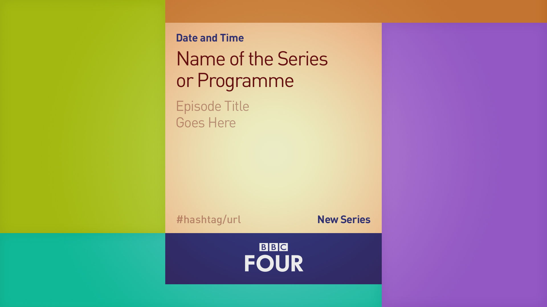
It's just an example of some kind of branding image, to show it doesn't have to use a plain colour background.
BBC Two Graphics


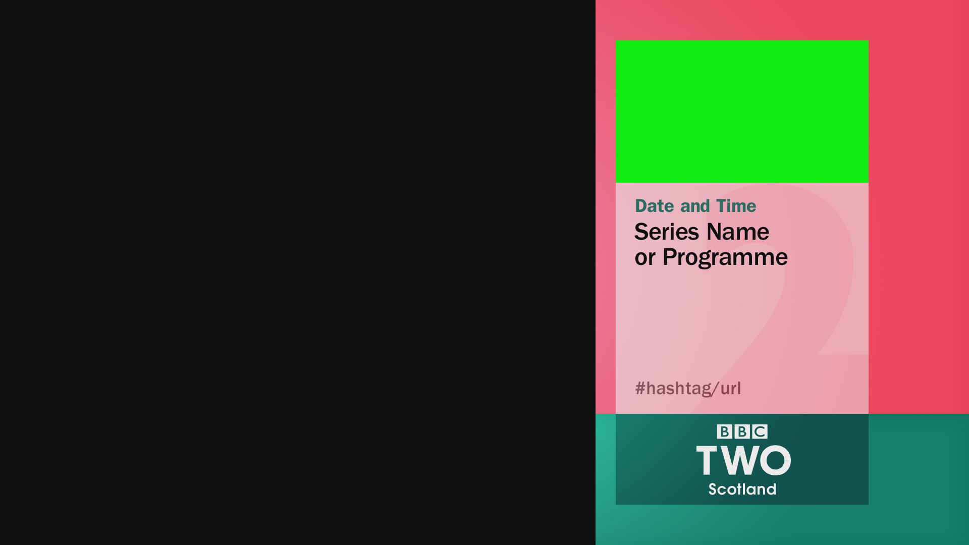
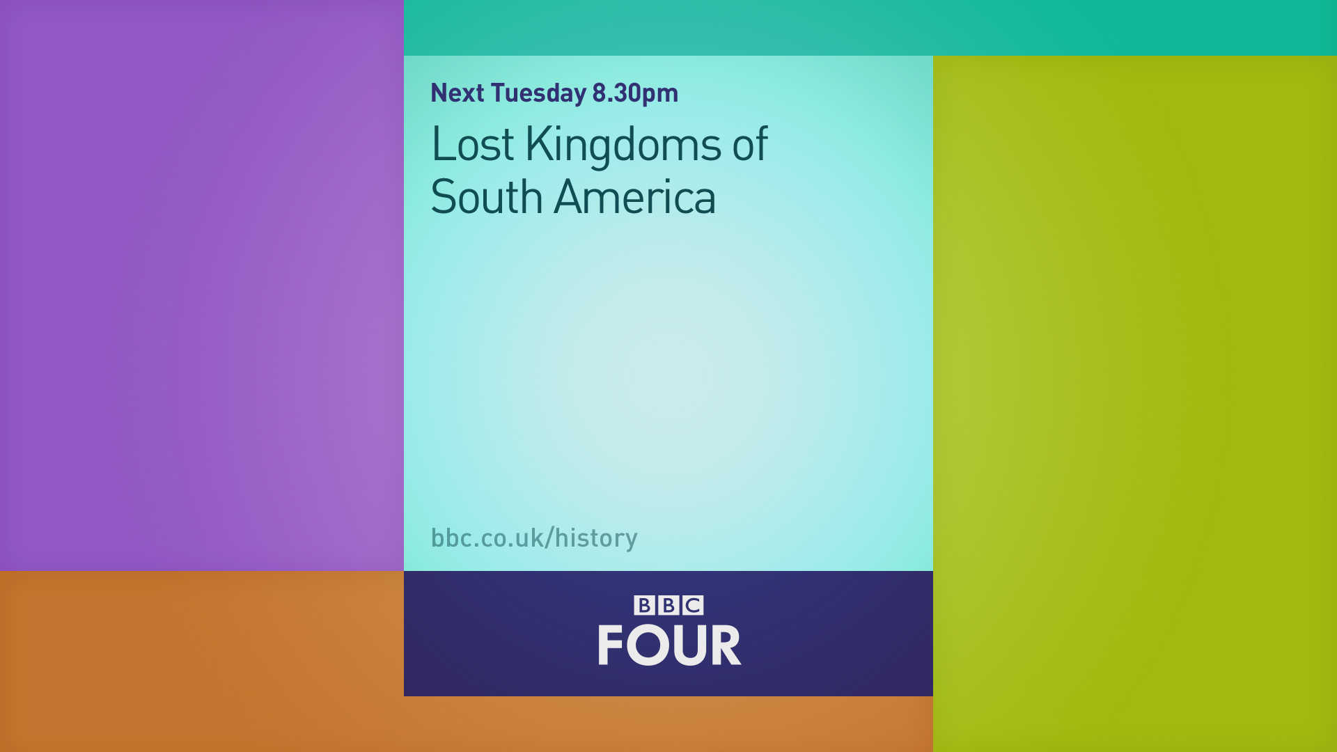
I can't quite work out what the background is? Is it a red curtain of some sort?
It's just an example of some kind of branding image, to show it doesn't have to use a plain colour background.
BBC Two Graphics
TA
It's just an example of some kind of branding image, to show it doesn't have to use a plain colour background.
BBC Two Graphics
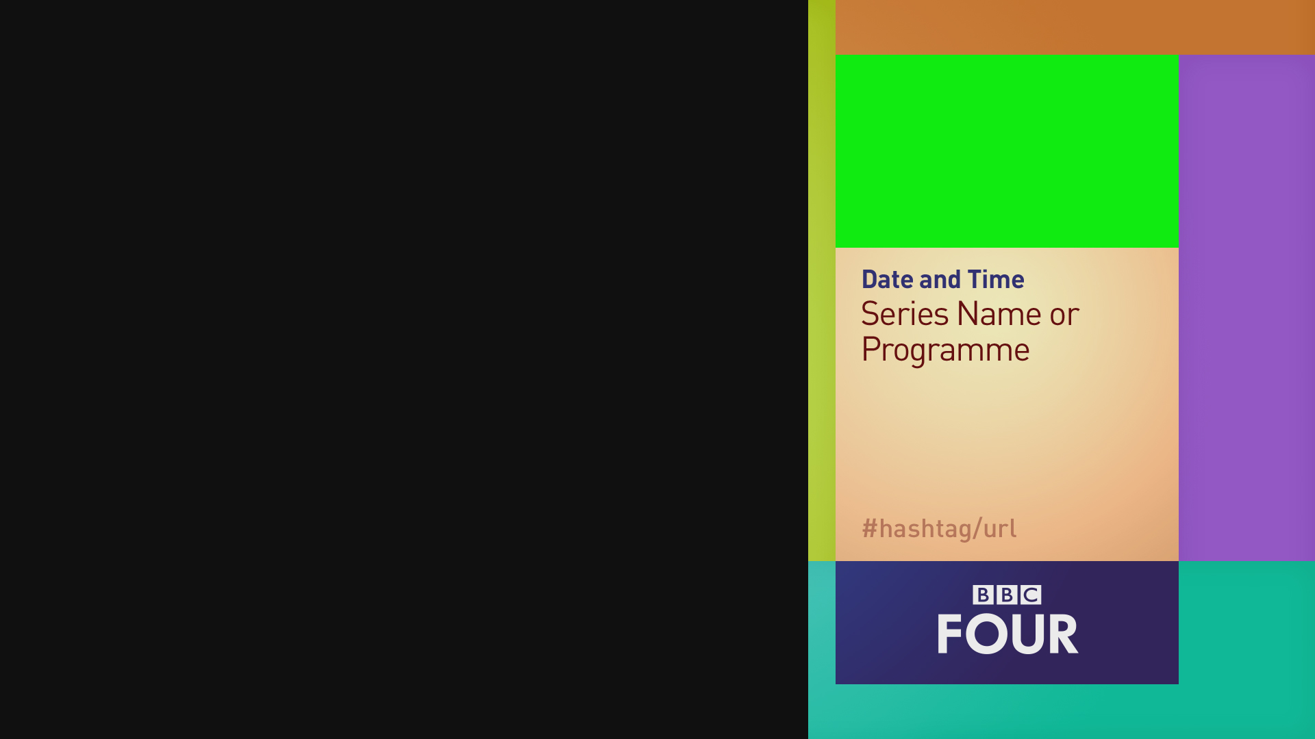
Not much to say about this. It's the logo on a black background. It looks nice, but that's as much as I can say.
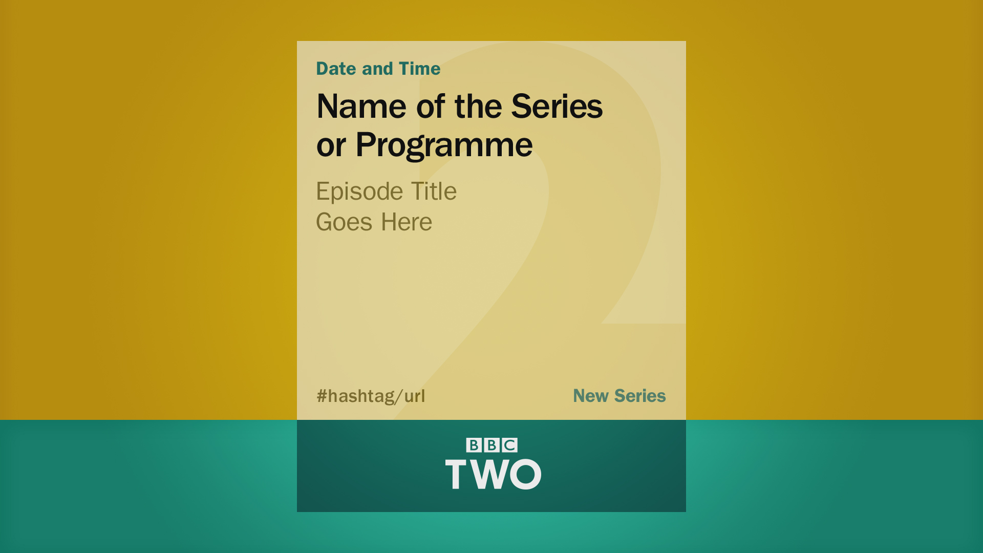
These colours go really well together. I do quite like the BBC TWO being on a bar of it's own colour at the bottom.
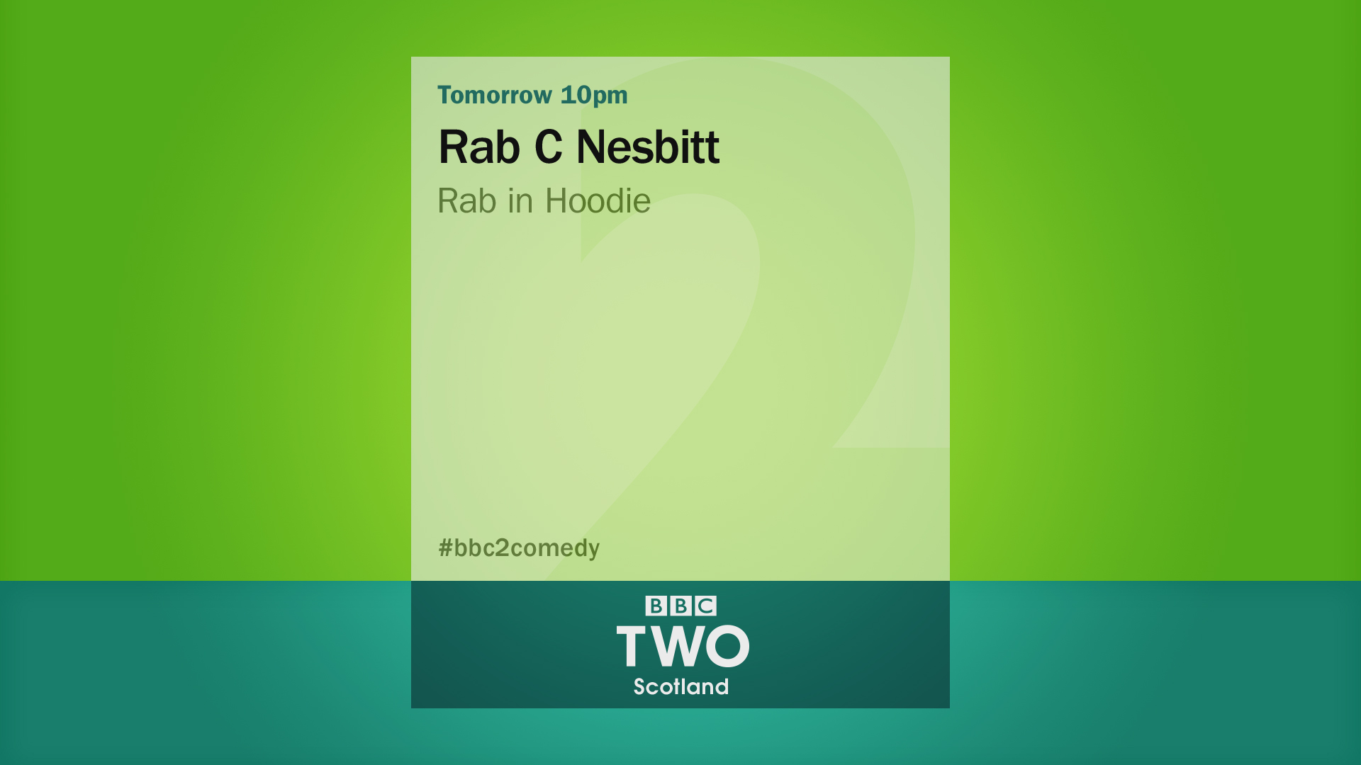
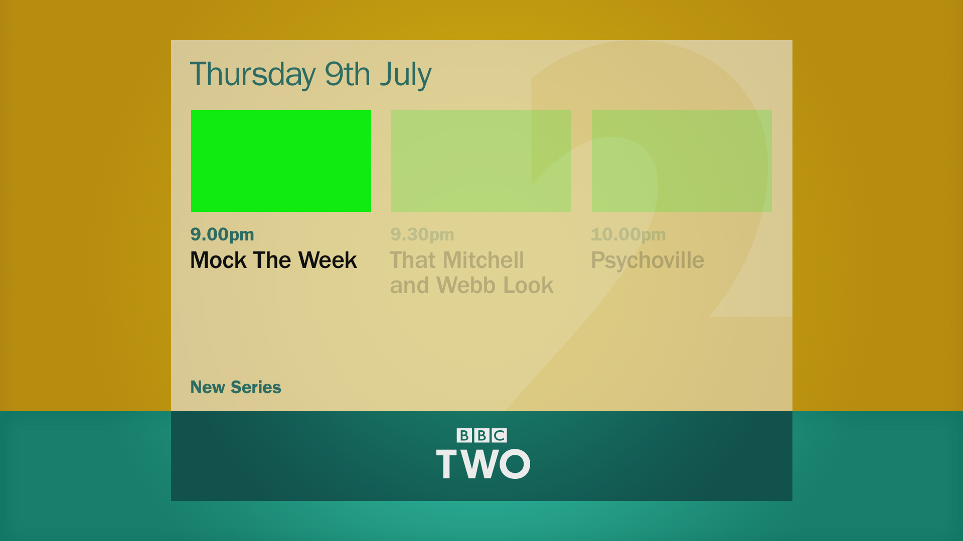
Looks nice, but would probably look better with actual footage instead of those green boxes.
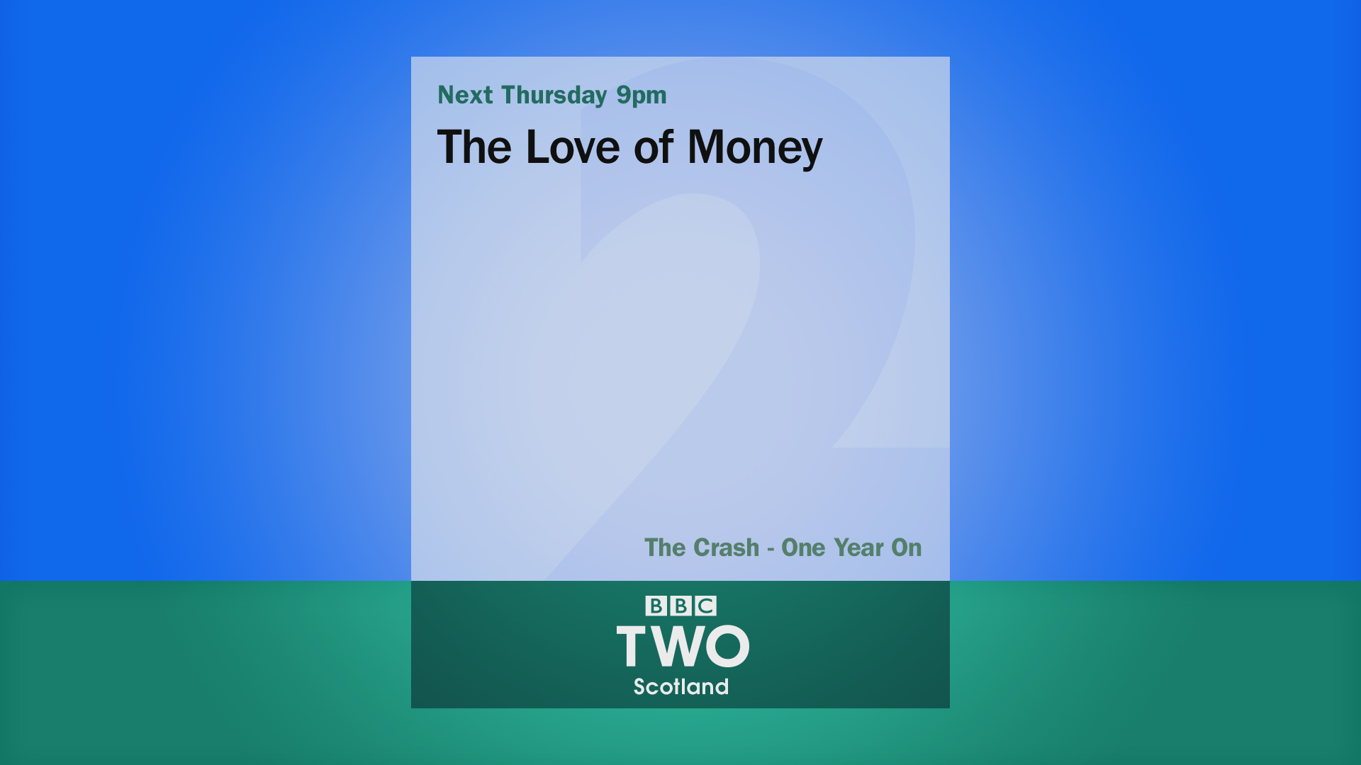
The ECPs still need work. The BBC TWO bar doesn't seem to fit well.
I can't quite work out what the background is? Is it a red curtain of some sort?
It's just an example of some kind of branding image, to show it doesn't have to use a plain colour background.
BBC Two Graphics
Not much to say about this. It's the logo on a black background. It looks nice, but that's as much as I can say.
These colours go really well together. I do quite like the BBC TWO being on a bar of it's own colour at the bottom.
Looks nice, but would probably look better with actual footage instead of those green boxes.
The ECPs still need work. The BBC TWO bar doesn't seem to fit well.


CR
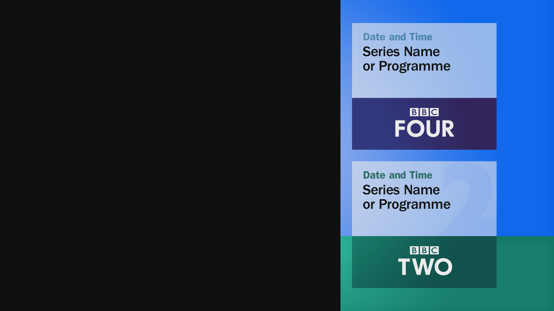
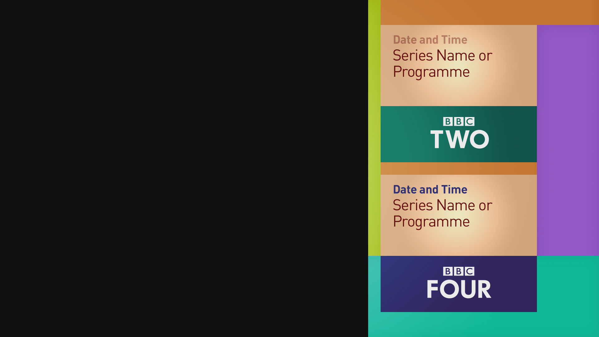
All in all these channel specific ones look quite nice - particularly like the special bar the BBC Two set have on the promo endboards. Only thing that doesn't look quite right to me is the BBC Two bar on the ECP when advertising something on BBC Four at the same time - it doesn't look balanced.
MD
Hmm, I did imagine any BBC Two promos on the BBC Two ECP graphics, would be placed at the bottom so it lines up with the bar. But That bottom bar is just some kind of channel branding, splitting the screen in two etc.
There may be some scope to remove the branding from the ECPs, and opt for some variant of the channel's colour in the background instead.
I think I will wait for some more responses and thoughts before I finalise these layouts. Once things are final and most people like them, then I can start on any videos.
All in all these channel specific ones look quite nice - particularly like the special bar the BBC Two set have on the promo endboards. Only thing that doesn't look quite right to me is the BBC Two bar on the ECP when advertising something on BBC Four at the same time - it doesn't look balanced.
Hmm, I did imagine any BBC Two promos on the BBC Two ECP graphics, would be placed at the bottom so it lines up with the bar. But That bottom bar is just some kind of channel branding, splitting the screen in two etc.
There may be some scope to remove the branding from the ECPs, and opt for some variant of the channel's colour in the background instead.
I think I will wait for some more responses and thoughts before I finalise these layouts. Once things are final and most people like them, then I can start on any videos.
DO
*headdesk*
Looks nice, but would probably look better with actual footage instead of those green boxes.
*headdesk*
TA
*headdesk*
Sorry. Did that hurt? Here, have- Have an ice pack. There you go. Now just keep that between your head and the desk and it should heal u- NO! NO! DON'T BASH YOUR HEAD INTO THE ICE PA- Okay, I'll just take it back now.
The green was bright and looked bad. Also see sig.
Looks nice, but would probably look better with actual footage instead of those green boxes.
*headdesk*
Sorry. Did that hurt? Here, have- Have an ice pack. There you go. Now just keep that between your head and the desk and it should heal u- NO! NO! DON'T BASH YOUR HEAD INTO THE ICE PA- Okay, I'll just take it back now.
The green was bright and looked bad. Also see sig.