MQ
I really, really like Avenir. It's an outstanding font, and I think it is a sound replacement for Gill Sans -- although, personally, I would happily see Gill Sans survive. Maybe that's just because in a branding sense, I associate it strongly with the BBC. But if it is to be replaced, then I'd pick Avenir in a heartbeat over Helvetica/Swiss.
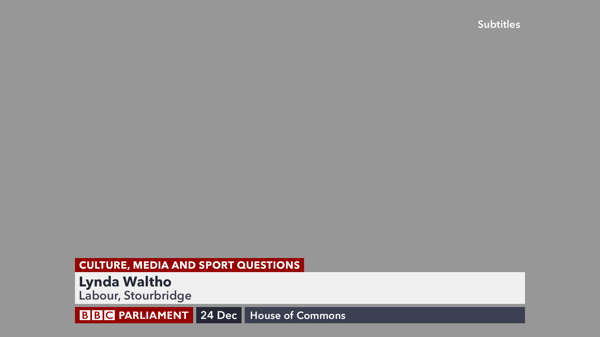
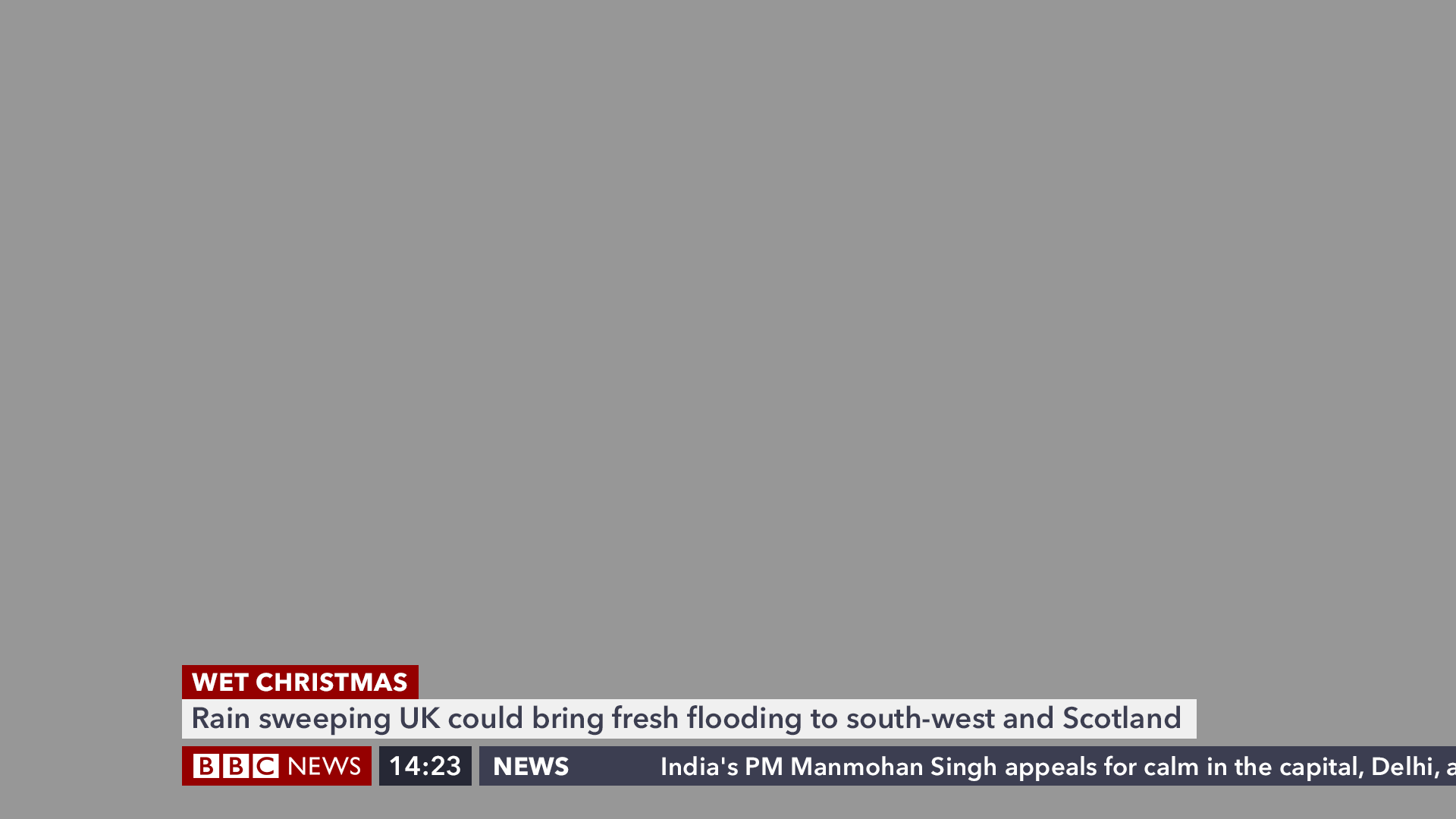
In the broad, I also like these designs. I'm pleasantly surprised by how the strap, DOG and ticker sit together as a block so neatly. It is remarkable the difference simply changing the height of the DOG and ticker makes -- compared to the current graphics, which run to the bottom of the screen, this design looks much cleaner. I also like the decision to retain the existing design of stretching the strap only to the right-hand side of the screen -- though simple, I view it as a distinctive part of the modern BBC News brand. With revisions over time (and ignoring the period where the straps stretched right across the screen), I think it still works as well today as it did back in 1999.
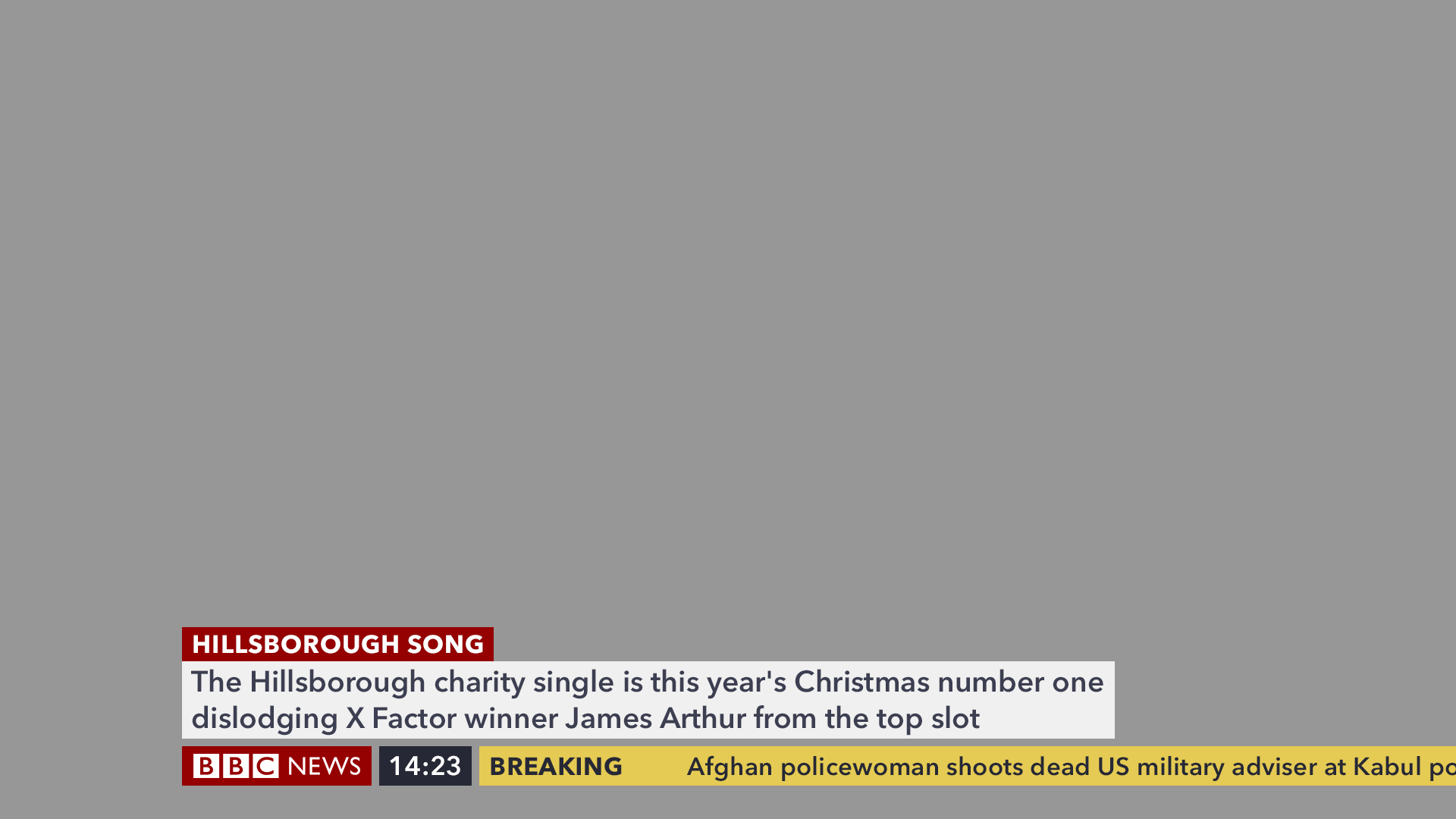
However, I will echo the comments about the choice of orange for breaking news. I don't have an issue with the colour per se, but for breaking news, there's something about it that doesn't tell me 'this is important, watch me now!' -- it doesn't convey urgency or importance. Even Al Jazeera, which also uses orange (albeit a brighter, opaque version than this), seems to struggle with this in my eyes -- but that might just be because I think the orange graphics get overused on AJE to emphasise key stories. The only alternative I can think of, in terms of avoiding a solid red block as in the current graphics, is to use a black strap with a bright red or yellow breaking news heading (still with white text for the story description). I'm mindful though that the combination of red and yellow may conjure up a visual association with McDonalds!
In the broad, I also like these designs. I'm pleasantly surprised by how the strap, DOG and ticker sit together as a block so neatly. It is remarkable the difference simply changing the height of the DOG and ticker makes -- compared to the current graphics, which run to the bottom of the screen, this design looks much cleaner. I also like the decision to retain the existing design of stretching the strap only to the right-hand side of the screen -- though simple, I view it as a distinctive part of the modern BBC News brand. With revisions over time (and ignoring the period where the straps stretched right across the screen), I think it still works as well today as it did back in 1999.
However, I will echo the comments about the choice of orange for breaking news. I don't have an issue with the colour per se, but for breaking news, there's something about it that doesn't tell me 'this is important, watch me now!' -- it doesn't convey urgency or importance. Even Al Jazeera, which also uses orange (albeit a brighter, opaque version than this), seems to struggle with this in my eyes -- but that might just be because I think the orange graphics get overused on AJE to emphasise key stories. The only alternative I can think of, in terms of avoiding a solid red block as in the current graphics, is to use a black strap with a bright red or yellow breaking news heading (still with white text for the story description). I'm mindful though that the combination of red and yellow may conjure up a visual association with McDonalds!