The Gallery

ITV Weekend: V5

Updated with V5.1 (November 2015)

This site closed in March 2021 and is now a read-only archive
BR
Brekkie
This is like the Kate Garraway of the mocking world - it just won't go away!!!

I just can't find anything constructive to say as I'm just really bored of the idea I'm afraid Aaron. The concept of the show doesn't particularly interest me and the mocks aren't developing in such a way that they appear different each time you post them. I know you've put a lot of work in over the weeks and months and years and decades you've been sharing this idea but really just don't think it's going anywhere. There is nothing particularly bad about it but I just think it might be time to move on to another idea.
Multi, Aaron_2015 and Nicky gave kudos
AA
Aaron_2015
This is like the Kate Garraway of the mocking world - it just won't go away!!!

I just can't find anything constructive to say as I'm just really bored of the idea I'm afraid Aaron. The concept of the show doesn't particularly interest me and the mocks aren't developing in such a way that they appear different each time you post them. I know you've put a lot of work in over the weeks and months and years and decades you've been sharing this idea but really just don't think it's going anywhere. There is nothing particularly bad about it but I just think it might be time to move on to another idea.

I understand your point, but I was really keen to keep developing this mock. Of course, it has to stop somewhere.

I think I'll make the suggested changes, before calling time on this.
PE
permotio
Personally I think the studio is on-point now, but you've changed the graphics to the point where they make this mock just as frustrating as your previous ones.
PI
pip2
I admire your determination Aaron, and your passion, and there's some good advice that you seem to be already taking on board.

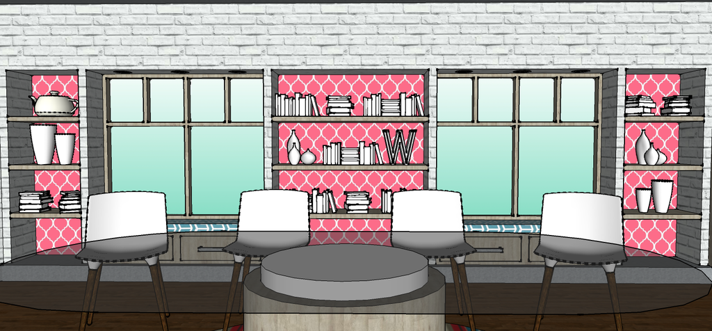
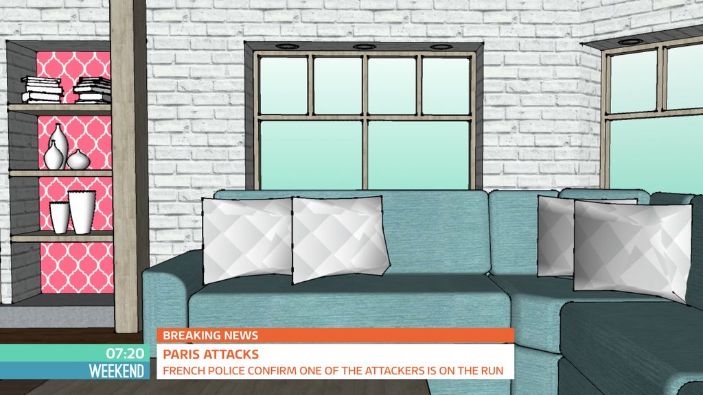
All I'm going to add is that i think you're missing the opportunity to add a whole world (literally) of interest to the studio. How long would you put up with your windows being covered by a subtle opaque gradient, especially when you have the power to have any environment you care to create out there? The way it is feels cold and claustrophobic. It's TV... Anything is possible. As it stands every head and shoulders shot that isn't in front of the wallpaper/shelving is going to be backed by white brick or mint green glass, which will get very boring very quickly.

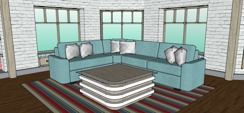
Also, the pattern on the rug is too small.

Finally, attention to detail is key I'm afraid Aaron. It matters that in your top of the hour shot, where presumably the presenters are at the desk, two of them are obscured by the screen. You'd complain if that happened on GMB quick enough wouldn't you? As I'm sure you would if there was a ruddy great clock in the background at breakfast time showing 1.20. It does nothing to convince the viewer that 'this feels right'. A good mock should try to convince you with every pixel.

Good luck. I haven't scored it BTW.
UBox, Aaron_2015 and CoreyLHughes gave kudos
PI
pip2
Quote:
Finally, attention to detail is key I'm afraid Aaron. It matters that in your top of the hour shot, where presumably the presenters are at the desk, two of them are obscured by the screen . You'd complain if that happened on GMB quick enough wouldn't you?


Quote:
Thankfully, Kate Garraway will be appearing a lot less when Piers starts. Without going into "pecking orders" or rotas too much, the lineup should be:

Mon - Weds: Susanna, Piers and Charlotte
Thurs: Susanna, Ben and Ranvir
Fri: Ben, Kate and Ranvir

However, Charlotte seems to be being sent out on location more, she's been out and about for the past few Thursday's.


Ha! Unless one of them is Kate Garraway of course. Maybe that's why you framed the TOTH shot like that. Even in the fictional world of Weekend Kate has managed to find herself in seat 2 and that was the only way you could ensure she didn't appear on screen. On screen, with all her (love it or loathe it) vivacious, infectious, self-deprecating, bubbly, engaging personality. Engaging is the important thing.

Good luck with the mock.
Brekkie and Aaron_2015 gave kudos
AA
Aaron_2015
pip2 posted:
Quote:
Finally, attention to detail is key I'm afraid Aaron. It matters that in your top of the hour shot, where presumably the presenters are at the desk, two of them are obscured by the screen . You'd complain if that happened on GMB quick enough wouldn't you?


Quote:
Thankfully, Kate Garraway will be appearing a lot less when Piers starts. Without going into "pecking orders" or rotas too much, the lineup should be:

Mon - Weds: Susanna, Piers and Charlotte
Thurs: Susanna, Ben and Ranvir
Fri: Ben, Kate and Ranvir

However, Charlotte seems to be being sent out on location more, she's been out and about for the past few Thursday's.


Ha! Unless one of them is Kate Garraway of course. Maybe that's why you framed the TOTH shot like that. Even in the fictional world of Weekend Kate has managed to find herself in seat 2 and that was the only way you could ensure she didn't appear on screen. On screen, with all her (love it or loathe it) vivacious, infectious, self-deprecating, bubbly, engaging personality. Engaging is the important thing.

Good luck with the mock.


Haha, if Garraway was presenting, she would be behind the screen for the whole show. Thumbs up

For the TOTH, one presenter stands next to the screen, whilst the rest are sat at the desk.
AA
Aaron_2015
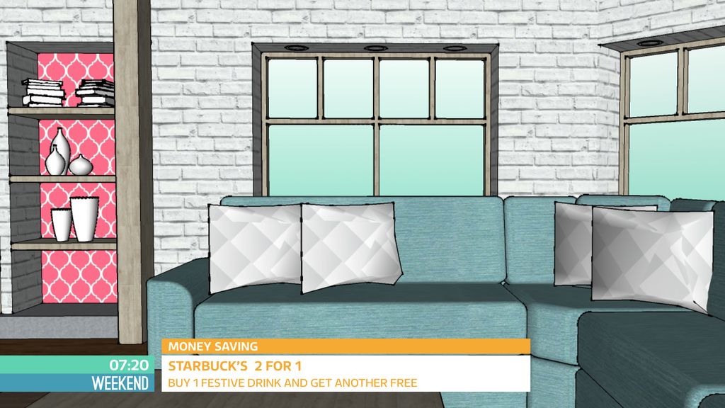
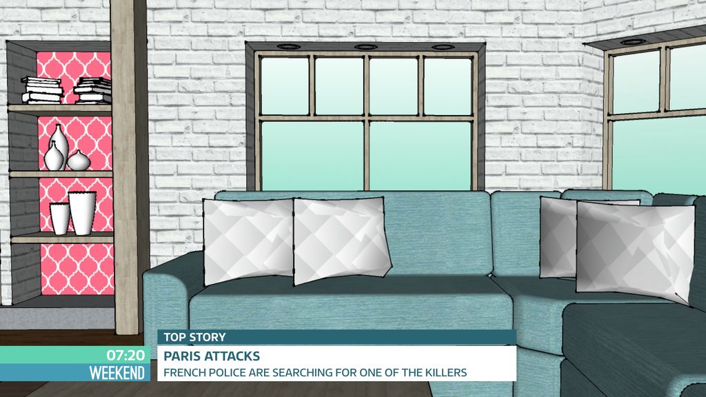
Here is V5.1 (The final update).

Updated here is the set (a new sofa, which took a fair number of hours and was based off a design found on the DFS website) and the graphics (changed the semicircle strap to a square design and changed the font to ITV Reem). The segment names with alliteration have been dropped, replaced with simply "Money Saving", "Health", "Politics", etc.

*

*

*

*

Additionally, the 'title card' and the menu have been dropped. The show would have a set of titles that would involve all of the presenters/experts in their respective fields (Piers in the House of Commons, Sean at a football ground, etc.) before the whole team comes together for breakfast and the Weekend typeface fades on.

So let me know what you think of this update.

Aaron

*
AS
ASO
If this is your final update, I won't bother with a lot of suggestions but I will say you have improved a lot since this

Windows could still have been something that wasn't a blue gradient though...

Sofa is good and graphics better than before.
AA
Aaron_2015
ASO posted:
If this is your final update, I won't bother with a lot of suggestions but I will say you have improved a lot since this

Windows could still have been something that wasn't a blue gradient though...

Sofa is good and graphics better than before.


Thanks.

I won't be updating this anymore, but I will be doing Christmas titles and music, as well as decorating the studio for Christmas (just for a bit of fun).
AA
Aaron_2015
Just another quick update, this time an out of break sequence which I was working on for the return of I'm A Celeb.


Best viewed in HD.

Next update will be a set of Christmas titles, as well as a decorated studio and festive music.
PATV Scunthorpe and JamesTV gave kudos

Newer posts