AA
Here is V5 of Weekend.
*NOTE: If you do not plan to comment on the mock itself, please do not comment. If you have a personal issue to raise, please PM me instead of ruining another thread. Thank you.*

I've made some significant changes in this update, including brightening up the set, ditching the 'VV' and have created a consistent pattern thought. (Rather than a news/showbiz split throughout).
I'm going to go through all of the changes one by one, including my justifications for these changes.
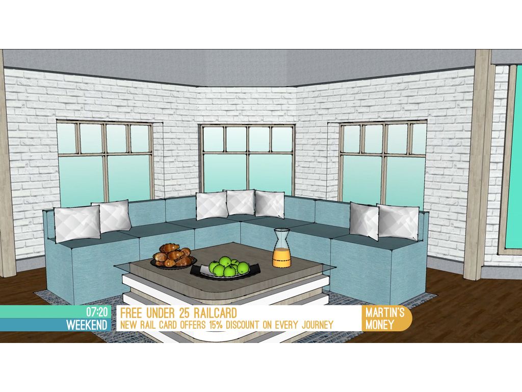
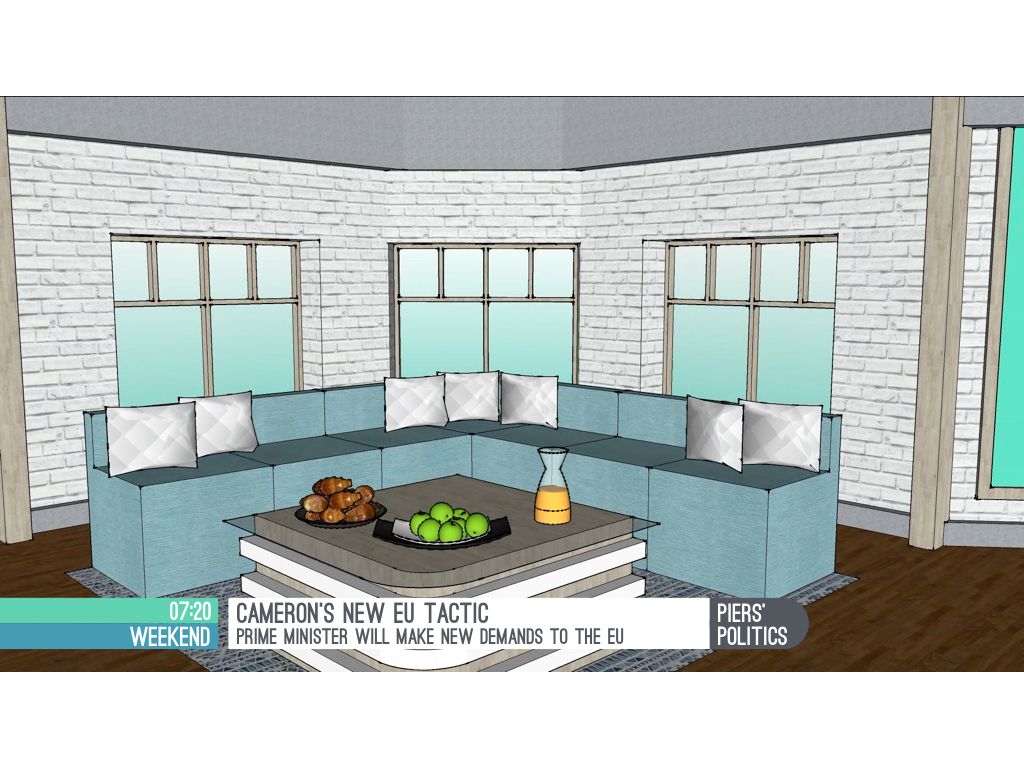
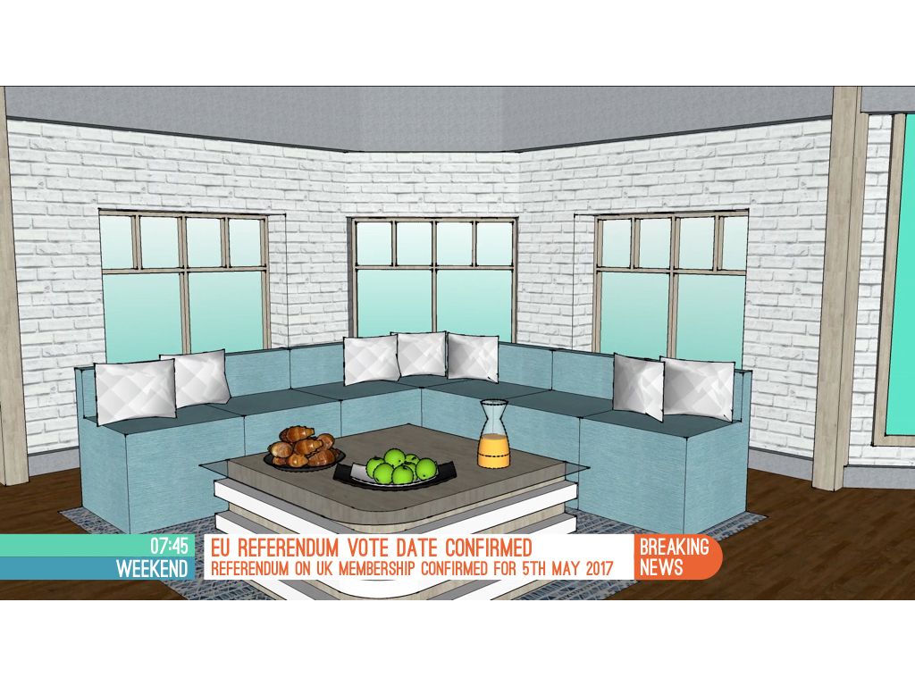
First up are the graphics. Whilst the clock was always visible in the last update, the logo got lost because there was nothing behind it. I moved the logo and clock around endlessly before deciding on this positioning. I tried having the clock only and various box formations (like Daybreak 2012). The semicircle at the side may appear odd to begin with, but I think it's an effective way of having a smaller aston without squashing the larger aston. The semicircle isn't there at all times, just for the regular features and news stories (top story, breaking news, etc.) I'm not 100% on the semicircle, but it's the best idea I think I have come up with. Shown below is how the live bug and strap animates, the new TOTH, opening shot and a program menu (used after the top story).
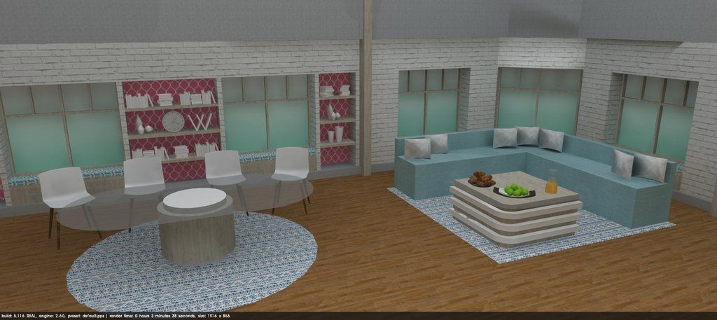
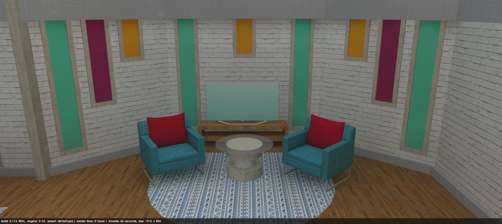
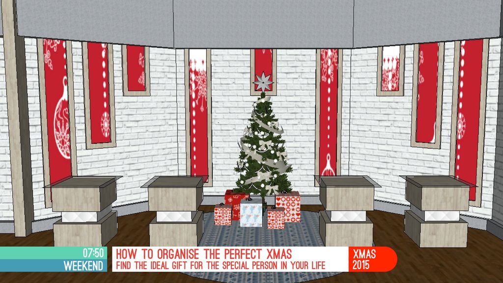
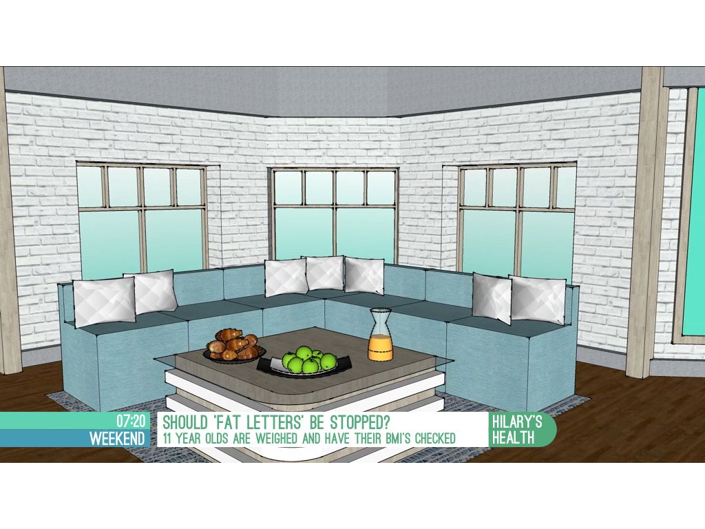
Now on to the set. The shape of the desk was changed to 'pill' shaped, to allow 4 presenters to sit there. Wallpaper was added behind the the shelving. New wooden flooring and soft area. The new soft area has LCD screens which can display solid colours (as shown), or be used during features. Also shown below is an example of how the soft area could be used, for an Xmas feature in this case.
Rest of the graphics:
Please let me know what you think, I spent a lot of time on this update. I would really appreciate any advice you may have on how to improve this .
.
*NOTE: If you do not plan to comment on the mock itself, please do not comment. If you have a personal issue to raise, please PM me instead of ruining another thread. Thank you.*

I've made some significant changes in this update, including brightening up the set, ditching the 'VV' and have created a consistent pattern thought. (Rather than a news/showbiz split throughout).
I'm going to go through all of the changes one by one, including my justifications for these changes.
First up are the graphics. Whilst the clock was always visible in the last update, the logo got lost because there was nothing behind it. I moved the logo and clock around endlessly before deciding on this positioning. I tried having the clock only and various box formations (like Daybreak 2012). The semicircle at the side may appear odd to begin with, but I think it's an effective way of having a smaller aston without squashing the larger aston. The semicircle isn't there at all times, just for the regular features and news stories (top story, breaking news, etc.) I'm not 100% on the semicircle, but it's the best idea I think I have come up with. Shown below is how the live bug and strap animates, the new TOTH, opening shot and a program menu (used after the top story).
Now on to the set. The shape of the desk was changed to 'pill' shaped, to allow 4 presenters to sit there. Wallpaper was added behind the the shelving. New wooden flooring and soft area. The new soft area has LCD screens which can display solid colours (as shown), or be used during features. Also shown below is an example of how the soft area could be used, for an Xmas feature in this case.


Rest of the graphics:


Please let me know what you think, I spent a lot of time on this update. I would really appreciate any advice you may have on how to improve this
.
Last edited by Aaron_2015 on 15 November 2015 7:58pm