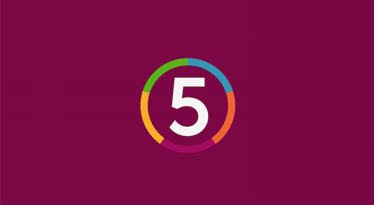
The problem is most likely the green, the yellow and purple looks just about right, blue is too short too.
Yeah I thought so and in my opinion it makes sense to give them all an equal length if they've to represent a genre.
Thanks Jake - sarcasm is the greatest way forward.
Anyway, best of luck I'd really like to see some trailers, endboards, etc including this new logo. Maybe upload a few different "5"s though, I'm not 100% on the one used.
Amended the sections to be equal sizes. Adjusted the blue slightly and also the position of the sections so that the bottom has one section with the top having two.
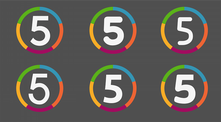
Declan - here are some different 5's that I've tried along side each other.
That's because it is. I tried it out and typically it works quite well, though not rounded enough at the bottom.
The top left that I've gone on to using is nicely balanced, has a nice curve to match the bottom of the circle and works within it nicely. It's finally starting to grow on me.
Ok, this is finally starting to come together nicely. I like the small adjustment with the sections - making the bottom matching the 5.
When compared, your 5 does work best but I do agree with ASO maybe look back into drawing a 5 yourself especially now you have a solid outline. Failing, I'll contradict myself and advise you to keep the 5 you chose.
When I look at this I see great potential and I can't wait to see it develop.
I can't help but think that despite you probably having an idea about where you'll take this logo and use it across the channel I think you should look into a recent ten mock which can be found in the gallery. The vibrancy and feel of the logos are similar in my opinion and I think some of the ideas from that mock could be applied here - naturally not copying but take inspiration.
Like I've said I look forward to seeing the rest of the package. Good luck.