

AS
It looks flat and grainy.
I have a condensed version...?
What about the font?
It looks flat and grainy.
I have a condensed version...?
HJ
It looks flat and grainy.
I have a condensed version...?
I think it would look better, IMO.
What about the font?
It looks flat and grainy.
I have a condensed version...?
I think it would look better, IMO.
TH
Much better than the current titles, fits in more with the BBC News brand. The current titles somehow remind me of these:
http://cart.cranchs-sweetshop.co.uk/images/products/fruit_salad_chews.jpg
http://cart.cranchs-sweetshop.co.uk/images/products/fruit_salad_chews.jpg
AS
Thanks for feedback What would you suggest though? Make it bigger?
People. I would like to improve this mock. I will start with the LIVE aston.
Is there anything else I need to do besides the points already here?
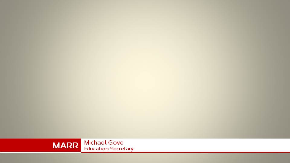
The font is fine, but on the astons it's almost undreadable
Thanks for feedback
What would you suggest though? Make it bigger?
People. I would like to improve this mock. I will start with the LIVE aston.
Is there anything else I need to do besides the points already here?
AS
Thank you very much!
I cannot understand why this mock only has 2 stars! I love it its a massive improvement on the current graphics which reminds me of that god awful stripy wallpaper on daybreak.
Thank you very much!