The Gallery

GMB Studio Mock

GOOD MORNING BRITAIN, Studio and Graphics (March 2014)

This site closed in March 2021 and is now a read-only archive
TW
tweedledum
Better, but still poor. For starters, the title card is quite clearly based around ASO's one, but your is overall much poorer. Something's not quite right with the clock. Maybe because its a bit big. Maybe have just 'GMB' in a smaller circle
HJ
HJL
Personally I hope to God that there is never a time they abbreviate it to 'GMB', it feels really clunky and american, which the show really shouldn't be! With regard to it being like ASO's, perhaps its just the picture. I am in the process of including some pictures into the updated mock, that I used in the Original. After all I criticised him for only using London! I had planned to use a few from around Britain! Thanks anyway for your feed back. Very Happy
AS
ASO
I agree. That's why I didn't have GMB in the straps in my mock. I only write it because I can't be arsed to write Good Morning Britain in every post. I would appreciate if you chose a different picture though for the title card Wink
GM
gmb2014
I think the second version is an improvement, but still needs some work.

1. I'm not too keen on the grey. It seems a bit bland and boring for breakfast TV. The red, white, and blue works fine imo, and it's quite British, so ties in with Good Morning Britain.
2. The clock, compared to the logo, seems tiny. Maybe make 'Good Morning Britain' a bit smaller, and have the clock a bit bigger? I just feel that right now, the logo overwhelms the clock.

Hope my opinion helps. Very Happy
HJ
HJL
Better, but still poor . For starters, the title card is quite clearly based around ASO's one, but your is overall much poorer. Something's not quite right with the clock. Maybe because its a bit big. Maybe have just 'GMB' in a smaller circle


Absolutely fine for you to have an opinion. I would also love to hear how you would like to see it improved. In my personal opinion, I think ASO uses a font that is to big and the ticker at the bottom is to far down. Thats my opinion.

Also I have worked hard to make the corrections indicated by other members, in a bid to improve my skills and get a better mock. Whereas ASO never improved their mock, instead just included a really awful continuation for weekend.
DO
dosxuk
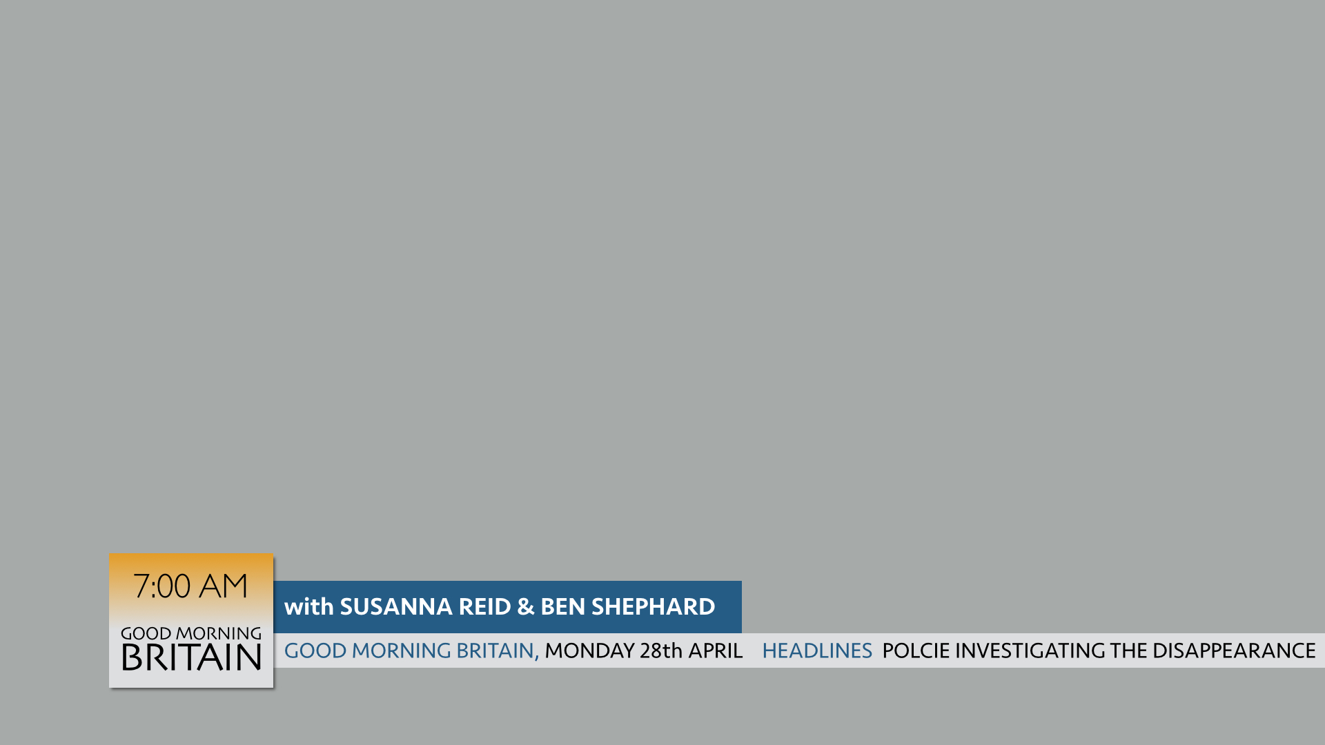
I would completely ditch the circle, along with having "Good Morning Britain" on screen all the time. It's a horrible clunky name that should get as little airtime as possible. What you need is a symbol to go with the words and to sit beside (/around?) your clock.

Why are you showing the name of the building the programme is filmed in in your location bugs? That along with the "(SPECIAL CORRESPONDENT)" text is cringey. Who cares what the reporter's job title is? And why do they need their name on screen all the time during the split screen?

And is a view of Boris Johnson's office really the best view of the whole of Britain you could find?

Also I have worked hard to make the corrections indicated by other members, in a bid to improve my skills and get a better mock. Whereas ASO never improved their mock, instead just included a really awful continuation for weekend.


By the way, if you start criticising other members mocks in your threads, it just sounds like you're being a petulant child. If you have a problem with his mocks, bring them up on his thread, don't drag them round the forum.
BR
Brekkie
Fair play the second version is much much better but I agree the circle needs to go, as does the name being on screen. The ticker can probably go as well if we're being realistic.

I think the font needs to be of heavier weight in the straps etc. and frankly it just needs a bit of life with the look being a bit bolder. At the moment if you're channel hopping this look would encourage me to hop on rather than stick with it.
HJ
HJL
Fair play the second version is much much better but I agree the circle needs to go, as does the name being on screen. The ticker can probably go as well if we're being realistic.

I think the font needs to be of heavier weight in the straps etc. and frankly it just needs a bit of life with the look being a bit bolder. At the moment if you're channel hopping this look would encourage me to hop on rather than stick with it.


Sorry should the ticker go altogether or just for the split screen?? I think it would be too Daybreak without the ticker in format, as some sort of rolling news needs to occur!! Very Happy
HJ
HJL
Little changes, only want to upload this one, however will do more if you prefer it. Obviously this remains a working progress!!

*

I hope you agree that it is different enough from the original Daybreak!
GM
gmb2014
Ooh! I like the clock. imo, this is a big improvement. Would like to see a bit more.
HB
HarryB
What's written on the ticker is the same layout as what I have written, was that planned?!

It looks alright, but I can't really see the light grey working with morning and waking people up.
AG
AxG
Don't like the updated logo and clock DOG.

Newer posts