PC
PCarter1998
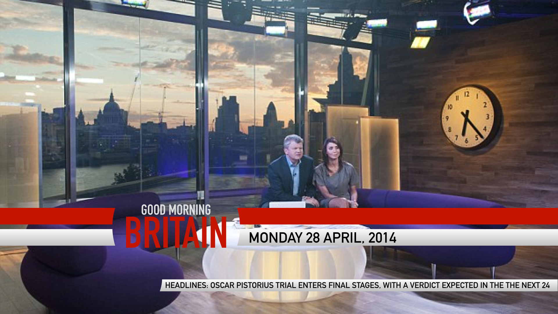
The idea for the tiles is similar to the TODAY show on NBC. The idea is that the lines will move, with headlines and appropriate images/ videos and will last around 1.5 minutes, ending with this, which will appear on the studio as a camera either focuses or pans the studio onto the presenters.
FEEDBACK WOULD BE GREAT!
FEEDBACK WOULD BE GREAT!
Sort of reminds me of Sunday Side Up/Scoop with the DOG and the studio, Aside from that its a brilliant mock though.
HJ
Sort of reminds me of Sunday Side Up/Scoop with the DOG and the studio, Aside from that its a brilliant mock though.
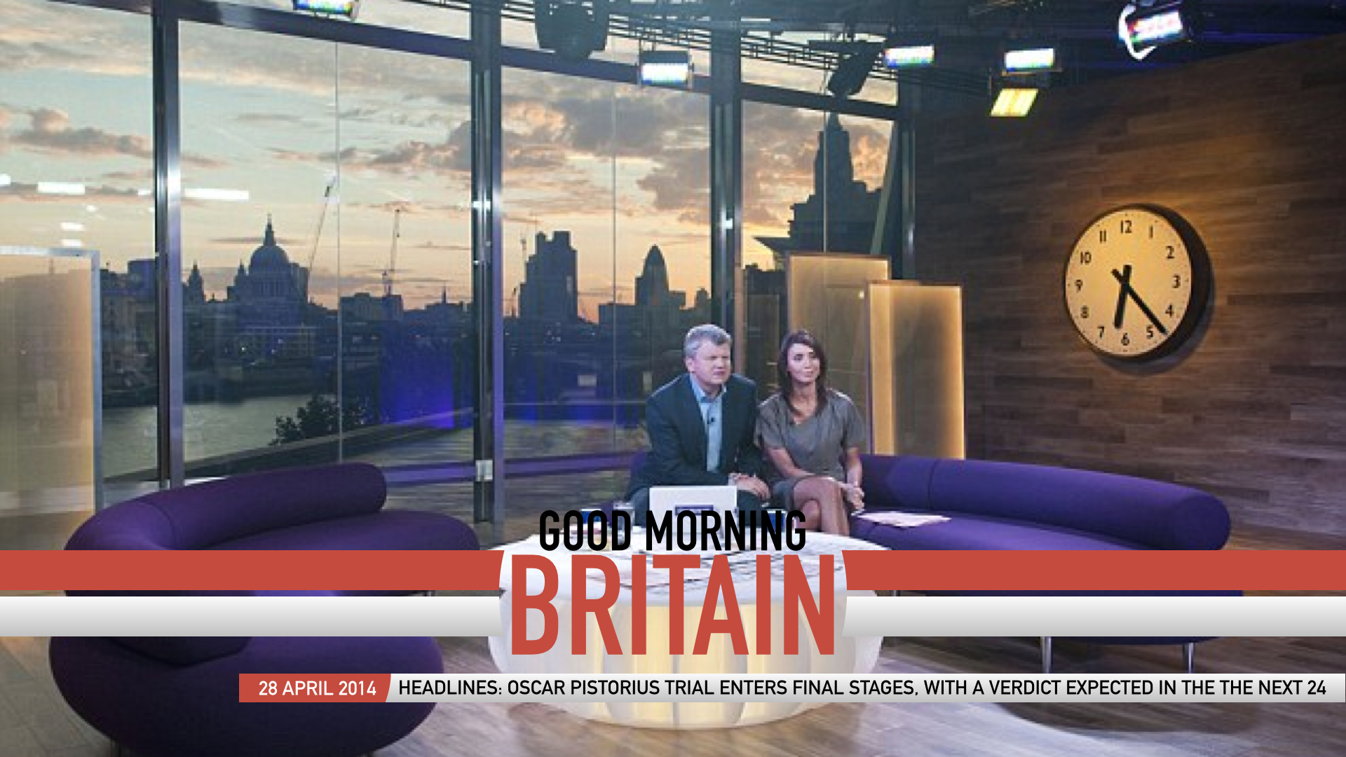
Do you prefer this one??
The idea for the tiles is similar to the TODAY show on NBC. The idea is that the lines will move, with headlines and appropriate images/ videos and will last around 1.5 minutes, ending with this, which will appear on the studio as a camera either focuses or pans the studio onto the presenters.
FEEDBACK WOULD BE GREAT!
FEEDBACK WOULD BE GREAT!
Sort of reminds me of Sunday Side Up/Scoop with the DOG and the studio, Aside from that its a brilliant mock though.
Do you prefer this one??
PC
PCarter1998
The idea for the tiles is similar to the TODAY show on NBC. The idea is that the lines will move, with headlines and appropriate images/ videos and will last around 1.5 minutes, ending with this, which will appear on the studio as a camera either focuses or pans the studio onto the presenters.
FEEDBACK WOULD BE GREAT!
FEEDBACK WOULD BE GREAT!
Sort of reminds me of Sunday Side Up/Scoop with the DOG and the studio, Aside from that its a brilliant mock though.
Do you prefer this one??
There both equally as good... its simple and basic
HJ
Which is a good thing??
What would you want to see in a studio design that would fit with this graphic, want to know so that I can design something at people like, rather than design something that gets hated! Plus its a point of personal interest!
They're both equally as good... its
simple and basic
Which is a good thing??
What would you want to see in a studio design that would fit with this graphic, want to know so that I can design something at people like, rather than design something that gets hated! Plus its a point of personal interest!
PC
PCarter1998
They're both equally as good... its
simple and basic
Which is a good thing??
What would you want to see in a studio design that would fit with this graphic, want to know so that I can design something at people like, rather than design something that gets hated! Plus its a point of personal interest!
Yes in a good way that its simple and basic and also Personally I like studio 7....

PC
PCarter1998
HJ
Why... hope you're not intending to take this forum off topic! If its because its mainly red, the studio has a lot of blue, and I'm only following the favoured palette of many people on this forum!
This look seems to be based on the assumption Scotland vote Yes in the referendum.
Why... hope you're not intending to take this forum off topic!
If its because its mainly red, the studio has a lot of blue, and I'm only following the favoured palette of many people on this forum!
HJ
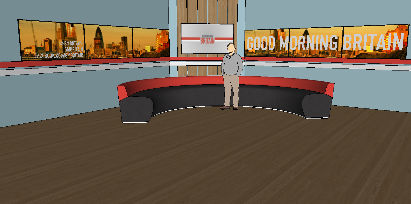
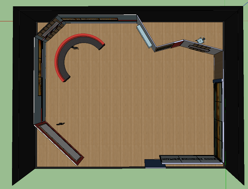
Below are the first two images of my set design!
There is a sofa area, interactive/ news/ small presentation area, a news wall/ performance area and a large screen, for the weather! I would also propose that a desk could be placed in the middle of the studio, as the primary presentation set, where all four presenters can sit. It's obviously not finished, but Id love feedback, as you can gather an understanding of both the layout and colour palette of this studio design.
I hope you all like it, and feedback would be great! Thanks.
Sofa Area
Studio Layout
Last edited by HJL on 16 April 2014 3:45pm
DK
Not bad, walls are a bit bland and sparse. Look at the current Daybreak set, they have drawers and cupboards, windows and flowers etc. Today in the US has credenzas and even a physical door. The layout seems decent although again the whole thing is sparse, fully furnish it and post it again. Also, IMO, sofa's belong on a riser. The man and the sofa do look sort of out of scale too...