CR
I've decided to try and create a new logo package for ITV. I felt that the logos had to be simplistic as this would be more effective onscreen. My main inspiration for the logos was the previous "YLE" logo as it stood out on-screen.
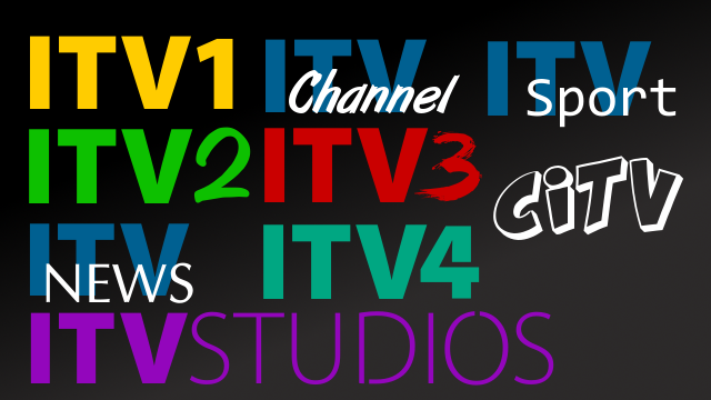
ITV1 - A family entertainment channel. The logo I created here was a standard set for the others. I wanted to keep the yellow/black design as it gave the channel a sense of brightness and togetherness
ITV2 - Youth entertainment channel. I kept the green theme as it reflected an outlandish attitude (one of which may suit the viewers ) The "2" at the end was in a pen marker-style because it looked more hip than just a solid font.
ITV3 - Drama/mystery/archive specialist channel. I wanted to keep the red colouring because it represented blood as much of the programming on ITV3 is crime dramas. The 3 was styled as a blood splatter for the same reason.
ITV4 - Sport/Classic channel with a male slant. I used a teal look for the font for the logo as I felt the green-blue colour was quite masculine and therefore would suit the audience. The 4 at the end was made to look retro to suit the channel's output.
CITV - Children's channel. I liked the logo they used from 2001 to 2006 as it was more childish and friendly than the ones used from 2006 to 2011 and the current logo. This logo can also be adapted to be used up against any colour scheme.
ITV Channel - Regional station. I felt that the Channel Islands should keep it's ITV heritage of which I used in this logo as the tagline "Channel" under the ITV logo.
ITV Sport - Sport programming block. I felt that ITV Sport should have a simplistic, solid logo that could be used in many situations (OSG, sets, promotional material).
ITV News - News program brand. I decided that ITV News should adopt a more classic, professional logo instead of a flimsy, generic one. This was to "class it up" a bit more!
ITV Studios - In-house production company. The original ITV Studios logo colours were used to reflect both the Granada brand and the previous ITV Productions brand. However, IMO, Granada has a larger brand influence and therefore the logo colour scheme should be modeled after it.
Please leave "constructive criticism" only as we've all seen the whimsy, humourus comments that many of you leave!
ITV1 - A family entertainment channel. The logo I created here was a standard set for the others. I wanted to keep the yellow/black design as it gave the channel a sense of brightness and togetherness
ITV2 - Youth entertainment channel. I kept the green theme as it reflected an outlandish attitude (one of which may suit the viewers
) The "2" at the end was in a pen marker-style because it looked more hip than just a solid font.
ITV3 - Drama/mystery/archive specialist channel. I wanted to keep the red colouring because it represented blood as much of the programming on ITV3 is crime dramas. The 3 was styled as a blood splatter for the same reason.
ITV4 - Sport/Classic channel with a male slant. I used a teal look for the font for the logo as I felt the green-blue colour was quite masculine and therefore would suit the audience. The 4 at the end was made to look retro to suit the channel's output.
CITV - Children's channel. I liked the logo they used from 2001 to 2006 as it was more childish and friendly than the ones used from 2006 to 2011 and the current logo. This logo can also be adapted to be used up against any colour scheme.
ITV Channel - Regional station. I felt that the Channel Islands should keep it's ITV heritage of which I used in this logo as the tagline "Channel" under the ITV logo.
ITV Sport - Sport programming block. I felt that ITV Sport should have a simplistic, solid logo that could be used in many situations (OSG, sets, promotional material).
ITV News - News program brand. I decided that ITV News should adopt a more classic, professional logo instead of a flimsy, generic one. This was to "class it up" a bit more!
ITV Studios - In-house production company. The original ITV Studios logo colours were used to reflect both the Granada brand and the previous ITV Productions brand. However, IMO, Granada has a larger brand influence and therefore the logo colour scheme should be modeled after it.
Please leave "constructive criticism" only as we've all seen the whimsy, humourus comments that many of you leave!
