By making a comment about liking Daybreak's actual logo, or preferring it, at least, I mean that I think you should use Daybreak's actual logo. Your new logo is okay, but the font is dull...
By making a comment about liking Daybreak's actual logo, or preferring it, at least, I mean that I think you should use Daybreak's actual logo. Your new logo is okay, but the font is dull...
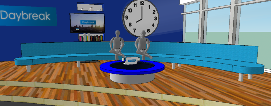
Do you really think it should stay like it is now? Its dark and very drab compared to what GMTV was and I think it just needs brightning up and a new look with a new set up to bring back the viewers
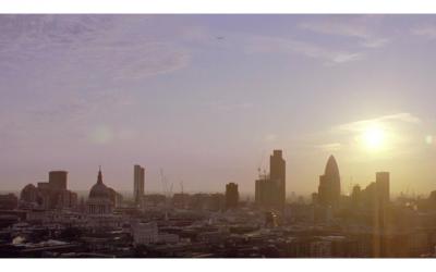
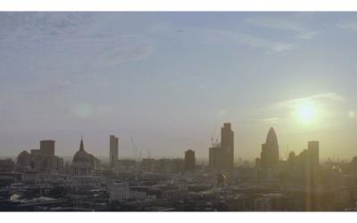
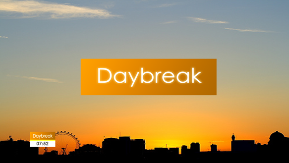
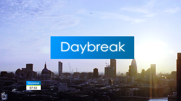
Out of curiousity, You've used the current 'London' skyline used on Daybreak. Why, for illustration purposes didn't you use a libarary image and change that. the reason I wonder is the one used on Daybreak has probably been altered, so you altering it makes it look a bit crap.
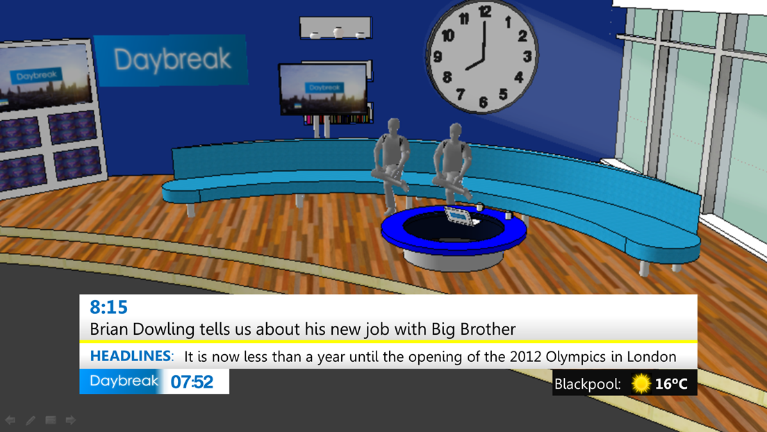
also, as mentioed, use a different font. It's too thin. Would be hard to read on the DOG in SD
its hard to see how it would work in still shots so now I have made this video for you to see how it would all come together. There are a few versions in the video some with new graphics and some with new music tracks for the show. Please tell me what ones you think work and which ones don't. So here it is:
which ever one is liked the most will then be made in to a video with the whole graphics animated and music placed in in the new look studio.
Though it looks fresh (ish) I think the blue is a bit too stark and cold - a complaint with the current Daybreak look. Try orange? (best i can think of hahah)
Though it looks fresh (ish) I think the blue is a bit too stark and cold - a complaint with the current Daybreak look. Try orange? (best i can think of hahah)
 do you think its better than what they got now?