The Gallery

Daybreak and Lorraine V 4.0:All new look.

ITV Daybreak (July 2011)

This site closed in March 2021 and is now a read-only archive
MW
Mike W
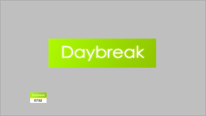
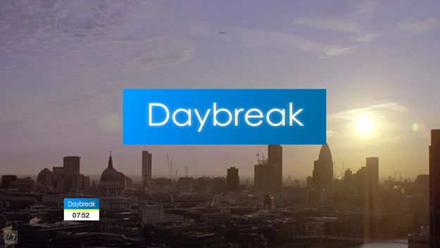
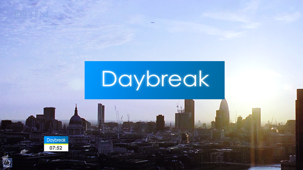
I have to say, this mock has come on leaps and bounds from the first one thrown at us, that said I still don't like it, it's the logo, it looks tacky and horrific;
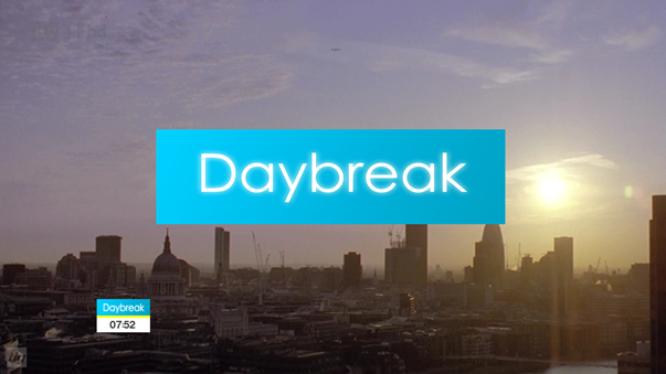
http://upload.wikimedia.org/wikipedia/en/thumb/a/a9/Daybreak.svg/2000px-Daybreak.svg.png

Our very own AxG redrew the logos and they are available in svg format too, so if you need it big, there you go!

Graphically the ideas are okay, but textbook, and the execution really let it down.

I see what you're trying to do though!
Last edited by Mike W on 3 August 2011 12:30pm
ID
Identity
Seen as Daybreak and Lorraine have the same branding I thought I should update Lorraine too and this is what I got:

Ad break:
*

Introduction:
*

Lorraine's news:
*

Lorraine's weather:
*

Lorraine's Kitchen:
*

Guests name:
*

Live in and out of studio feed split screen:
*

Coming up:
*

Live from ..... :
*

Still to come:
*

so, what do you all think?
CR
Critique
I don't like the Lorraine mock as much... The logo and clock look far too big, to start. Also, and I noticed this on your Daybreak mock too, but part of your LIVE strap goes further out than the ticker - surely the LIVE strap should end in a position that aligns with the end of the ticker? Also, for split-screens, instead of a widescreen image, the shot is usually cropped to more of a portrait image - otherwise, the images seem too small, as is apparent in your mock.

And, finally, I have to agree with Mike W and say that I'd prefer the actual logos, instead of your version.
ID
Identity
I don't like the Lorraine mock as much... The logo and clock look far too big, to start. Also, and I noticed this on your Daybreak mock too, but part of your LIVE strap goes further out than the ticker - surely the LIVE strap should end in a position that aligns with the end of the ticker? Also, for split-screens, instead of a widescreen image, the shot is usually cropped to more of a portrait image - otherwise, the images seem too small, as is apparent in your mock.

And, finally, I have to agree with Mike W and say that I'd prefer the actual logos, instead of your version.


Okay, thanks critique. You know when you say you rather their logo, do you think I should keep the logos they got now or should I maybe try a whole new look for them as in logos and fully change the graphics because ive tried to keep it as similar as I could to what they got now. So do you think they need a whole new look?
ID
Identity
I don't like the Lorraine mock as much... The logo and clock look far too big, to start. Also, and I noticed this on your Daybreak mock too, but part of your LIVE strap goes further out than the ticker - surely the LIVE strap should end in a position that aligns with the end of the ticker? Also, for split-screens, instead of a widescreen image, the shot is usually cropped to more of a portrait image - otherwise, the images seem too small, as is apparent in your mock.

And, finally, I have to agree with Mike W and say that I'd prefer the actual logos, instead of your version.


Okay, thanks critique. You know when you say you rather their logo, do you think I should keep the logos they got now or should I maybe try a whole new look for them as in logos and fully change the graphics because ive tried to keep it as similar as I could to what they got now. So do you think they need a whole new look and logo?
ID
Identity
that it for the updated daybreak for now. So V 2.0 is a whole new look, well it will be. here is the new logo and clock:

*
some of you may think OMG NO!!!! but think about it. green is fresh and and calm. where as purple was dark for first thing in the morning. feel free to say what you like about it and I'll see if I can make you like it more as it is updated. but if you like it already then that's great!
JA
james
that it for the updated daybreak for now. So V 2.0 is a whole new look, well it will be. here is the new logo and clock:

*
some of you may think OMG NO!!!! but think about it. green is fresh and and calm. where as purple was dark for first thing in the morning. feel free to say what you like about it and I'll see if I can make you like it more as it is updated. but if you like it already then that's great!


I feel sick.....
ID
Identity
or maybe blue:

*
JA
james
or maybe blue:

*


It would burn your eyes out on a morning. I am sorry but it really is horrid.
ID
Identity
this wont burn as much:

*
JK
JK08
Instead of this purple themed background...
*

Why not changed it to look more blue?
*
ID
Identity
JK08 posted:
Instead of this purple themed background...
*

Why not changed it to look more blue?
*


*

that's a lot better, thanks Smile do you think its better than what they got now?

Newer posts