
NE
I agree that it is a little bit crowded, i was just trying to keep what is on the homepage now. Although maybye the images etc could be scaled down.
Thanks for your feedback and I'll take that into account if I redo it in the future!
Everything is far too big, give me space!
I agree that it is a little bit crowded, i was just trying to keep what is on the homepage now. Although maybye the images etc could be scaled down.
Thanks for your feedback and I'll take that into account if I redo it in the future!
NE
I did try to have more white space, as I agree it does seem a little to dark, but I found that the white space seemed to make it more "cheaper" looking.
I have a few ideas for other pages, but I wanted to try and get the homepage right before I attemped other pages.
This needs far more whitespace before it will look good. Also, have you thought about other pages, how they'd look?
I did try to have more white space, as I agree it does seem a little to dark, but I found that the white space seemed to make it more "cheaper" looking.
I have a few ideas for other pages, but I wanted to try and get the homepage right before I attemped other pages.
CR
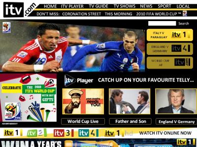
Surely you can't currently watch HD live online? Or either way, it's not provided. I do like the 'Watch Live' bar though, but think the menu bar at the top could do with some brightening. Would be interesting to see the News site and stuff like that.
Hi, based on the comments I received I've used some of what I've done before with a bit of a different design to give it a bit more of a overhall. With a altered logo and menu.
(click for larger view)

(click for larger view)
Surely you can't currently watch HD live online? Or either way, it's not provided. I do like the 'Watch Live' bar though, but think the menu bar at the top could do with some brightening. Would be interesting to see the News site and stuff like that.
NE
Surely you can't currently watch HD live online? Or either way, it's not provided. I do like the 'Watch Live' bar though, but think the menu bar at the top could do with some brightening. Would be interesting to see the News site and stuff like that.
well you never know ITV might provide it in the future!! It was more to fill up the space tbh!
The "watch live" I would say is my favourite part of the design, if I say so myslef! I did spend quite a bit of time on that.
The menu bar, I tried to change from the current rectangle look and that's in part why I changed the logo. I'll see what i can do about brigtening it up.
Well I'll see what improvements I can make on the homepage and then I'll be able to base the news site etc from that.
Thanks for you comments!
Hi, based on the comments I received I've used some of what I've done before with a bit of a different design to give it a bit more of a overhall. With a altered logo and menu.
Surely you can't currently watch HD live online? Or either way, it's not provided. I do like the 'Watch Live' bar though, but think the menu bar at the top could do with some brightening. Would be interesting to see the News site and stuff like that.
well you never know ITV might provide it in the future!!
It was more to fill up the space tbh!
The "watch live" I would say is my favourite part of the design, if I say so myslef! I did spend quite a bit of time on that.
The menu bar, I tried to change from the current rectangle look and that's in part why I changed the logo. I'll see what i can do about brigtening it up.
Well I'll see what improvements I can make on the homepage and then I'll be able to base the news site etc from that.
Thanks for you comments!
TV
First of all, I must give you credit for completing your itv.com mock as I gave up with mine. I prefer the second one because it is brighter, however it is not quite the brighter side. It needs to be brighter and 'glossy' if you have the software to do so, and there needs to be more space - you have gone for a low res approach when most computers now have high res widescreen, which allows more space. Also, ditch the darkened gold/brown.
Overall 3.5/5. Keep up the good work!
Overall 3.5/5. Keep up the good work!
NE
Thanks - I nearly did give up , but thought I should finish it!
I was trying to go for "the brighter side" look i.e the itv yellow too, but I agree does need to be brighter, less black.
I agree that it does need to be a bit more glossy and sharp.
I've got the low res because of the software I'm doing it on, will try and sort it out.
On the last point, it is suppose to be the "itv yellow" ( i used some softare to get the exact colour code) but as it's small/ a bit unclear it does seem a bit of a different colour.
Thanks for all your suggestions - will try and implement them all for an updated mock.
First of all, I must give you credit for completing your itv.com mock as I gave up with mine.I prefer the second one because it is brighter, however it is not quite the brighter side. It needs to be brighter and 'glossy' if you have the software to do so, and there needs to be more space - you have gone for a low res approach when most computers now have high res widescreen, which allows more space.
Also, ditch the darkened gold/brown.
Overall 3.5/5. Keep up the good work!
Also, ditch the darkened gold/brown.
Overall 3.5/5. Keep up the good work!
Thanks - I nearly did give up , but thought I should finish it!
I was trying to go for "the brighter side" look i.e the itv yellow too, but I agree does need to be brighter, less black.
I agree that it does need to be a bit more glossy and sharp.
I've got the low res because of the software I'm doing it on, will try and sort it out.
On the last point, it is suppose to be the "itv yellow" ( i used some softare to get the exact colour code) but as it's small/ a bit unclear it does seem a bit of a different colour.
Thanks for all your suggestions - will try and implement them all for an updated mock.
Last edited by newsatten on 18 June 2010 10:46pm