The Gallery

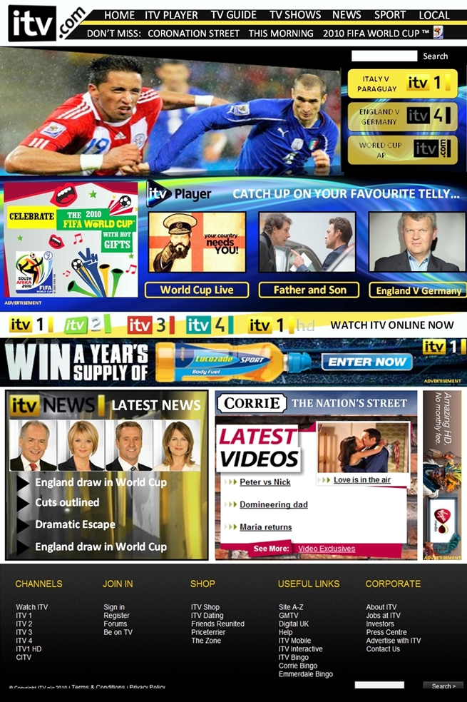
ITV.com - NEWLY UPDATED

See Page 2 (June 2010)

This site closed in March 2021 and is now a read-only archive
NE
newsatten
Made quite a few changes and the bottom half of the homepage.
Tried to take the points made by some on board. Hope you like - Comments please. Very Happy
(btw did nick the bottom bar because I would have only of done the same, minus the ITV type font
plus the Corrie "Video's" bit obviously, but the rest is 100% made by me.)
*
Last edited by newsatten on 19 June 2010 1:49am - 2 times in total
JA
james
Better, but still cluttered. I also don't like all the different backgrounds on one page.
CR
Critique
Made quite a few changes and the bottom half of the homepage.
Tried to take the points made by some on board. Hope you like - Comments please. Very Happy
(btw did nick the bottom bar because I would have only of done the same, minus the ITV type font
plus the Corrie "Video's" bit obviously, but the rest is 100% made by me.)
*


I do like that design, much clearer and the whole main widget piece in the centre looks so much better and it overall looks more professional. However, try being dynamic, why not go for a different look for the bottom bar, drop down menu's ETC?
JO
Joe
Yuck, this is not good.

It was more to fill up the space tbh!


This says it all really. It needs more whitespace! Do you know what whitespace is?
TV
TV Matters
I prefere the second one still. Like I said before, 'glossy' is the key.

Newer posts