OR
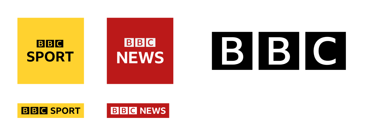
The BBC-less channel logos have got me thinking if the BBC blocks with no text as a logo would work. Probably not, but it would be ultra minimalist and work as an icon or symbol of sorts.
It's so daring that I couldn't actually imagine BBC doing it though.
It's so daring that I couldn't actually imagine BBC doing it though.
Last edited by orange on 8 September 2017 2:26am
JO
Joking aside, and I assume you haven't watched W1A, I see where you are coming from.
I know other international big brands have done it but they all have very distinctive symbols. Whilst on that level they could just about get away with it here internationally it wouldn't work so you'd always have to have the BBC in text next to it which would defeat the point.
Also have have tried mocking it up or thinking about it in your mind? It would look bloomin awful. You also gain nothing from losing the letters IMO.
OR
Hmm. Perhaps it would be better as a brand element rather than the logo itself. I was thinking maybe like if they do all the channels logos as squares like they have been trying to attempt for ages, the squares could portray the colours of the channels (with the blocks being multiplied rather just the set of 3 blocks) something to portray the portfolio of channels.
Might be because it being so late and I'm recovering from being sick too though, maybe I'm going crazy
Might be because it being so late and I'm recovering from being sick too though, maybe I'm going crazy
DE
<pedant>
Helvetica is only 60 years old, and Gill 90.
However, the fonts that directly inspired them - Akzidenz-Grotesk and Johnston respectively - *are* over 100 years old.
</pedant>


The 1972 logo managed to survive into the '90s - although, of course, it wasn't used right across the Corporation and didn't have the current logo's timeless quality.
I'd definitely be horrified if they changed the logo at any point before 2030. And I'd probably be horrified if they changed it at any point after, too.
AFAIK, Reith will be replacing the '100 year old fonts' of Helvetica and Gill (although not within the BBC blocks).
<pedant>
Helvetica is only 60 years old, and Gill 90.
However, the fonts that directly inspired them - Akzidenz-Grotesk and Johnston respectively - *are* over 100 years old.
</pedant>
20 years on and you wonder if they will change the logo again. After many alterations with the blocks and lettering this one seems to have stuck, and like Martin shows a change for changes sake would not look as good. Let's not give them any ideas!
The 1972 logo managed to survive into the '90s - although, of course, it wasn't used right across the Corporation and didn't have the current logo's timeless quality.
I'd definitely be horrified if they changed the logo at any point before 2030. And I'd probably be horrified if they changed it at any point after, too.
SP
I would suggest steering clear of colour coding as your main means of differentiation, not least for people with colour blindness.
Plus finding a colour for each channel and brand that has a sufficient contrast ratio with the body text colour but look ok together is going to be harder than it might sound.
I think your idea of having something iconic for each channel is a good one, and it's where we were pre 1997 with the stylised 1 and 2.
JA
They already are colour coded though. Red for 1, Teal for 2, Pink for 3, Black for 4, Yellow for Sport, and a slightly darker Red (with a lot more white in the surrounding elements) for News. Before it rebranded, CBBC was green, and they use Purple for Worldwide. They do have unique fonts, except for News and Four which both use Gill. The radio logos have colours too, though combined with the old 90s TV system of unique stylised numerals, and with circles instead of boxes.
SP
Which is fine as a secondary branding, if the text is with it also. On its own, not so much.
LO
It doesn't look good. It would need a custom C shape to fill the block better, and if you do that, there is little point changing it at all, considering the costs that would be involved.
it doesn't look as good, but i put it to you that 99.9999 wouldn't notice - the logo is usually shown so small on screen that the distinctive qualities of gill are quite hard to distinguish anyway.
I know they're not going to make the BBC blocks Reith, but if they did, what would it look like?
It doesn't look good. It would need a custom C shape to fill the block better, and if you do that, there is little point changing it at all, considering the costs that would be involved.
it doesn't look as good, but i put it to you that 99.9999 wouldn't notice - the logo is usually shown so small on screen that the distinctive qualities of gill are quite hard to distinguish anyway.
WO
The main channel that suffers from a boxed logo problem is BBC Parliament, mainly due to the word 'Parliament' being so long. When the whole thing is boxed on screen, the BBC boxes and channel name are shrunk so small you can't read them properly.
A channel name change would be the only way that could be resolved if a boxed logo is still used on trails.
A channel name change would be the only way that could be resolved if a boxed logo is still used on trails.
ST
BBC Politics?
A channel name change would be the only way that could be resolved if a boxed logo is still used on trails.
BBC Politics?