W1
So that'll be the 'oneness' idents written in BBC Reith for 2018 then......
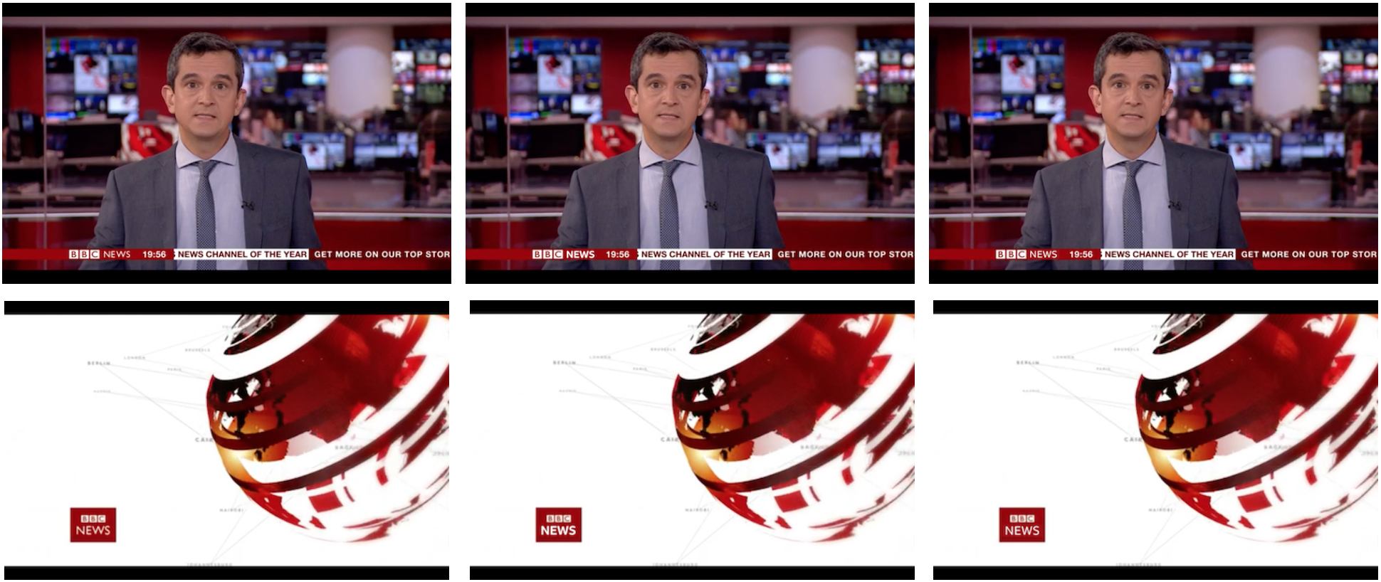
AFAIK, Reith will be replacing the '100 year old fonts' of Helvetica and Gill (although not within the BBC blocks). Taking that as a guide, it doesn't necessarily mean replacing custom fonts used on the channels, but wherever you see Gill and Helvetica, expect Reith. News, Sport and Weather will be most affected by the change I expect. One of the goals of the project, according to many articles about it, is to reduce the licensing fees caused by use of Helvetica and Gill, so I expect it will be replaced on the TV and Radio websites, as well as the iPlayer - but it's doesn't necessarily mean the iPlayer word mark will change.
So that'll be the 'oneness' idents written in BBC Reith for 2018 then......
AFAIK, Reith will be replacing the '100 year old fonts' of Helvetica and Gill (although not within the BBC blocks). Taking that as a guide, it doesn't necessarily mean replacing custom fonts used on the channels, but wherever you see Gill and Helvetica, expect Reith. News, Sport and Weather will be most affected by the change I expect. One of the goals of the project, according to many articles about it, is to reduce the licensing fees caused by use of Helvetica and Gill, so I expect it will be replaced on the TV and Radio websites, as well as the iPlayer - but it's doesn't necessarily mean the iPlayer word mark will change.