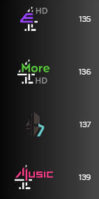
The only one that looks remotely presentable is 4 Music because of how the M is formed out of pre-existing blocks, so the 4 is still intact. E4 just looks like utter s**t.
It's a bit weird that they've done that for 4Music but not More4.
The E4 logo is really odd. Like they took the “E” out of the current logo and stuck it into the C4 logo. It’s an end of an era because they’ve had that logo (and some of the most unusual and inventive presentation on TV) since the day they launched.
E4's branding and marketing has always been phenomenal - often, much better than the programmes they air. I'm really curious to see how they'll keep that up if there's a level of uniformity being brought in throughout Channel 4's sister channels, unless the logo is the only thing that'll tie them together.
I’d imagine it’s not just the logos, 4Music’s current presentation revolves around the four blocks (columns) that make up the logo, can’t exactly continue with that if that’s not the logo anymore.
Agree the 4 music one works but the rest look terrible. It's really suprising to see the 4 portfolio go for this kind of uniformity after all this time.
So what we are saying is that a BBC rebrand is better than Channel 4?
If your going to completely dump a brand then dump it. They just tried to merge two logos together which had ended up looking a mess. You have half an E4 logo and a fifth of a 4 music logo and the fonts between the logos are different. Why not go for a full rebrand with blocks.