If anyone from the BBC is reading this - STOP letting graphics be made by employees who clearly have no design experience/can’t follow templates or guidelines. Please. Your brand is being tainted.
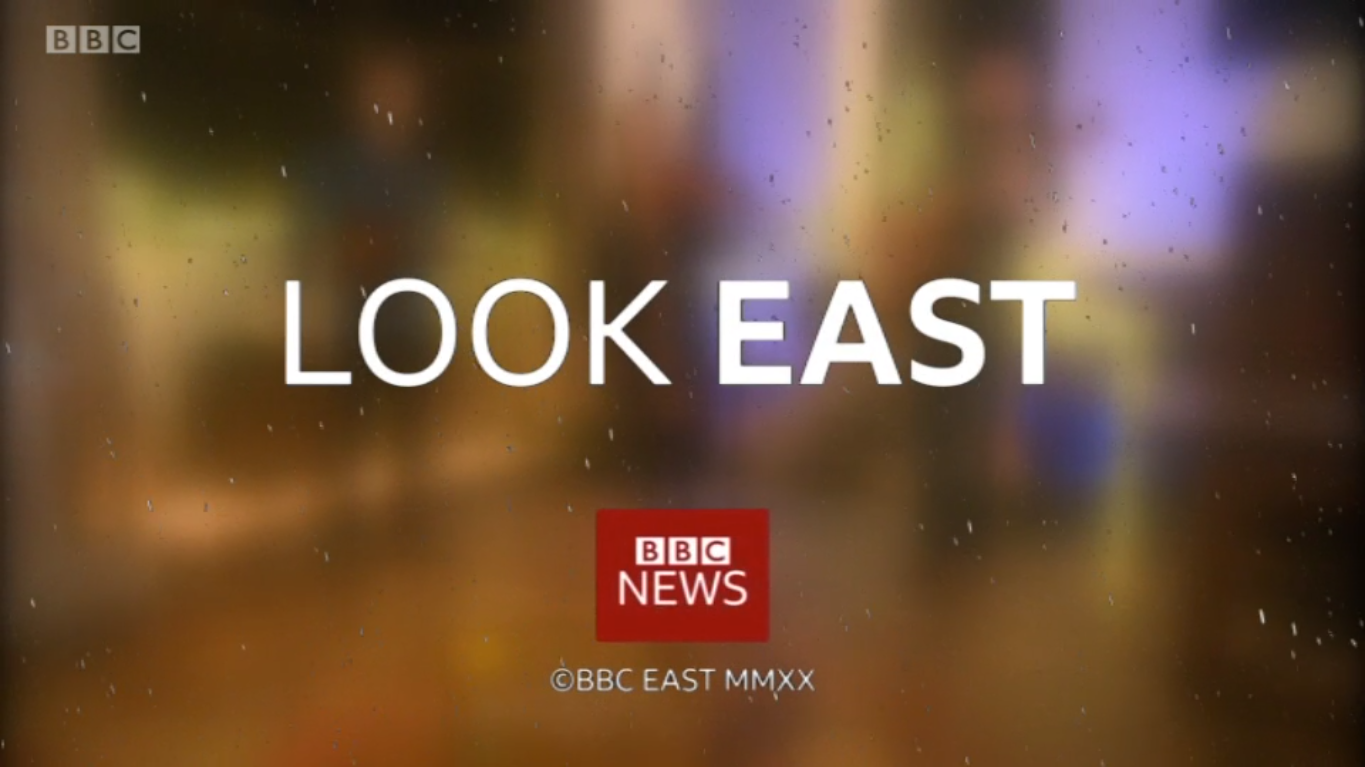
I do wonder *where* they found that logo, but if I'm honest it took me a while to figure out what was wrong with the image (maybe I should rescind my TVF membership!), so I'm not sure it's the worst crime against design that a BBC English Region has committed...
I won't forget in a hurry the period a few years back where they decided to cram their social media details onto the title endslate, using a weird mishmash of Gill Sans and Helvetica in the process. Then, when they later changed the URL of one of their social accounts, rather than render the sequence again with the new details in properly, they just stuck some white fill over that area and hoped no-one would notice!
I know we’re prone to exaggeration on here and for many it doesn’t matter, but it’s just so sloppy. You only have to google “BBC News Logo” and it’s the first image to appear. It’s very poor when TV Producers don’t notice such details.
I know we’re prone to exaggeration on here and for many it doesn’t matter, but it’s just so sloppy. You only have to google “BBC News Logo” and it’s the first image to appear. It’s very poor when TV Producers don’t notice such details.
Although if they start using that method it’s only a matter of time before something from the gallery is used.
If anyone from the BBC is reading this - STOP letting graphics be made by employees who clearly have no design experience/can’t follow templates or guidelines. Please. Your brand is being tainted.
Also can Norwich be reminded that they need to produce graphics for East and West for breakfast, lunchtime and weekend bulletins. Suspiciously the Christmas themed graphic used on the studio screen never stays on long and always shows places in the east.
If anyone from the BBC is reading this - STOP letting graphics be made by employees who clearly have no design experience/can’t follow templates or guidelines. Please. Your brand is being tainted.
Be careful what you wish for. This is the kind of edict that big organisations issue which really stifles those who know what they are doing (yet aren't technically qualified graphic designers) so everything ends up being bland.
Don’t worry....I don’t think anyone will be urgently reacting to this edict
If anyone from the BBC is reading this - STOP letting graphics be made by employees who clearly have no design experience/can’t follow templates or guidelines. Please. Your brand is being tainted.
Be careful what you wish for. This is the kind of edict that big organisations issue which really stifles those who know what they are doing (yet aren't technically qualified graphic designers) so everything ends up being bland.
Often used by marketing departments to justify an increase/retaining their staffing numbers. Normally ends up with blandness everywhere as the people who care about the output are separated from the people who have to do the work, and they're also now overworked doing little jobs rather than things that interest them.