The Gallery

Sky... again

featuring a redesigned Sky News (May 2020)

This site closed in March 2021 and is now a read-only archive
PA
PATV Scunthorpe
Hi all...

*

Back with the first part of America Decides, the opening. As I said earlier in the thread, I rather liked the look of Sky's graphics, so this is mostly a recreation, just altering the logo to match that of the style used by NBC News, MSNBC, CNBC, Telemundo and so on, creating a cohesive logo across both sides of the Atlantic.

I've also decided to go back on some the decisions made when I first posted some America Decides stills and have reverted the colour scheme back to Sky's on the straps, wipes, slides... the only example of the NBC colours are in the logos.

MO
Mockah
Excellent work, as usual! Very Happy

Honestly can't believe you use PowerPoint!

8 days later

PA
PATV Scunthorpe
Hi,

*

Spent yesterday and today working on recreating the title card for Breakfast since I've decided to switch to the 'Sky News Breakfast' branding as opposed to '(Kay Burley) @Breakfast' with the option of adding 'with Kay Burley' and 'with Stephen Dixon & Gillian Joseph' in the same way as 'The News Hour (with Mark Austin)'.

I wanted to have a go at trying to recreate the current title card more accurately than the recoloured time-lapse footage I've used previously...


Reference:
Last edited by PATV Scunthorpe on 9 January 2021 10:54am - 3 times in total
VA
valley
Top work as always!

22 days later

PA
PATV Scunthorpe
Hi again,

*

Back with another set of Sky News examples to incorporate the new version of the logo and replace the @Breakfast titlecard with Sky News Breakfast.

Other changes include a recolour of the opening, I removed the red on the 'timeline' section as I didn't think it fitted in that well, and added a black background to the smartwatch section to more reflect how news is presented on watches.

The other change is to the stocks graphic which I have now moved to the bottom right corner as part of the ticker, previously it occupied the top right corner, and would have used a 'stacking' system with any live location graphics sitting next to it, but I've moved it to prevent that.


DW
DavidWhitfield
Looking good, PATV.
Good move on the stocks 'flipper' too - looks neat on the bottom right and frees up top left.
Animations slicker than oil itself, as ever.
JosiahStuart and PATV Scunthorpe gave kudos
AA
Aaron_2015
Excellent work as usual PATV, all three look fantastic already so only a couple of minor suggestions:

- At the start of the TOTH it could possibly do with using your Sky News logo animation, rather than having 5 seconds or so of still logo
- The wipes are fantastic, but I think the solid colour bar on each one looks a little out of place

It would also be really interesting to see your take on some titles/a longer sting rather than recreating the current sequence (the animations are lovely though). The current titles clash a little IMO with the rest of your package; the current titles remind me of 2010 or so when being able to access Sky News on your phone, tablet, etc. was more of a selling point.
PA
PATV Scunthorpe
Thanks


- At the start of the TOTH it could possibly do with using your Sky News logo animation, rather than having 5 seconds or so of still logo
- The wipes are fantastic, but I think the solid colour bar on each one looks a little out of place


I think because it animates on again after the opener, it would look a little odd doing it before.
I not entirely sure which bit you're referring to with the 'solid colour bar'? I'm assuming you mean on the title cards, in which case, that's to improve the legibility of the text.

I think the mention of changing the titles has come up before, and really, I don't know what I could replace it with.

18 days later

PA
PATV Scunthorpe
Hi again,

Back with an update on something new...

*

Over the last few weeks I've been working on some stuff relating to the rebranded Sky Challenge,

As part of this, I'm recreating the ident(s), 1) to update the logo and 2) update the programmes that are referenced but are no longer shown.

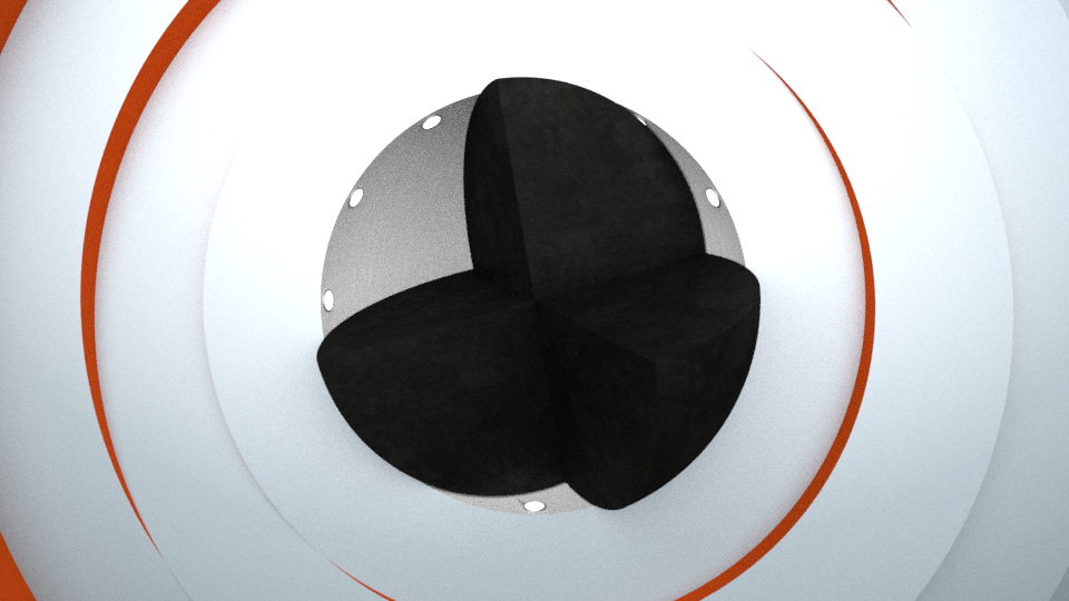
I haven't yet added any gameshow elements, but I've finished the main animation of it and wanted to share it, along with some stills. One thing you lot may be able to help with is what idents you may want to see, currently the actual three idents in use on Challenge are

Classic: Wheel of Fortune, Bullseye and Countdown
Modern: Deal or No Deal, The Chase and Pointless
Physical: Ninja Warrior, Robot Wars and Total Wipeout

In the same way I want to have idents based on a theme, but was thinking more along the genre line such as "Quiz" and "Adventure", featuring stuff like Millionaire and The Crystal Maze, are there any other genres you can think of, and what gameshows should they reference? (Considering it's a mock, I don't mind having a not too unrealistic fantasy schedule)


(The first image was from before I changed the lighting as it was too bright)
*
*
*
Last edited by PATV Scunthorpe on 17 February 2021 10:08pm
JL
J. Lyric
Oh, this is interesting. In a good way, of course.

Newer posts