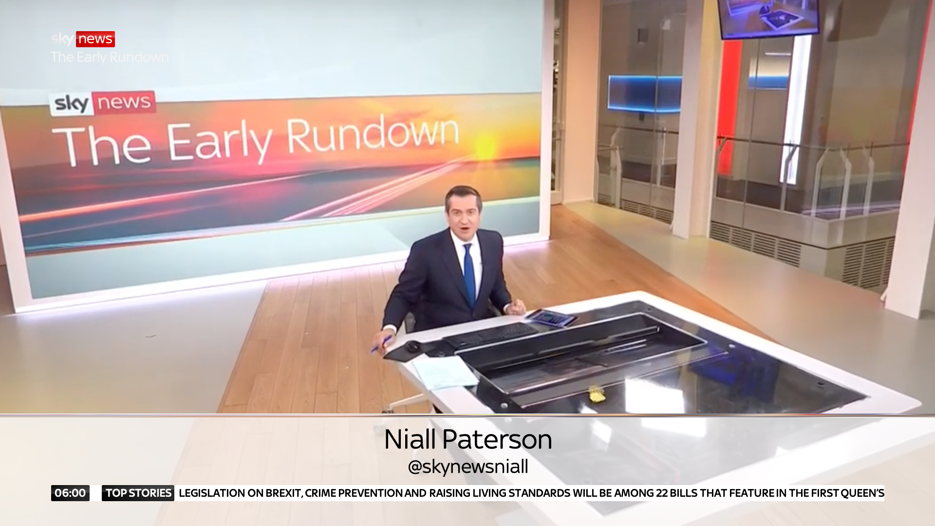
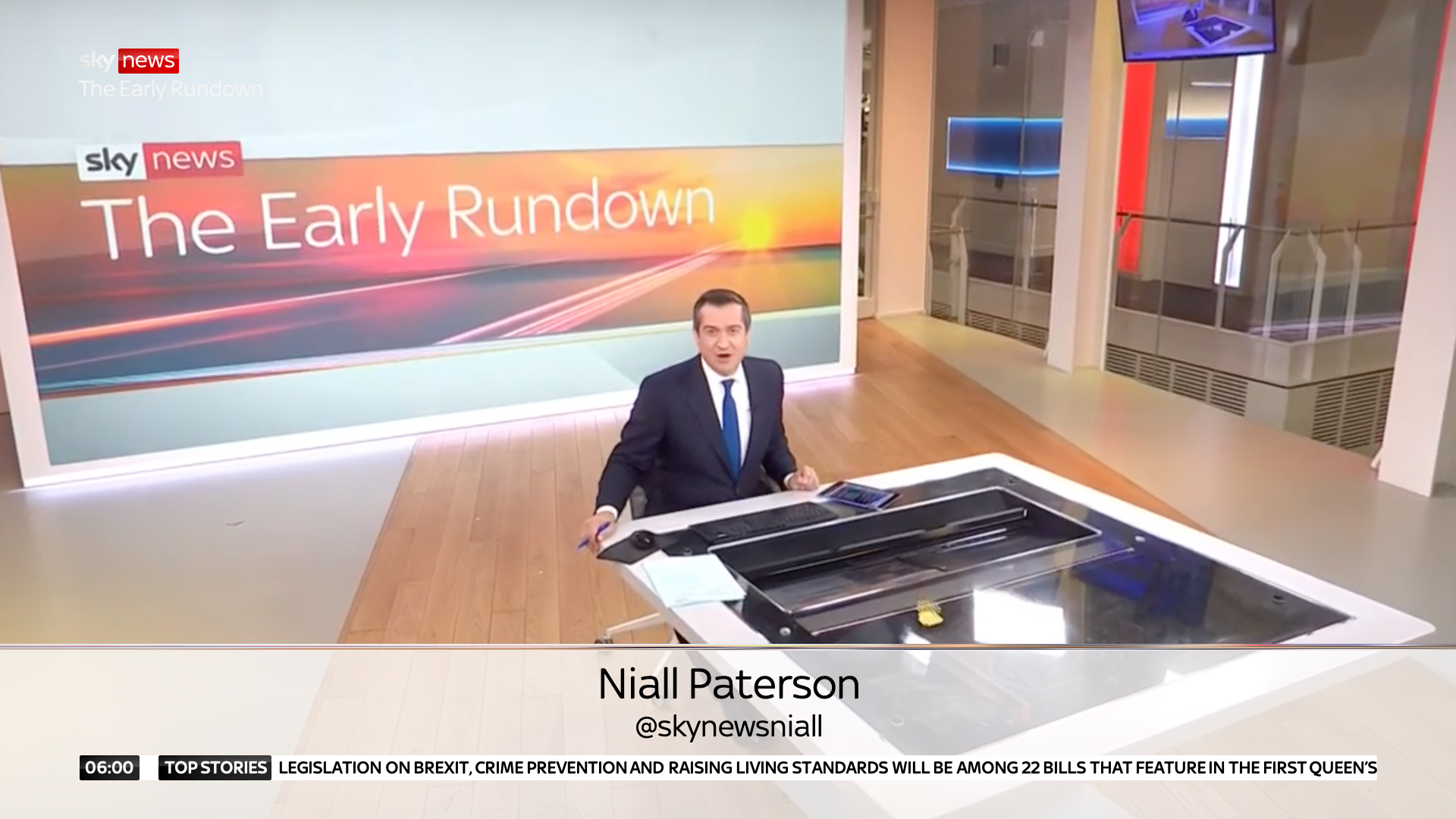
The Gallery

Sky... again

featuring a redesigned Sky News (May 2020)

This site closed in March 2021 and is now a read-only archive
PA
PATV Scunthorpe
UBox posted:
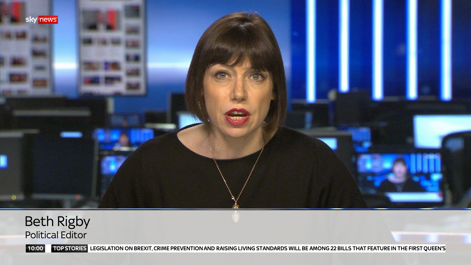
I think these are some fantastic designs. The only thing I don't like/irritates me is the way the image behind the straps is zoomed in like on the image below. I can imagine it being a bit distracting to watch. Apart from that amazing work! https://up.metropol247.co.uk/PATV%20Scunthorpe/SkyNews1.png

There is a 10% zoom, however that picture is technically inaccurate, I forgot to change the image behind the straps so... you're seeing Beth Rigby with Adam Boulton's body, and therefore that one appears quite a bit larger than the others.

*
Last edited by PATV Scunthorpe on 26 September 2020 6:50pm
VA
valley
There is a 10% zoom, however that picture is technically inaccurate, I forgot to change the image behind the straps so... you're seeing Beth Rigby with Adam Boulton's body, and therefore that one appears quite a bit larger than the others.


Hmm, I'm not sure that works well as an animate on with that zoom. Maybe try it without and see if that is perhaps slightly more aesthetically pleasing?
DW
DavidWhitfield
I personally think that the slightly zoomed in 'glassy' effect is a lovely touch, and is inkeeping with Sky's wider branding style.
PA
PATV Scunthorpe
Hmm, I'm not sure that works well as an animate on with that zoom. Maybe try it without and see if that is perhaps slightly more aesthetically pleasing?


I quite like the zoom, to me the zoom emphasises that it's supposed to be a piece of glass, whereas without it it's just a coloured rectangle and I don't think it fits with the glass bar at the top either. And it's more inkeeping with the original graphic that inspired it.

*
*
lukeshep, BBI45 and JosiahStuart gave kudos
CA
Capybara
Ah sorry about that, didn't see that PATV had already commented on it.

By the way is anyone else having problems viewing some of PATV's videos on mobile? The first couple work fine, then the rest load for a couple of seconds, display a play button but when you press it, it just loads again and gets stuck in that cycle. I also noticed this problem with your "Merry Christmas" thread also, is this a problem with Metropol?
JK
JK08
Would it be possible to see the Sky News logo animation/ident on the blue background? In my head, it would look amazing and echo the late 90s-2015 branding.
PA
PATV Scunthorpe
JK08 posted:
Would it be possible to see the Sky News logo animation/ident on the blue background? In my head, it would look amazing and echo the late 90s-2015 branding.


Of course I used red to echo the other channels, but go on then...
JK
JK08
Looks brilliant
VA
valley
Hmm, I'm not sure that works well as an animate on with that zoom. Maybe try it without and see if that is perhaps slightly more aesthetically pleasing?


I quite like the zoom, to me the zoom emphasises that it's supposed to be a piece of glass, whereas without it it's just a coloured rectangle and I don't think it fits with the glass bar at the top either. And it's more inkeeping with the original graphic that inspired it.


Hmm yes, I think it looks nicer on that wide shot compared to on the MCU of Beth Rigby. I still prefer the non-zoomed version, but personal preference for certain!

15 days later

PA
PATV Scunthorpe
Hi again,

*

I'm still working on the election stuff, however one of the other things I've been trying to work on is improving the titlecards, considering they were the aspect of this mock that was commented about the most negatively.

I've been trying to think of ways to make them less subtle, but I either couldn't think of many ideas, or the ones that I did think of I didn't like the end result of.

Having another go tonight, I've ended up with something I feel quite happy with. I feel they remove the 'bland' feel of the last, with the removal of the white background, in favour of making the shows visual full screen, and using the middle section as another way to use the zoomed in glass effect. It's a simple change, but I feel it makes them less subtle...

AA
Aaron_2015
Absolutely outstanding work. My only suggestions would be to reduce the use of dark blue, particularly on the wipes. To my mind it looks a little outdated when used with red, but the animation and general design is perfect. I’d also suggest considering something else for the TOTH titles, I’d like to see something different to the current website/app sequence. Maybe something making use of Sky Central (like the VR used during the Election Coverage?). Particularly like the astons, and the use of the glassy, zoomed in ‘bar’ is very clever.
SK
skynewsfreak
... also suggest considering something else for the TOTH titles, I’d like to see something different to the current website/app sequence.
How about a modern take on the 2003/4 globe sequence - the globe TOTH was Sky News back then. Smile

Newer posts